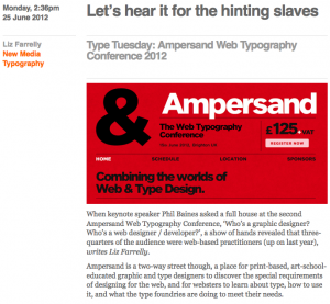
Good conferences are a joy to attend, and Ampersand proved to be a pleasant surprise. Last June, at short notice, Eye requested that I cover it. I wasn’t sure what to expect, as I’m neither a web nor graphic designer (core audience), but I got a lot out of it, and more importantly, so did that expectant crowd. This year’s conference is on 28 June 2013; but as there’s nothing wrong with a little nostalgia, so here’s my review from last year.
Ampersand Web Typography Conference, Brighton
Organised by Clearleft and compèred by production director, Richard Rutter
Attended 15 June 2012
Monday 2:36pm, 25 June 2012
“Let’s hear it for the hinting slaves”
by Liz Farrelly
Originally posted on Eye Blog
When keynote speaker Phil Baines asked the full house at the second Ampersand Web Typography Conference, “Who’s a graphic designer? Who’s a web designer / developer?”, a show of hands revealed that three-quarters of the audience were web-based practitioners (up on last year). Ampersand is a two-way street though, a place for print-based, art-school-educated graphic and type designers to discover the special requirements of designing for the web, and for websters to learn about type, how to use it, and what the type foundries are doing to meet their needs.
Ampersand delivered on all fronts. If at times it felt like Type 101 or Web 101 – depending on which camp you were in – a bit of back to basics never hurt anyone. And, as Baines pointed out, “designers need to talk to one another”, so it follows that both camps should propagate a mutual understanding of parlance.
Continue reading

