Seminar Paper; Mediating Design, a case study in diversity

Modes of Mediating Applied Art and Design
7th Tallinn Applied Art Triennial
Soprus Cinema
Vanna-Posti 8, Tallinn, Estonia
21 April 2017

This is an edited version of a paper I presented amidst Art Deco splendor in Tallinn. While the city was still waiting for spring the reception was warm, and the audience and fellow speakers contributed to a lively discussion around the role of media in the mediating art and design. I’d like to thank Triin Jerlie and Keiu Krikmann for inviting me to speak, and the organising committee of the Tallinn Applied Art Triennial and the British Embassy Tallinn for funding my trip. Look for another post about Tallinn, the city-wide Triennial and the Estonian Museum of Applied Art and Design.

This paper is still in the form of a ‘talk’, but also constitutes work-in-progress that will inform the last chapter of my doctoral thesis on the future of design museums. In May, I presented a longer version to University of Brighton MA Art and Design History students as part of the module, Critical Reflection, at the invitation of my colleague, Megha Rajguru, and that version of the talk provided an opportunity to explore changing definitions of ‘interpretation’. The images are from my PowerPoint presentation, and either taken from the Internet or using my Apple iPhone 4S.
Continue reading

signature

From the Archive; summer anarchy

2017-06-21 09.57.242017-06-21 09.57.42

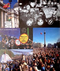
It’s the Summer Solstice and I’m re-posting this article as the Glastonbury Festival kicks off and protesters take to the streets for a Day of Rage. In heatwave temperatures (warmest since 1976), the soixante-huitards’ slogan, ‘les pavés, la plage!’ (translates as, under the paving stones the beach) is ringing in my ears. It’s twenty years since I went to Glastonbury; 1997 was a mud bath, two years before it had been glorious sunshine. Both times friends were made and tested, and despite the odds familiar faces popped out of the crowd. That era was all Parties & Protests and although my plans to visit a Euro Teknival didn’t materialise, later that summer I made it to Burning Man in the Nevada desert and learnt the mantra of hydration from the daily newsletter, Piss Clear!

Much has changed; the underground events mentioned in this article were organised without the aid of social media and minimal Internet coverage, even though I make much of ‘the daily mayhem of mobile phones, faxes and pagers’! One source of information (not mentioned in this article, but I wrote about it another time) was the indomitable SchNEWS, a photocopied newsletter reporting on legal and political campaigns and listing direct actions. It worked like this; you posted them a pile of stamps and they mailed you weekly issues. I met the photographer, Nick Cobbing, through SchNEWS, and by an odd quirk of fate have ended up living next door to their old office!

Now, come the summer there’s a stage in a field catering to every taste and subculture. Festivals are bespoke, niche, glampy affairs, with fancy dress, boutique beers, Insta-Stories and Twitter-Moments. This branch of the music, entertainment and events industries has blossomed, fanned by the British love of a camp-fire sausage and a piss-up in a tent. But I’d suggest that the roots were there back in the 1990s, as innovation and diversity were the order of the day. So I’m not complaining, just suggesting that an updated article would be a whole other story. On a more serious note though, the Millennials have discovered politics, and protest is once again in vogue…plus, we have the weather for it.
Continue reading

signature

From the Archive; You never know when you might need them

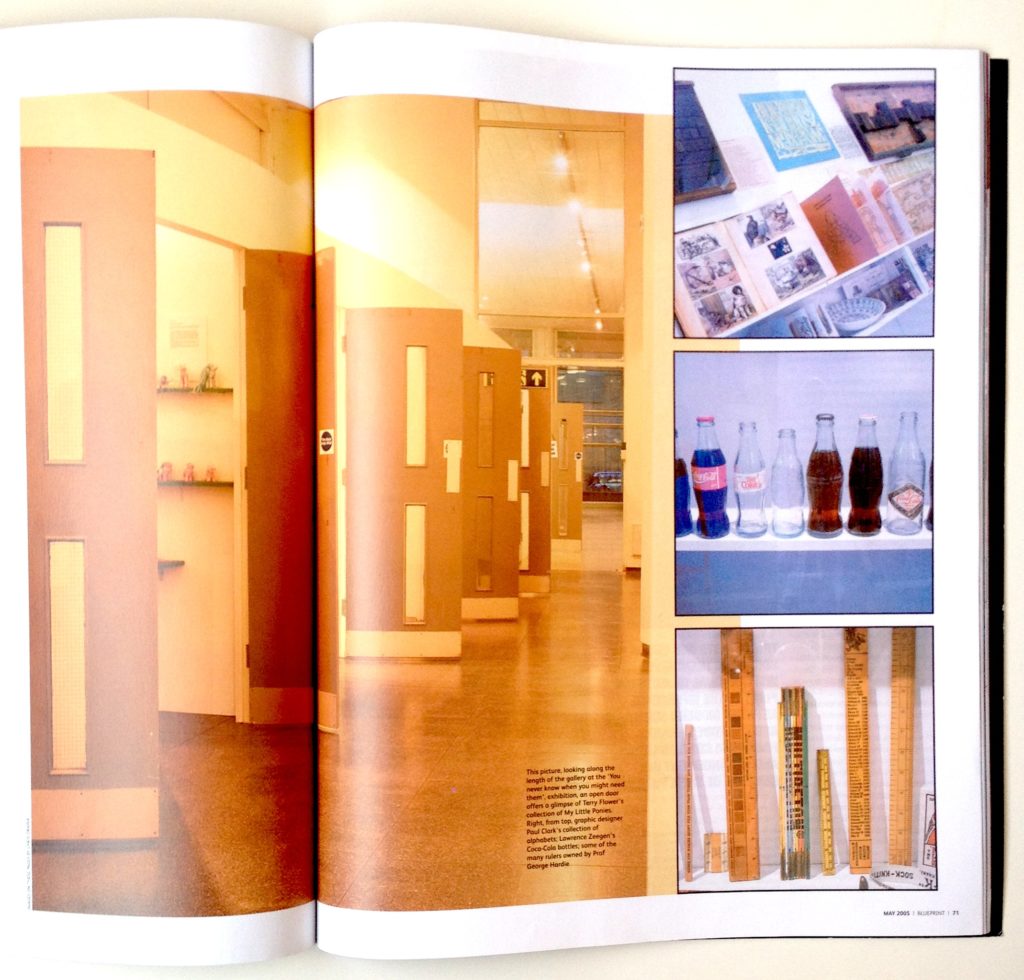
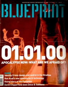
Spread from ‘Blueprint’ showing University of Brighton Gallery and exhibition design featuring salvaged fire doors

Spread from ‘Blueprint’ showing the University Gallery in Brighton and the exhibition design featuring salvaged fire doors

I was reminded of this article when visiting another exhibition, George Hardie …Fifty Odd Years, also at the University Gallery at University of Brighton. (Look out for a review of that exhibition, soon).

Back in 2005, Professor Hardie contributed his collection of rulers to You never know when you might need them, and they feature in the opening spread of the Blueprint article about the show, see above. At the time, my husband, Gregg Virostek, was an Interior Architecture student and worked on the exhibition build, while I was beginning to explore an obsession with collecting. That interest has developed into a research topic, as evidenced by this blog. So, as this article has yet to be digitised and made available online by the originally publisher it, here it is for reference.
Continue reading

signature

First Visit; Vitra Schaudepot

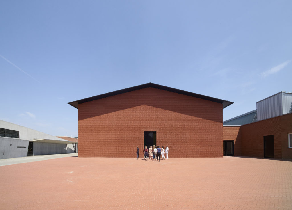
Exterior of the Vitra Schaudepot, by Herzog & de Meuron. Photo © Vitra Design Museum, Julien Lanoo

Exterior of the Vitra Schaudepot, by Herzog & de Meuron. Photo © Vitra Design Museum, Julien Lanoo

Vitra Schaudepot
Vitra Design Museum
Charles-Eames-Str. 2, Weil am Rhein, Germany
Visited, 31 May 2016

I used to go on press trips so regularly that I thought I didn’t need holidays. Travelling on planes and trains across Europe, America and further afield I visited designers, studios, factories and museums. Having swopped my peripatetic lifestyle for a more sedentary teaching gig, this press trip came out of the blue. I previously visited Vitra for a MUSCON conference (read about it, here) and marvelled at the Vitra Haus (read, here), so was aware of the upcoming addition to the extraordinary campus and keen to see the Schaudepot (Open Storage), a relatively new development in museum practice. A return visit wasn’t on my agenda though, so when this invitation popped into my inbox along with a commission to review the Vitra Collection’s new home, I was up for it! My article appeared in Blueprint magazine (no.347, p.36) and is available online at Design/Curial, here. This post adds details from the press conference and a conversation with Curator Janna Lipsky.
Continue reading

signature

From the Archive; Sagmeister’s first sabbatical

IMG_8258

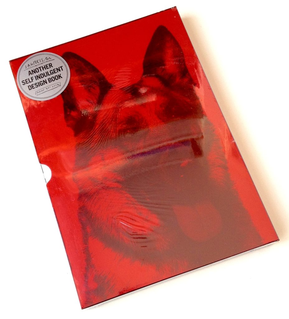
On the occasion of an earlier blog post about The Happy Film, which began as one of Stefan Sagmeister’s sabbatical projects, here’s an article I wrote when his first book, Sagmeister made you look was about to be published by Booth-Clibborn Editions, as that too was the product of a ‘year without clients’, his first in fact.

I also worked with Edward Booth-Clibborn but wasn’t involved in the editorial or production process of Sagmeister’s book, so felt that it was OK to write about it. This article appeared in the esteemed German magazine, Form, subtitled ‘The European Design Magazine’, and is presented in German and English. Scans of the article are available through the magazine’s online archive, here (access requires registration).

Reading this article reveals that even then Sagmeister would seek collaborators with complementary skills, in this case, design writer Peter Hall (for The Happy Film, he worked with co-directors Hillman Curtis and Ben Nabors). But he was wrong about one thing; that once design work is published, it’s off the agenda. A star turn like Sagmeister is always going to be known for that poster (info for AIGA Miami scratched into his skin) and that CD cover (Lou Reed’s face overwritten with lyrics). If he doesn’t show then at a lecture or talk about them in an article it’s like your favourite band refusing to play their signature tune on stage; Sagmeister’s greatest hits keep his fans happy! This article also points to the performative aspect of graphic design; not only the lure of being ‘guest speaker’ at an international conference doing your best ‘show and tell’, but also with regard to selling ideas in client presentations…a very useful skill.
Continue reading

signature

The Happy Film; graphic design on screen

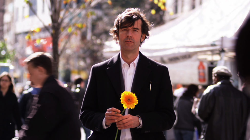
Stefan Sagmeister in ‘The Happy Film’, seeking discomfort on the streets of New York. Photograph: Ben Wolf.

Stefan Sagmeister in ‘The Happy Film’, seeking discomfort on the streets of New York. Photograph: Ben Wolf.

The Happy Film
Duke of York’s Picturehouse
Preston Road, Brighton, East Sussex
14 June 2017 at 6pm

I’m not a fan of solo cinema visits but even with my partner-in-crime currently ‘away’, I had to see this just released, much discussed film at this special screening. Right on the money, the power-couple hosts of Glug Brighton, Carl Rush of creative agency Crush, and Helen, the renowned Illustration agent and founder of Agency Rush, invited graphic-design hero (and I don’t use the term lightly) Stefan Sagmeister to show his seven-years in the making documentary, The Happy Film. Despite the lure of a glorious summer evening, Brighton’s historic Duke of York’s cinema was packed with the city’s creative community including a good number of Graphic Design and Illustration students from University of Brighton, come to see the legend in action, for after a film of thrills and spills Sagmeister stepped up for the Q&A.
Continue reading

signature

From the Archive; remembering Lucienne Day

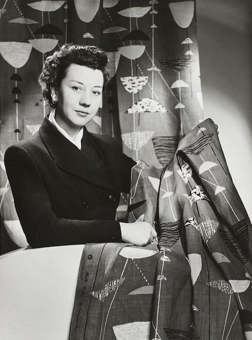
Lucienne Day in New York with Calyx (1951), 1952: The Robin and Lucienne Day Foundation and archive. Photographer: Studio Briggs.

Lucienne Day in New York with Calyx (1951), 1952: The Robin and Lucienne Day Foundation and archive. Photographer: Studio Briggs.

The current issue of Blueprint celebrates the life and work of Lucienne Day in the centenary year of her birth, with articles by and about her. The back pages of the magazine collect previous articles about the renowned designer, including a review I wrote about an exhibition at Manchester’s Whitworth Art Gallery, long before the stunning renovation and addition (mentioned in a previous post about Manchester, here); when I visited the Gallery presented a perfect example of late Victorian institutional architecture, a fine addition to the “Red Brick” University of Manchester. Initially, the thought of re-reading an article written over 24 years ago was a bit daunting, but then it helped me recall my first time in Manchester, an extraordinary day trip, meeting Lucienne Day and Jennifer Harris (the curator and author of the exhibition catalogue), and the privilege of walking the exhibition in their company. A new exhibition at the Gallery, Lucienne Day – A sense of growth, from 14 April to 11 June 2017, examines how plant forms inspired many of Lucienne Day’s iconic patterns. I hope to get back up north to visit it…

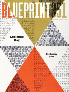
Lucienne Day celebrated in Blueprint, no. 351.

Lucienne Day celebrated in Blueprint, no. 351.

“British design’s first celebrity”
by Liz Farrelly
Blueprint, June 1993, pp.36-38
Exhibition review of Lucienne Day: a career in design
Whitworth Art Gallery, Oxford Road, Manchester
23 April to 26 June 1993
Visited 22 April 1993

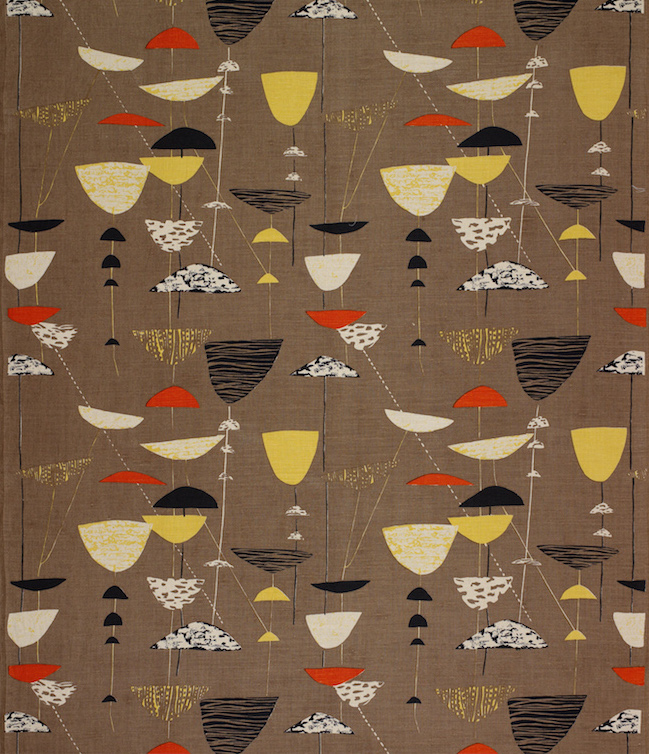
Calyx screen-printed furnishing fabric, Lucienne Day, Heal’s Wholesale &; Export, 1951. The Robin and Lucienne Day Foundation and archive.

Calyx screen-printed furnishing fabric, Lucienne Day, Heal’s Wholesale & Export, 1951: The Robin and Lucienne Day Foundation and archive.

After a long and distinguished carer, Lucienne Day is being honoured with a retrospective exhibition which, appropriately enough for a textile designer, is in Manchester. Over 80 per cent of her furnishing fabrics are here, supplemented by examples of designs for wallpaper and tableware, showing a great virtuosity of image-making and variety of aesthetics. And while the exhibition sheds light on an individual’s career, it acts just as effectively as a review of changing styles in domestic taste, albeit at the upper end of the market.
Continue reading

signature

First Visit; IKEA Museum

Gallery

This gallery contains 36 photos.

IKEA Museum IKEAgatan, 5, 343.36 Älmhult, Sweden ikeamuseum.com Visited, 9 June 2016 Invited to the Press Preview of the new IKEA Museum, I travelled to the company town of Älmhult in southern Sweden. Later I wrote an article about the … Continue reading

From the Archive; listening to Kalle Lasn

2017-02-06 15.32.43

The outpourings of unease, dread and fear that recent political events have caused reminds me of an earlier era, 1999 (although back then we were asked to party too). The run up to the Millennium witnessed the kind of end-of-days headbanging practiced by religious zealots since the Middle Ages, spiced with a dose of fin de siècle decadence and topped with the techno-paranoia of the Y2K Bug and the predicted meltdown of communications, power and defence systems worldwide. With the Internet still in its infancy and social media merely a glint in its circuitry, hysteria was polarised. Mainstream media presented experts and button-holed politicians while conspiratorial survivalists used grass-roots networks to challenge official messages meant to placate the public.

One media practitioner commanding attention was Kalle Lasn not because he peddled doom-laden prophecies, although he was angry, but because the magazine he had launched a decade before seemed to (now) perfectly fit the zeitgeist. Adbusters gave a message of resistance and not from a place of despair. It advocated for urgent action using the incendiary power of the image, documentary and manipulated, while retaining a stance of positivity, and the look and feel of the magazine – colourful, glossy, eye-catching – helped promoted that can-do, future-focused message.
Continue reading

signature

From the Archive; Mysterious Absence at the Cutting Edge

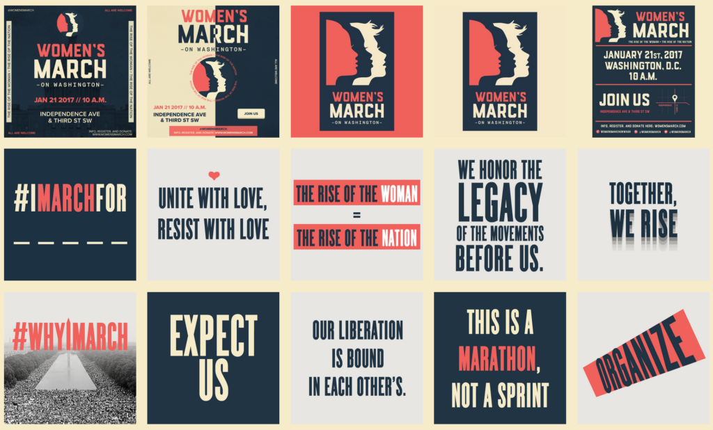
Screen Shot from Women’s March on Washington webpage of downloadable graphics.

Screen Shot from Women’s March on Washington webpage of downloadable graphics.

Last weekend women the world over took to the streets to protest, making themselves visible and their voices heard, as they waved an array of protest signs. Hand-made, humorous, strident and strong, the signs were seen in Instagram feeds, shared via Twitter, broadcast on television and pictured in newspapers. The importance of graphic design to protest cannot be over stressed; multiples of engaging graphics will communicate and amplify your message. To that end the Women’s March on Washington website contains a page of downloadable graphics offering slogans and images to be used for free as posters, placards, t-shirt graphics, wherever and however.

That vision of graphic protest was anticipated in a recent a seminar text read with Level 4 Graphic Design and Illustration students at University of Brighton. Teal Trigg’s chapter on “Graphic Design” in Feminist Visual Culture (edited by Fiona Carson and Claire Pajaczkowska) contained a quote from Eye magazine about the activist group she co-founded: “They [WD+RU] aim to talk to women in all walks of life, but the first step is to initiate a debate that will politicise designers and prompt them to address gender issues through their work’ (p.157).
Continue reading

signature