Digital histories in Northumbria; a workshop

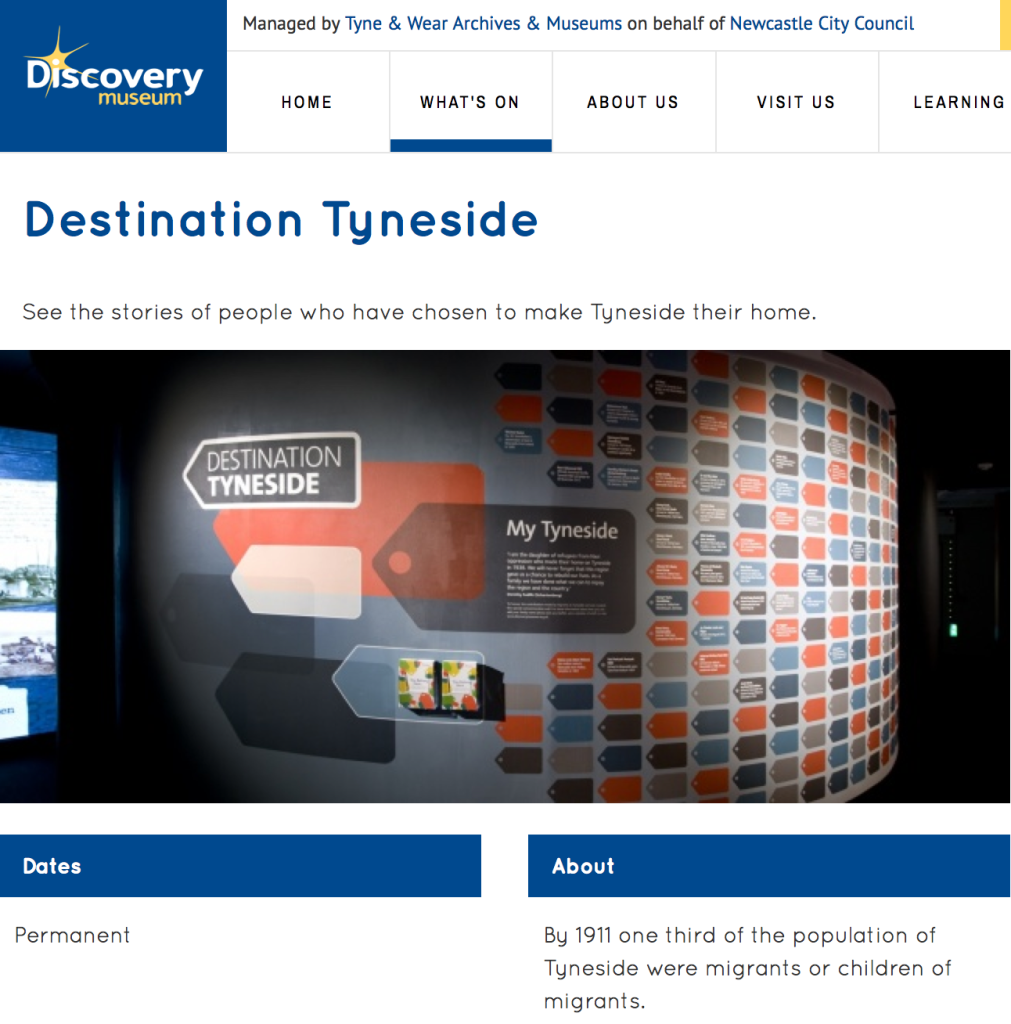
Screen Shot from The Discovery Museum website showing a permanent gallery where workshop delegates played on interactive exhibits.

Screen Shot from The Discovery Museum website showing a permanent gallery where workshop delegates played on interactive exhibits.

Digital Histories: Advanced Skills for Historians
Northumbria University Newcastle and Tyne and Wear Archives and Museums
24-25 April 2014

Flying to Newcastle for a two-day workshop may seem an extravagant use of research time but this AHRC-funded workshop (organised by Laura Hutchinson and André Keil of University of Northumbria) promised to investigate issues around the digital humanities, to do with archives, text, image, data and metadata, and examine a number of innovative projects into the bargain. Speakers, including a Medieval scholar, a social media maven, community organisers and university- and museum-based IT consultants, were to discuss the implications of: putting archives online; striving for web- and museum-based interactivity; and crowd-sourcing projects that link institutions with volunteers.

The event spotlit concerns around digital and online cultural activity that will now inform my museum-based research. Delegates voiced concerns about unfamiliar material. Text-based historians, comfortable working with online resources be they newspaper archives or scanned records, admitted to lacking confidence when it came to image-based documentation. But there also seems to be a (conspicuous) lack of art- and design-led projects within this digital arena, perhaps because historians with those prefixes prefer to interact with objects and images, offline.
Continue reading

signature

Tracing the temporary; clues to past exhibitions

I’m apologising upfront for ranging around a few ideas here. I wanted to avoid using footnotes but not lose any tangents either; after all this is a blog post which needs to be a little more condensed than my thesis (!) but at the same time it is discursive. This is a place for me to try out ideas.

While my PhD is not a history or geography of design museums a taxonomy is helpful in order to demarcate the field, the still novel “museum type” of “design museum”. The exhibition catalogue, Design Museums of the World: Invited by Die Neue Sammlung Munich (published by Birkhäuser in 2004) accompanied the show, Design Museums of the World, staged at Neues Museum Staatliches Museum für Kunst und Design in Nürnberg (17 September to 23 November 2003). A rich source of information and opinion, this surveys the field at the start of the 21st-century, and I investigate it at length in my literature review.

If I could travel the world visiting exhibitions I would, but as I don’t…I didn’t see the exhibition and I would guess that few of the MUSCON Europe delegates did either, as when a big box of the exhibition’s catalogues made an appearance at Vitra Design Museum (summer 2014), coinciding with Angelika Nollert’s keynote speech, it was eagerly consumed. Angelika had been Director at the Neues Museum Staatliches Museum für Kunst und Design in Nürnberg and is now Director at sister institution Die Neue Sammlung München; the collaboration between the institutions, which produced the exhibition and publication, is mirrored by Angelika’s career.

As I’m interested in how a temporary show lives on after its “time is up”, this catalogue proves a point – the usefulness of investing in print on paper. Originally produced for the debut exhibition at Nürnberg’s new art and design museum, the catalogue is a unique resource for comparing and contrasting a number of design museums, 29 in all, at a particular moment in history. Worldwide there are about twice that number now, and while many of the institutions listed in the catalogue evolved from museums of decorative arts, or were art museums that extended their remit, most of the newly opened institutions are “purely” design focused. Along with the newbies, some of the world’s most established museums of design are reinventing themselves; this is a time of flux.
Continue reading

signature

Voting for Design; Designs of the Year

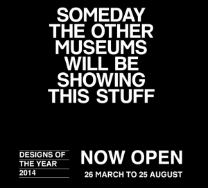
For its annual Designs of the Year award, London’s Design Museum employs social media, an email campaign and a micro-site to engage with its audience and entice it to judge the exhibits. It also suggests that talent-spotting curation offers a glimpse into the future.

For its annual Designs of the Year award, London’s Design Museum employs social media, an email campaign and a micro-site to engage with its audience and entice it to judge the exhibits. It also suggests that talent-spotting curation offers a glimpse into the future.

Designs of the Year 2014
Design Museum
Shad Thames, London SE1
26 March to 25 August 2014
Nominees’ Party
25 March 2014

An exercise in engagement, a sure-fire media event, and a comprehensive round-up of the best design launched in a year, the Design Museum’s Designs of the Year award and exhibition is now in its seventh year, showcasing design across a range of categories; Architecture, Digital, Fashion, Furniture, Graphic, Product and Transport. Designs of the Year was instigated by the current Director, Deyan Sudjic, to replace the “Designer of the Year” award, when a winner was picked from just four nominated individuals whose careers and recent achievements were being judged rather than any particular outcomes. Increasingly, that competition attracted criticism for pitting star-designers against rank outsiders, and for some controversial decisions. Opening up the nomination and judging process to a wider panel, Designs of the Year provides the public with an annual, international round-up of headline-grabbing ideas, solutions and products.

The selection process for this new format has also generated a worldwide network of judges and nominatee from across the design industry — the museum’s extended “family” — who are now known to curators, with both parties mutually benefitting from the association. For the past three years, I’ve been asked to nominate, and each year had a couple of my choices make it through to the “exhibition” round. Proof of how much designers and their clients appreciate this opportunity to exhibit at the Design Museum may be judged by the massive amount of social media and personal thanks generated on the “shortlist” day, when the selection is announced; and by the packed, riotous party on the eve of opening. I’m writing this after attending the nominees party, so excuse the lack of focus on particular exhibits; this show demands repeat viewing as there’s so much to see.
Continue reading

signature

From the Archive; Nostalgic for Ampersand

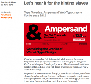
Good conferences are a joy to attend, and Ampersand proved to be a pleasant surprise. Last June, at short notice, Eye requested that I cover it. I wasn’t sure what to expect, as I’m neither a web nor graphic designer (core audience), but I got a lot out of it, and more importantly, so did that expectant crowd. This year’s conference is on 28 June 2013; but as there’s nothing wrong with a little nostalgia, so here’s my review from last year.

Ampersand Conference Eye Blog

Ampersand Web Typography Conference, Brighton
Organised by Clearleft and compèred by production director, Richard Rutter
Attended 15 June 2012

Monday 2:36pm, 25 June 2012
“Let’s hear it for the hinting slaves”
by Liz Farrelly
Originally posted on Eye Blog

When keynote speaker Phil Baines asked the full house at the second Ampersand Web Typography Conference, “Who’s a graphic designer? Who’s a web designer / developer?”, a show of hands revealed that three-quarters of the audience were web-based practitioners (up on last year). Ampersand is a two-way street though, a place for print-based, art-school-educated graphic and type designers to discover the special requirements of designing for the web, and for websters to learn about type, how to use it, and what the type foundries are doing to meet their needs.

Ampersand delivered on all fronts. If at times it felt like Type 101 or Web 101 – depending on which camp you were in – a bit of back to basics never hurt anyone. And, as Baines pointed out, “designers need to talk to one another”, so it follows that both camps should propagate a mutual understanding of parlance.
Continue reading

signature