From the Archive; design Boom

James Jennifer Georgina, 2010, by Jennifer Butler, designed by Irma Boom

James Jennifer Georgina, 2010, by Jennifer Butler, designed by Irma Boom

Last week I wrote and delivered a lecture about Feminism to first-year Graphic Design and Illustration students at the University of Brighton. In addition to the feminist art history strategy of re-evaluating under-appreciated women artists, I’d like to stress the importance of presenting female role models to students, more so now that the gender balance in the classroom is tipping in favour of female students while the teaching is mainly done by men. Of course this is an old story; I wrote about the invisibility of women in design in 1995, first published in Eye and re-posted here. Kudos goes to the women’s advocacy groups within design academia and the profession, including WD+RU and Graphics UK Women, who are curating, teaching and writing about women in design. So, with the aim of increasing visibility, as the last few posts have been interviews with the usual suspects, here is an interview with one of the world’s most renowned designers, Irma Boom, who has consistently advocated experimentation with materials and techniques (which is good advice for all), while self-directing her career and occasionally stepping into the limelight to promote her work.
Continue reading

signature

The Happy Film; graphic design on screen

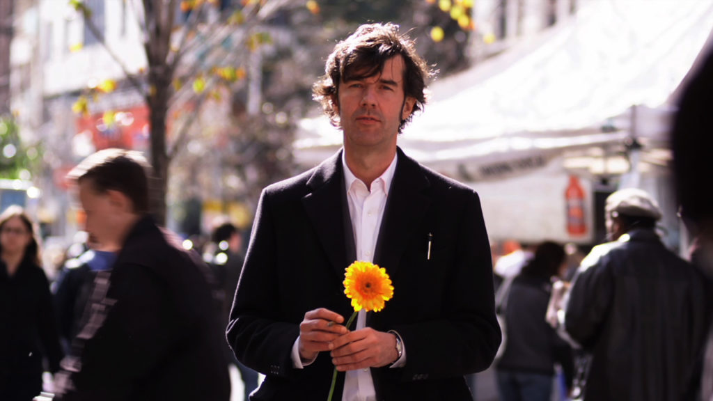
Stefan Sagmeister in ‘The Happy Film’, seeking discomfort on the streets of New York. Photograph: Ben Wolf.

Stefan Sagmeister in ‘The Happy Film’, seeking discomfort on the streets of New York. Photograph: Ben Wolf.

The Happy Film
Duke of York’s Picturehouse
Preston Road, Brighton, East Sussex
14 June 2017 at 6pm

I’m not a fan of solo cinema visits but even with my partner-in-crime currently ‘away’, I had to see this just released, much discussed film at this special screening. Right on the money, the power-couple hosts of Glug Brighton, Carl Rush of creative agency Crush, and Helen, the renowned Illustration agent and founder of Agency Rush, invited graphic-design hero (and I don’t use the term lightly) Stefan Sagmeister to show his seven-years in the making documentary, The Happy Film. Despite the lure of a glorious summer evening, Brighton’s historic Duke of York’s cinema was packed with the city’s creative community including a good number of Graphic Design and Illustration students from University of Brighton, come to see the legend in action, for after a film of thrills and spills Sagmeister stepped up for the Q&A.
Continue reading

signature

Guest blogger; revisiting Pick Me Up (version one)

Pick Me Up: Contemporary Graphic Arts Fair
Somerset House, London WC1
24 April to 5 May 2014

Five years in and Pick Me Up is now a headline event in London’s creative calendar; undoubtedly it’s evolved and mutated, and much discussion has been generated about how it reflects and influences the graphic arts in London, the UK and beyond. But more of that later, when I visit this year’s PMU. Also, watch this space for an archival re-post of a PMU debate that I chaired in 2012, here.

Meanwhile, here’s guest blogger John O’Reilly, editor of Varoom, the magazine of the Association of Illustrators, with a long-form review of the very first Pick Me Up, back in 2010. I commissioned this for étapes magazine; it was published in “issue zero”, an experimental, white-cover experiment intended to rehearse the redesign/relaunch in the form of a quarterly “bookazine”. John explored the widest implications of PMU, as an expression of zeitgeist and as a reinvention of the exhibition/artfair.

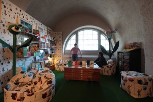
Nobrow’s nook, Pick Me Up, 2010

Nobrow’s nook, Pick Me Up, 2010

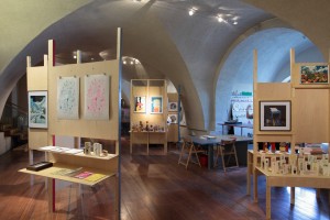
Peepshow Collective’s DIY installation, Pick Me Up, 2010

Peepshow Collective’s DIY installation, Pick Me Up, 2010

Photography: © Sylvain Deleu
Courtesy: Somerset House

Review of Pick Me Up 2010 by John O’Reilly
23 April to 3 May 2010

Two exhibitions bookend transition moments in recent British visual culture. Back in the late 1980s a young art student took over an empty building in London’s docklands and put on an exhibition that would shape the Art World over the next two decades. Born in a recession, Damien Hirst’s show, “Freeze”, introduced the general public to a type of brash, spectacular art, and over time these Young British Artists (YBAs) combined the two-fingered, anti-establishment sensibility of their roots with a growing awareness of big-budget, Art World thrills. It evolved into brash, boom-time art, and whereas artist Robert Patterson described the YBA tag as “a kind of licence to show tits and arse more than anything”, with this second exhibition, the invitation implied in the informality of “Pick Me Up”, of a cultural cheap date, is ideologically, temperamentally and aesthetically very different.
Continue reading

signature

Voting for Design; Designs of the Year

For its annual Designs of the Year award, London’s Design Museum employs social media, an email campaign and a micro-site to engage with its audience and entice it to judge the exhibits. It also suggests that talent-spotting curation offers a glimpse into the future.

For its annual Designs of the Year award, London’s Design Museum employs social media, an email campaign and a micro-site to engage with its audience and entice it to judge the exhibits. It also suggests that talent-spotting curation offers a glimpse into the future.

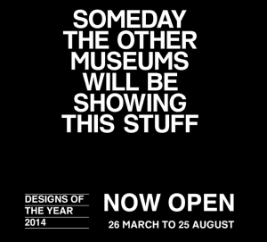
Designs of the Year 2014
Design Museum
Shad Thames, London SE1
26 March to 25 August 2014
Nominees’ Party
25 March 2014

An exercise in engagement, a sure-fire media event, and a comprehensive round-up of the best design launched in a year, the Design Museum’s Designs of the Year award and exhibition is now in its seventh year, showcasing design across a range of categories; Architecture, Digital, Fashion, Furniture, Graphic, Product and Transport. Designs of the Year was instigated by the current Director, Deyan Sudjic, to replace the “Designer of the Year” award, when a winner was picked from just four nominated individuals whose careers and recent achievements were being judged rather than any particular outcomes. Increasingly, that competition attracted criticism for pitting star-designers against rank outsiders, and for some controversial decisions. Opening up the nomination and judging process to a wider panel, Designs of the Year provides the public with an annual, international round-up of headline-grabbing ideas, solutions and products.

The selection process for this new format has also generated a worldwide network of judges and nominatee from across the design industry — the museum’s extended “family” — who are now known to curators, with both parties mutually benefitting from the association. For the past three years, I’ve been asked to nominate, and each year had a couple of my choices make it through to the “exhibition” round. Proof of how much designers and their clients appreciate this opportunity to exhibit at the Design Museum may be judged by the massive amount of social media and personal thanks generated on the “shortlist” day, when the selection is announced; and by the packed, riotous party on the eve of opening. I’m writing this after attending the nominees party, so excuse the lack of focus on particular exhibits; this show demands repeat viewing as there’s so much to see.
Continue reading

signature

Memory Interrupted

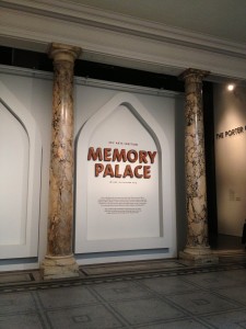
Entrance to “Memory Palace”, Porter Gallery, Victoria and Albert Museum.

Entrance to “Memory Palace”, Porter Gallery, Victoria and Albert Museum.

Sky Arts Ignition: Memory Palace
Victoria and Albert Museum
Cromwell Road, London SW7
18 June to 20 October 2013
Visited 26 June and 15 August 2013

The V&A’s Porter Gallery is, for me, the most engaging space within this behemoth of an institution, site of contemporary design exhibitions that continue to redefine the genre. Adjacent to the main entrance and information desk, it’s perfectly placed for quick-fix visits and the right size to accommodate an exhibition that is immersive but not overwhelming. The icing on the cake would be if all the groundbreaking temporary shows here could be free, so that more visitors might experience the V&A’s cutting edge of curatorship and exhibition design, without a second thought.

Visiting the current show, Memory Palace, the gallery was quiet, not empty, but not teaming like some rooms during the Bowie-Daze and while school was out. The visitors were a diverse bunch though; old, young, locals, tourists, and all very engaged. I asked a guard who confirmed; ”yes, people are reading”.

Disclaimer: If you haven’t seen the exhibition, go see it and don’t bother reading on, as these observations won’t make much sense until you’ve experienced the actual event.
Continue reading

signature

From the Archive; Nostalgic for Ampersand

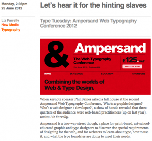
Good conferences are a joy to attend, and Ampersand proved to be a pleasant surprise. Last June, at short notice, Eye requested that I cover it. I wasn’t sure what to expect, as I’m neither a web nor graphic designer (core audience), but I got a lot out of it, and more importantly, so did that expectant crowd. This year’s conference is on 28 June 2013; but as there’s nothing wrong with a little nostalgia, so here’s my review from last year.

Ampersand Conference Eye Blog

Ampersand Web Typography Conference, Brighton
Organised by Clearleft and compèred by production director, Richard Rutter
Attended 15 June 2012

Monday 2:36pm, 25 June 2012
“Let’s hear it for the hinting slaves”
by Liz Farrelly
Originally posted on Eye Blog

When keynote speaker Phil Baines asked the full house at the second Ampersand Web Typography Conference, “Who’s a graphic designer? Who’s a web designer / developer?”, a show of hands revealed that three-quarters of the audience were web-based practitioners (up on last year). Ampersand is a two-way street though, a place for print-based, art-school-educated graphic and type designers to discover the special requirements of designing for the web, and for websters to learn about type, how to use it, and what the type foundries are doing to meet their needs.

Ampersand delivered on all fronts. If at times it felt like Type 101 or Web 101 – depending on which camp you were in – a bit of back to basics never hurt anyone. And, as Baines pointed out, “designers need to talk to one another”, so it follows that both camps should propagate a mutual understanding of parlance.
Continue reading

signature