From the Archive; Malcolm Garrett interview

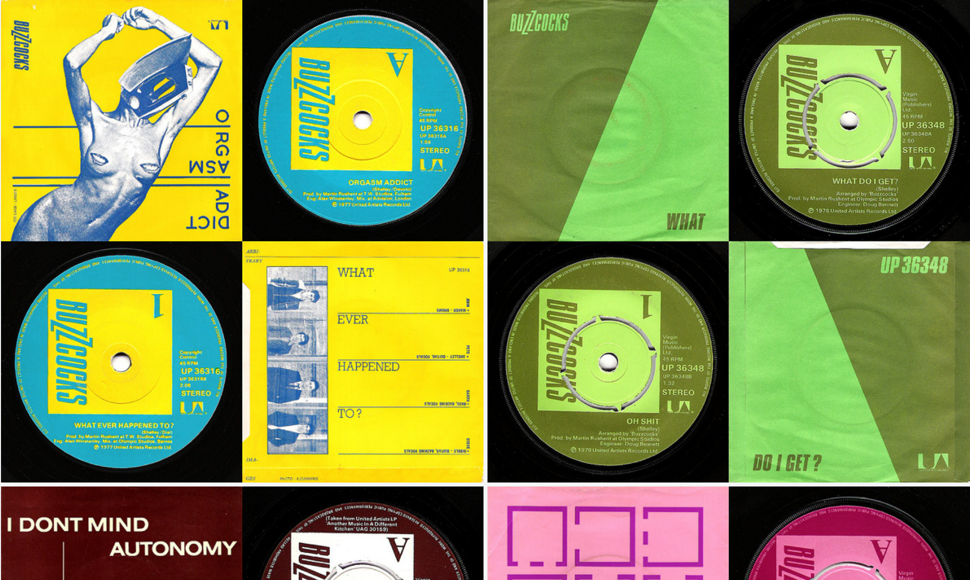
Screen Shot from Malcolm Garrett's website, showing Buzzcocks graphics, photographed by Nick Harling

Screen Shot from Malcolm Garrett’s website, showing Buzzcocks graphics, photographed by Nick Harling

I love collections, and exhibitions of collections, especially when they inspire designers and their work, so I would very much like to make the journey to Manchester (which I wrote about, here) to see Collecting Malcolm Garrett, part of the design festival, Design Manchester 17. In celebration of Malcolm Garrett and his work in the music industry (which he spoke about at Pick Me Up, reviewed here), I’m posting another previously unpublished interview from the British Council exhibition, Sound Design. Malcolm mentions his old school friends, Peter Saville (read that interview here) and Keith Breeden, who I also interviewed, so watch out for that interview too.

Malcolm Garrett, interviewed by Liz Farrelly on 12/7/2000.

Liz Farrelly: Where did it all start?

Malcolm Garrett: The Buzzocks was 23 years ago. It came about because I wanted to do a sleeve that wasn’t just a piece of cardboard and I was always interested in corporate graphics, as opposed to corporations, and subverting corporate graphics and systems graphics too, because a record sleeve is fundamentally information. So I was looking at it from an informational standpoint, as opposed to an art gallery standpoint. We were selling something so much more ethereal than say, banking services, so there was a frisson there. And because, with the Buzzcocks, some of their songs were looking at the nature of society and relationships in quite a detached way, it seemed appropriate to misappropriate some form of informational graphics.
Continue reading

signature

First Visit; IKEA Museum

Gallery

This gallery contains 36 photos.

IKEA Museum IKEAgatan, 5, 343.36 Älmhult, Sweden ikeamuseum.com Visited, 9 June 2016 Invited to the Press Preview of the new IKEA Museum, I travelled to the company town of Älmhult in southern Sweden. Later I wrote an article about the … Continue reading

From the Archive; Mysterious Absence at the Cutting Edge

Screen Shot from Women’s March on Washington webpage of downloadable graphics.

Screen Shot from Women’s March on Washington webpage of downloadable graphics.

Last weekend women the world over took to the streets to protest, making themselves visible and their voices heard, as they waved an array of protest signs. Hand-made, humorous, strident and strong, the signs were seen in Instagram feeds, shared via Twitter, broadcast on television and pictured in newspapers. The importance of graphic design to protest cannot be over stressed; multiples of engaging graphics will communicate and amplify your message. To that end the Women’s March on Washington website contains a page of downloadable graphics offering slogans and images to be used for free as posters, placards, t-shirt graphics, wherever and however.

That vision of graphic protest was anticipated in a recent a seminar text read with Level 4 Graphic Design and Illustration students at University of Brighton. Teal Trigg’s chapter on “Graphic Design” in Feminist Visual Culture (edited by Fiona Carson and Claire Pajaczkowska) contained a quote from Eye magazine about the activist group she co-founded: “They [WD+RU] aim to talk to women in all walks of life, but the first step is to initiate a debate that will politicise designers and prompt them to address gender issues through their work’ (p.157).
Continue reading

signature

From the Archive (and now); Destroy, punk and DIY

So an email arrived inviting me to the launch of Punk.London at Oxford Street’s 100 Club, and I have to admit it didn’t totally intrigue me. Instead in gushed cloudy memories of a dark, sweaty cellar and an uncomfortable din, which I must have endured (it feels like) a hundred times over a couple of decades. But a closer look at the invite revealed this to be an occasion for nostalgia, a celebration of a 40-year anniversary marking London’s punk moment and the start of a movement, a subculture in fact, the long-tail of which has affected both attire and attitude.

Screen Shot from Punk.London website, designed by Brody Associates, inviting D-I-Y participation in a city-wide cultural event

Screen Shot from Punk.London website, designed by Brody Associates, inviting D-I-Y participation in a city-wide cultural event

“Subversive Culture” is the strapline (pardon the bondage-tinged pun), which it is claimed has fuelled creativity (now the Creative Industries) ever since. Over the coming year a host of venues will stage events big and small, backed by the Greater London Authority (GLA); shouting about London’s past punk credentials must have tourist-attracting potential. With an identity and online hub branded by Neville Brody (still demonstrating punk attitude by being “notoriously abrasive”, according to Digital Arts), for me the most innovative element is an prompt to organise your own event; tagged “D.I.Y.” the page offers links to branding and fundraising advice, via the Heritage Lottery Fund (HLF).

Regardless of designated anniversaries punk is perennial, and it doesn’t need much of an excuse to hit the headlines. In 1998 I reviewed an exhibition, Destroy: Punk Graphic Design in Britain, and because it isn’t available on the magazine’s website I’m re-posting it, see below. Yes it was cheeky of me to declare punk to be the only “memorable cultural event in the 1970s”, but that’s a clue to my age. I may have been “witness” to the “heyday of punk” but only just; the article is unapologetically London-centric, too, hardly surprising as I was still at school and London was home. What isn’t mentioned is that I was a lender to the show too, having amassed a substantial collection of vinyl due to a fascination with indie record shops. I sold most of the best bits (the vultures were already circling at the Private View) as I became nomadic, leaving London in April 1998, and had neither the means (no turntable) nor inclination (changing musical tastes) to listen again.
Continue reading

signature

VitraHaus, displaying design for sale; implications for design museums

VitraHaus
Vitra Campus
Ray-Eames-Str. 1, Weil Am Rhein, Germany
www.vitra.com
Visited, 16 to 18 October 2014

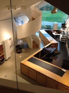
In relation to design objects and the museum, VitraHaus, the close neighbour of VDM, is worth pondering. Sited on the Vitra campus, it opened in 2010. As the flagship store for the Vitra Home Collection it showcases the furniture manufacturer’s domestic ranges (distinct from the contract products that are specified by architects for public and office spaces). On Vitra’s vast website, the page for VitraHaus invites us to “find inspiration for your home, explore your taste in design and try out, order and purchase furniture and design objects”.

IMG_1868IMG_1813
Continue reading

signature