From the Archive; Vaughan Oliver interview

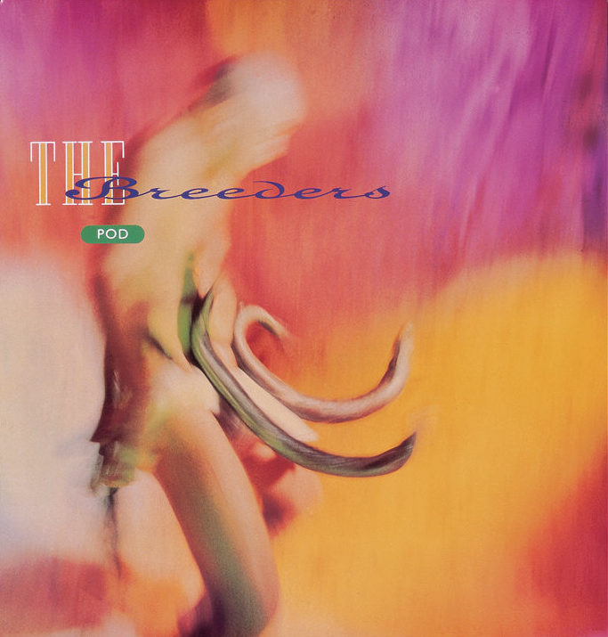
Pod by The Breeders, 1990, released by 4AD, designed by V23, photography by Kevin Westenberg

Pod by The Breeders, 1990, released by 4AD, designed by v23, photography by Kevin Westenberg

Here’s another interview from the unpublished series done for the Sound Design exhibition, which I curated for the British Council back in 2000. Vaughan Oliver’s work, as the studio known both as v23 and 23 Envelope, has been described as ‘graphic design for designers’; and while some people find it is difficult to decipher, it treats the initiated to a mix of undiluted wildness and superb craft. Indeed, it continues to win new fans, as Unit Edition’s successful Kickstarter campaign suggests. The aim is to publish a lavish ‘archive’ of Vaughan’s work, drawn from the extensive collection at the University of the Creative Arts, Epsom, where Vaughan is Visiting Professor of Graphic Design. Over the years, Vaughan has been a high-profile member of the graphic design community, participating in events and interviews, while his work has been collected by the Victoria and Albert Museum. This won’t be the first book about Vaughan either; Rick Poynor’s Vaughan Oliver: Visceral Pleasures was published by Booth-Clibborn Editions (who I worked with at the time), and designed by Vaughan himself, also in 2000.

Vaughan Oliver, interviewed by Liz Farrelly on 18/7/2000.

Liz Farrelly: How did your connection with 4AD start?

Vaughan Oliver: My interest in music graphics goes back to being a kid and the idea of combining my twin passions, music and visual arts.
Continue reading

signature

From the Archive; Peter Saville interview

Screen Shot 2017-09-26 at 16.37.26

The London Design Festival is the capital’s most prestigious design event, taking over the city for much of September each year. Back in 2013, Peter Saville won the London Design Festival Medal; I interviewed him for Blueprint and the article is available online via DesignCurial. At the time I asked a number of creatives about their favourite Saville works, and one guest blogger, Paul West of Form, mentioned True Faith by New Order, with photography by Trevor Key. Now, a display of work by that legendary photographer, a regular collaborator with Saville, is on show as part of Hull 2017, UK City of Culture. Trevor Key’s Top 40, features his iconic photographic images for some of the twentieth century’s most famous record sleeves. I’m using this opportunity to post another unpublished interview with a contributor to Sound Design, this time Peter Saville, as a number of their joint efforts featured in this exhibition, which the British Council toured across Asia and Australia in the early years of the new Millennium. These edited interviews come from long phone conversations or studio visits. I tried to keep the interviewees focused on the topic of designing for the music industry, and rather than bombard them with penetrating questions, I preferred to let the designers do the talking and reminisce anecdotal stories about the finer details of working with musicians and labels. You can find the Aubrey Powell interview, here, and there will be more in this series. As I’ve said before, I’m reluctant to post copyrighted images to illustration the interviews, but this Japanese website offering a complete discography of Peter Saville’s record sleeve designs is all you’ll need.

Peter Saville, interviewed by Liz Farrelly on 1/8/2000.

Liz Farrelly: Tell me about your involvement with Factory Records.

Peter Saville: Going right back to the beginning, I was at school with Malcolm Garrett, and at that point our horizons stretched no further than a Hawkwind, Velvet Underground or Roxy Music cover. Then Malcolm went to Reading University, and courtesy of the library there, the history of twentieth-century design became known to us, via his reading list, which included design theory that we at Manchester Art College didn’t get. I started college in 1974 and graduated in 1978. Malcolm did a year at Reading University while I did a Foundation Course and I encouraged Malcolm to do his next three years at Manchester.
Continue reading

signature

From the Archive; summer anarchy

2017-06-21 09.57.242017-06-21 09.57.42

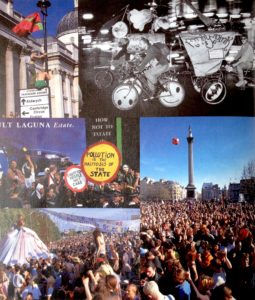
It’s the Summer Solstice and I’m re-posting this article as the Glastonbury Festival kicks off and protesters take to the streets for a Day of Rage. In heatwave temperatures (warmest since 1976), the soixante-huitards’ slogan, ‘les pavés, la plage!’ (translates as, under the paving stones the beach) is ringing in my ears. It’s twenty years since I went to Glastonbury; 1997 was a mud bath, two years before it had been glorious sunshine. Both times friends were made and tested, and despite the odds familiar faces popped out of the crowd. That era was all Parties & Protests and although my plans to visit a Euro Teknival didn’t materialise, later that summer I made it to Burning Man in the Nevada desert and learnt the mantra of hydration from the daily newsletter, Piss Clear!

Much has changed; the underground events mentioned in this article were organised without the aid of social media and minimal Internet coverage, even though I make much of ‘the daily mayhem of mobile phones, faxes and pagers’! One source of information (not mentioned in this article, but I wrote about it another time) was the indomitable SchNEWS, a photocopied newsletter reporting on legal and political campaigns and listing direct actions. It worked like this; you posted them a pile of stamps and they mailed you weekly issues. I met the photographer, Nick Cobbing, through SchNEWS, and by an odd quirk of fate have ended up living next door to their old office!

Now, come the summer there’s a stage in a field catering to every taste and subculture. Festivals are bespoke, niche, glampy affairs, with fancy dress, boutique beers, Insta-Stories and Twitter-Moments. This branch of the music, entertainment and events industries has blossomed, fanned by the British love of a camp-fire sausage and a piss-up in a tent. But I’d suggest that the roots were there back in the 1990s, as innovation and diversity were the order of the day. So I’m not complaining, just suggesting that an updated article would be a whole other story. On a more serious note though, the Millennials have discovered politics, and protest is once again in vogue…plus, we have the weather for it.
Continue reading

signature

From the Archive; You never know when you might need them

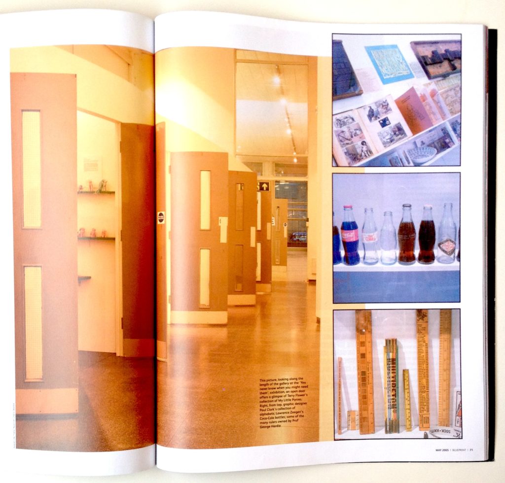
Spread from ‘Blueprint’ showing University of Brighton Gallery and exhibition design featuring salvaged fire doors

Spread from ‘Blueprint’ showing the University Gallery in Brighton and the exhibition design featuring salvaged fire doors

I was reminded of this article when visiting another exhibition, George Hardie …Fifty Odd Years, also at the University Gallery at University of Brighton. (Look out for a review of that exhibition, soon).

Back in 2005, Professor Hardie contributed his collection of rulers to You never know when you might need them, and they feature in the opening spread of the Blueprint article about the show, see above. At the time, my husband, Gregg Virostek, was an Interior Architecture student and worked on the exhibition build, while I was beginning to explore an obsession with collecting. That interest has developed into a research topic, as evidenced by this blog. So, as this article has yet to be digitised and made available online by the originally publisher it, here it is for reference.
Continue reading

signature

From the Archive; remembering Lucienne Day

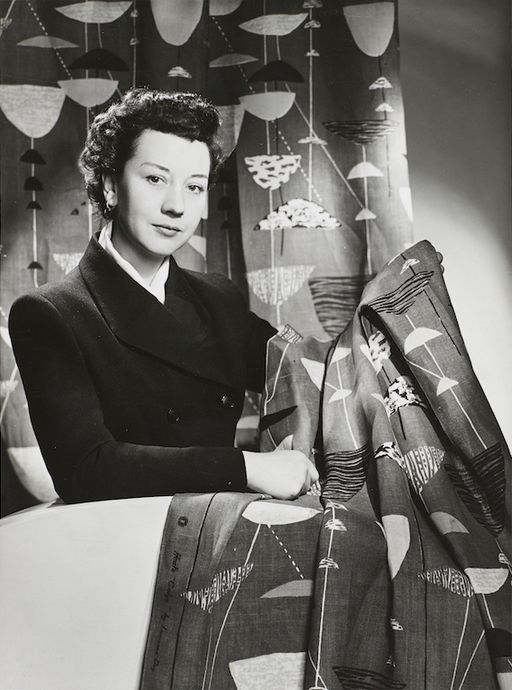
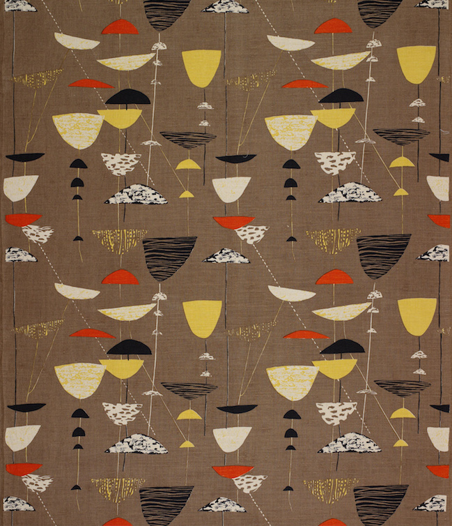
Lucienne Day in New York with Calyx (1951), 1952: The Robin and Lucienne Day Foundation and archive. Photographer: Studio Briggs.

Lucienne Day in New York with Calyx (1951), 1952: The Robin and Lucienne Day Foundation and archive. Photographer: Studio Briggs.

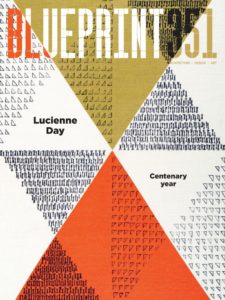
The current issue of Blueprint celebrates the life and work of Lucienne Day in the centenary year of her birth, with articles by and about her. The back pages of the magazine collect previous articles about the renowned designer, including a review I wrote about an exhibition at Manchester’s Whitworth Art Gallery, long before the stunning renovation and addition (mentioned in a previous post about Manchester, here); when I visited the Gallery presented a perfect example of late Victorian institutional architecture, a fine addition to the “Red Brick” University of Manchester. Initially, the thought of re-reading an article written over 24 years ago was a bit daunting, but then it helped me recall my first time in Manchester, an extraordinary day trip, meeting Lucienne Day and Jennifer Harris (the curator and author of the exhibition catalogue), and the privilege of walking the exhibition in their company. A new exhibition at the Gallery, Lucienne Day – A sense of growth, from 14 April to 11 June 2017, examines how plant forms inspired many of Lucienne Day’s iconic patterns. I hope to get back up north to visit it…

Lucienne Day celebrated in Blueprint, no. 351.

Lucienne Day celebrated in Blueprint, no. 351.

“British design’s first celebrity”
by Liz Farrelly
Blueprint, June 1993, pp.36-38
Exhibition review of Lucienne Day: a career in design
Whitworth Art Gallery, Oxford Road, Manchester
23 April to 26 June 1993
Visited 22 April 1993

Calyx screen-printed furnishing fabric, Lucienne Day, Heal’s Wholesale &; Export, 1951. The Robin and Lucienne Day Foundation and archive.

Calyx screen-printed furnishing fabric, Lucienne Day, Heal’s Wholesale & Export, 1951: The Robin and Lucienne Day Foundation and archive.

After a long and distinguished carer, Lucienne Day is being honoured with a retrospective exhibition which, appropriately enough for a textile designer, is in Manchester. Over 80 per cent of her furnishing fabrics are here, supplemented by examples of designs for wallpaper and tableware, showing a great virtuosity of image-making and variety of aesthetics. And while the exhibition sheds light on an individual’s career, it acts just as effectively as a review of changing styles in domestic taste, albeit at the upper end of the market.
Continue reading

signature

Shopping Paradise; objects on display

Gallery

This gallery contains 33 photos.

Outside looking in, the glazed facade of Brighton’s premier flea market, Snoopers Paradise (“Snoopers”), projects domestic objects right into the street. Close-up window-shopping is only possible out of hours when external stalls have been packed away, but it draws people … Continue reading

Collecting and sharing; the social life of objects

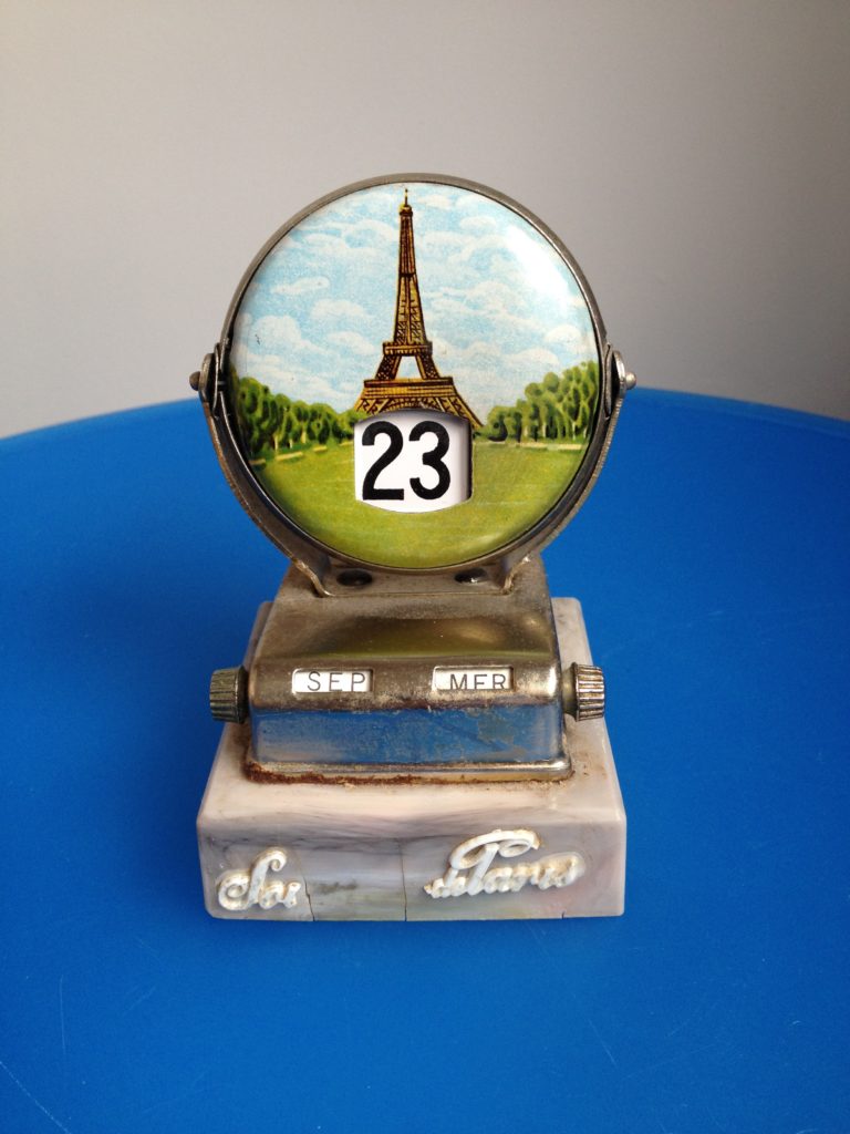
First Instagram post, 23 September 2015

First Instagram post, 23 September 2015

In Russell W. Belk’s journal article, “Extended Self in a Digital World” (2013) (available for download, here), the notion that our digital and online presence extends our self – mind and body – into the virtual realm, builds on Belk’s initial thesis “Possessions and the Extended Self” (1988), which posits that “knowingly or unknowingly, intentionally or unintentionally, we regard our possessions as parts of ourselves”. And by parts, Belk goes so far as to suggest they become stand-ins, prostheses, building blocks even, of our selves. Belk’s update looks at how the digital turn both dematerialises the self and ups the ante by networking our presence into a diversity of locations, communities, identities and avatars; we can become “multiple characters” so as “to explore different personality possibilities”.

One particular complication was examined by Belk and co-author Kelly Tian in “Extended Self and Possessions in the Workplace” (2005); “the battle that can take place between the ‘home self’ and the ‘work self’ as the time and place boundaries that once distinguished the two melt”. Admitting and allowing such a “melt” to become a positive enhancement rather than a negative detraction has necessitated accepting social media as part of my practice and most recently, Instagram, the photo-sharing app bought by Facebook in 2012 for $1-billion dollars. From an indie start-up it growth in size and popularity at a rate is now outperforming the parent company by a factor of 7 to 1. Why Instagram? Because I was looking for a way to connect multiple strands of my life – work, research, hobby, leisure, obsession – and Instagram’s informality, flexibility and outreach makes it a potentially useful tool. I have a project in mind, and by restricting my usage of Instagram to that specific task I hope to employ social media without lapsing into narcissism.
Continue reading

signature

Symposium; Hewison revisits heritage

Old postcard found on Pinterest.

Old postcard found on Pinterest.

Heritage in the 21st Century
Centre for Research in Memory, Narrative and Histories Annual Symposium
University of Brighton
Grand Parade, Brighton
7 February 2015

The programme promised critical analysis of literary guide books, prime-time costume dramas, gourmet vegetables and redesigned bank notes, the cherry on top being a keynote lecture from Professor Robert Hewison (Lancaster University), an academic legend, living and breathing. Professor Graham Dawson (Director of CRMNH) introduced the day by highlighting some issues; heritage is cross disciplinary and “slippery” and has supplanted “culture” as the buzz word du jour, but that doesn’t make it easier to define as, since the 1980s, its meaning has shifted especially in an era of the New Right and consumer capitalism. Plus, “tensions” between practitioners and critics, especially in the museum world, make it more difficult to question orthodoxies; leaving us with a big question to ponder, “how might heritage function in the 21st-century, in an age of austerity and new technology?” Co-convener, Professor Deborah Philips was also looking for definitions; “how do you describe heritage”, and provided a clue from The Oxford English Dictionary, which lists the root of the word as “inherited from the French”. I like that it’s borrowed from the language that also gave us “bureaucracy”, and also that Deborah went to the dictionary. Updating that methodology, the pr-installed Dictionary program on my MacBook includes “property, inheritance, value and preservation” in its definition. Then Deborah complicated the issue by suggesting that heritage has “many competing” definitions, and brought in a Guardian travel supplement offering “culture and heritage tours” as evidence, setting the scene for Hewison’s end of the day lecture. A PDF of the full programme is here.
Continue reading

signature

From the Archive (& now); a moment of manga

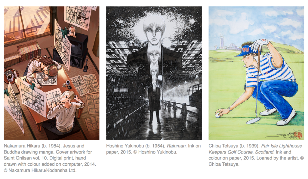
Manga is a popular choice for museum exhibitions and displays: with boundless variations in content and style, it’s accessible but (still) culturally exotic; it mixes scholarly research with contemporary collecting; and whether PG-rated or not, attracts a diverse audience of geeks and gawkers of all ages. Not for the first time, the British Museum gives over the high profile Room 3 (can’t miss it, first stop on the right) to a manga-moment with Manga now: three generations, which features new and specially commissioned work by Chiba Tetsuya, Hoshino Yukinobu and Nakamura Hikaru. I’ll pop in to inspect it next time I’m on the hallowed ground.

Manga now, three generations
The Asahi Shimbun Displays, Objects in Focus
British Museum
Great Russell Street, London WC1
www.britishmuseum.org
3 September to 15 November 2015

Screen Shot from the British Museum’s website; three manga artists

Screen Shot from the British Museum’s website; three manga artists

Previously the same gallery featured the stunning display, Manga, Professor Munakata’s British Museum adventure (5/11/09-3/1/10), by Hoshino Yukinobu. Jane Cheng reviewed that show on Eye, here: “The juxtaposition of hugely enlarged with minutely detailed asks visitors both to lean in closer and to step back”. Jane’s post features great images of the life-sized cut-outs in situ – like walking through a giant pop-up book — and she highlights the interactive nature of illustration exhibitions (something I recognised too at the V&A’s Memory Palace show, and featured in a conference paper, here). Loving a museum-based-mystery, especially one that showcases perfectly rendered images of museum objects (and hat’s off, what a tie-in, when’s the movie?), I ordered said graphic novel from the BM’s online shop having received a timely email reminding me of the publication on the same morning that the new show opened; now that’s what I call museum marketing. The online shop also tells customers, “Every purchase supports the Museum” (rather than Amazon).
Continue reading

signature

From the Archive (& now); catching up with knitting

A new exhibition, What Do I Need To Do To Make It OK?, features Freddie Robins and the arts of stitching and knitting, which reminded me of a review I wrote a decade ago, of an exhibition fanfaring the reinvention of knitting, Knit 2 Together at the Crafts Council Gallery.

Back in 2005, knitting was at the vanguard of the DIY/Maker Movement, and while that movement is going from strength to strength, the boom in all-things-knitted points to how commerce and the media can hitch a ride on even the most unlikely bandwagon. As I mention in the article, a decade ago yarn shops were closing. But now it can be argued that, along with other independent shops run by enthusiasts and local-entrepreneurs, crafting shops are spearheading a high street revival; while “public knitting” was once deemed radical, now it’s helping shopkeepers build communities (a “user group” even) with knitting circles that “keep the lights on” after closing time. Crafting events in libraries, schools and museums are guaranteed crowd-pleasers; Craft Fairs and Maker Faires draw in punters looking for unique items (which chain stores could ever supply), and all of this helps fund the freelance economy. Another knock on effect of knitting is the boost it has given publishing; from how-to books to anthologies of radical craft, publishers, magazines and newspapers are benefitting from the expansive-yarn-economy. And while it’s a decade since Design Week published my article, the message is still current; Susan Jones recently declared, “Our future is in the making” in The Guardian (19/3/15).
Continue reading

signature