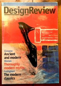
While moving piles of magazines around, I found this copy of Design Review, which was produced by the team that made Blueprint back in the early 1990s, when it was published by Wordsearch. It was an exercise in “contract”, the publishing company was paid by the Chartered Society of Designers (CSD) to create this quarterly magazine for its membership. I’m posting this article as a companion piece to “Mysterious Absence at the Cutting Edge”, which I wrote for Eye, as a member of the editorial team when employed at Wordsearch from August 1990 to August 1994.
Continue reading
Category Archives: Graphic Design
Guest blogger; protest student
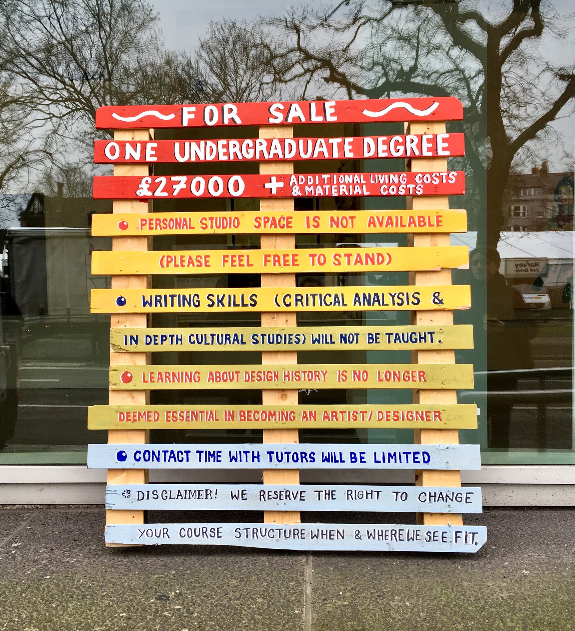
I teach Cultural and Critical Studies to Graphic Design and Illustration students at the University of Brighton and was suitably delighted when, on my way to give a lecture, I spotted this piece of ‘pallet protest art’. An Illustration student, Mhairi Lockett, created this message, so I invited her to tell us more in a guest blog.
Why did the University of Brighton lock up a student’s protest art?
by Mhairi Lockett
It is soon to be the May Festival here in Brighton and the Guest Director this year is Illustrator, David Shrigley. One of the themes of the Festival is protest art, this is timely as 2018 marks the 50th year since the student protests in Paris. As a third year student of Illustration at the University of Brighton, I have been moved to make my own protest art — pallet protest art.
Continue reading
From the Archive; Vaughan Oliver interview
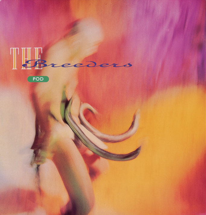
Here’s another interview from the unpublished series done for the Sound Design exhibition, which I curated for the British Council back in 2000. Vaughan Oliver’s work, as the studio known both as v23 and 23 Envelope, has been described as ‘graphic design for designers’; and while some people find it is difficult to decipher, it treats the initiated to a mix of undiluted wildness and superb craft. Indeed, it continues to win new fans, as Unit Edition’s successful Kickstarter campaign suggests. The aim is to publish a lavish ‘archive’ of Vaughan’s work, drawn from the extensive collection at the University of the Creative Arts, Epsom, where Vaughan is Visiting Professor of Graphic Design. Over the years, Vaughan has been a high-profile member of the graphic design community, participating in events and interviews, while his work has been collected by the Victoria and Albert Museum. This won’t be the first book about Vaughan either; Rick Poynor’s Vaughan Oliver: Visceral Pleasures was published by Booth-Clibborn Editions (who I worked with at the time), and designed by Vaughan himself, also in 2000.
Vaughan Oliver, interviewed by Liz Farrelly on 18/7/2000.
Liz Farrelly: How did your connection with 4AD start?
Vaughan Oliver: My interest in music graphics goes back to being a kid and the idea of combining my twin passions, music and visual arts.
Continue reading
From the Archive; Malcolm Garrett interview
I love collections, and exhibitions of collections, especially when they inspire designers and their work, so I would very much like to make the journey to Manchester (which I wrote about, here) to see Collecting Malcolm Garrett, part of the design festival, Design Manchester 17. In celebration of Malcolm Garrett and his work in the music industry (which he spoke about at Pick Me Up, reviewed here), I’m posting another previously unpublished interview from the British Council exhibition, Sound Design. Malcolm mentions his old school friends, Peter Saville (read that interview here) and Keith Breeden, who I also interviewed, so watch out for that interview too.
Malcolm Garrett, interviewed by Liz Farrelly on 12/7/2000.
Liz Farrelly: Where did it all start?
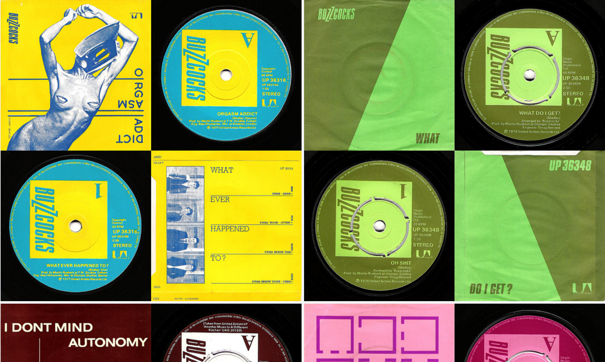
Malcolm Garrett: The Buzzocks was 23 years ago. It came about because I wanted to do a sleeve that wasn’t just a piece of cardboard and I was always interested in corporate graphics, as opposed to corporations, and subverting corporate graphics and systems graphics too, because a record sleeve is fundamentally information. So I was looking at it from an informational standpoint, as opposed to an art gallery standpoint. We were selling something so much more ethereal than say, banking services, so there was a frisson there. And because, with the Buzzcocks, some of their songs were looking at the nature of society and relationships in quite a detached way, it seemed appropriate to misappropriate some form of informational graphics.
Continue reading
From the Archive; Peter Saville interview
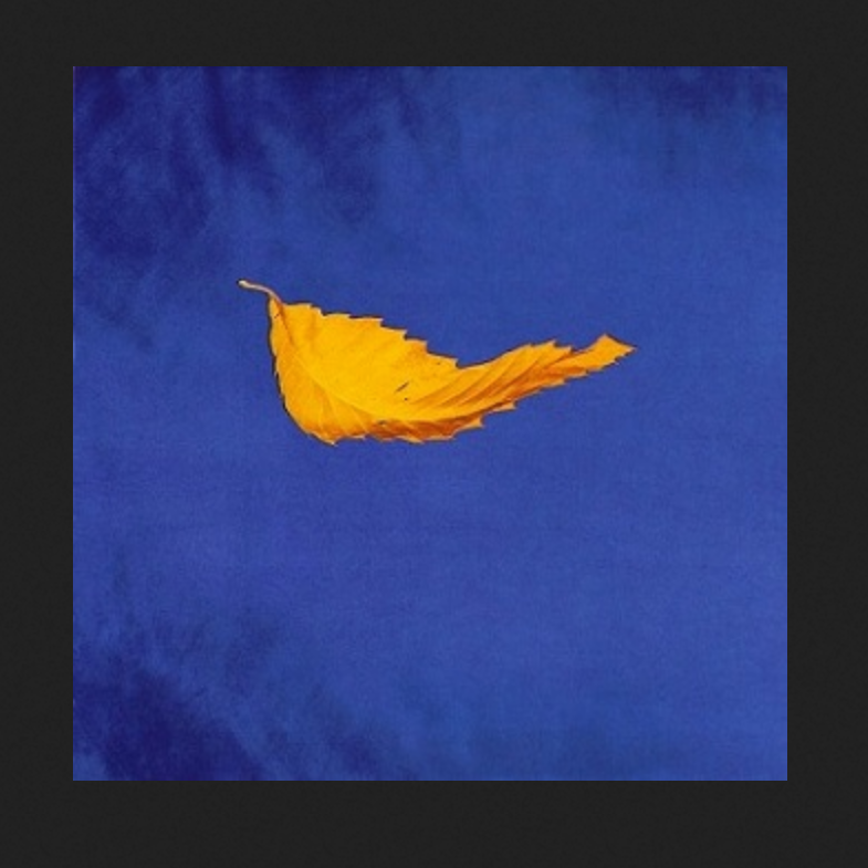
The London Design Festival is the capital’s most prestigious design event, taking over the city for much of September each year. Back in 2013, Peter Saville won the London Design Festival Medal; I interviewed him for Blueprint and the article is available online via DesignCurial. At the time I asked a number of creatives about their favourite Saville works, and one guest blogger, Paul West of Form, mentioned True Faith by New Order, with photography by Trevor Key. Now, a display of work by that legendary photographer, a regular collaborator with Saville, is on show as part of Hull 2017, UK City of Culture. Trevor Key’s Top 40, features his iconic photographic images for some of the twentieth century’s most famous record sleeves. I’m using this opportunity to post another unpublished interview with a contributor to Sound Design, this time Peter Saville, as a number of their joint efforts featured in this exhibition, which the British Council toured across Asia and Australia in the early years of the new Millennium. These edited interviews come from long phone conversations or studio visits. I tried to keep the interviewees focused on the topic of designing for the music industry, and rather than bombard them with penetrating questions, I preferred to let the designers do the talking and reminisce anecdotal stories about the finer details of working with musicians and labels. You can find the Aubrey Powell interview, here, and there will be more in this series. As I’ve said before, I’m reluctant to post copyrighted images to illustration the interviews, but this Japanese website offering a complete discography of Peter Saville’s record sleeve designs is all you’ll need.
Peter Saville, interviewed by Liz Farrelly on 1/8/2000.
Liz Farrelly: Tell me about your involvement with Factory Records.
Peter Saville: Going right back to the beginning, I was at school with Malcolm Garrett, and at that point our horizons stretched no further than a Hawkwind, Velvet Underground or Roxy Music cover. Then Malcolm went to Reading University, and courtesy of the library there, the history of twentieth-century design became known to us, via his reading list, which included design theory that we at Manchester Art College didn’t get. I started college in 1974 and graduated in 1978. Malcolm did a year at Reading University while I did a Foundation Course and I encouraged Malcolm to do his next three years at Manchester.
Continue reading
From the Archive; Aubrey Powell interview
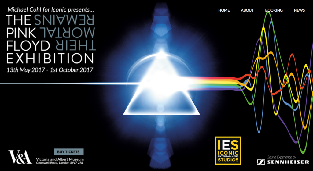
With the Victoria and Albert Museum staging the blockbuster exhibition, Pink Floyd: Their Mortal Remains, and an upcoming talk by Aubrey Powell titled, ‘Art of Hipgnosis and the Album Cover’ (14/9/2017), here’s an interview with the man himself. Back in 2000 I spoke with Aubrey on the phone while curating an exhibition, Sound Design, for the British Council, which featured the very best British record sleeve designs from the heyday of Rock to the rebellion of Punk, the eccentricities of New Wave and the innovations of Rave and Rare Groove.
The exhibition included extracts of interviews with all the contributing record sleeve designers but the complete interviews were not published, even though the designers gave permission for them to be compiled into a book. The publishing industry being what it was, at the time, the book didn’t fly, so look out for more interviews on this blog. My questions were quite general; the aim was to get the designers talking about what interested them. The interviews were edited from longer conversations, but I tried to keep the designer’s tone of voice, and each interviewee signed off on the final version. What’s particularly interesting is that at the time vinyl had been replaced by digital technology in the form of CDs; Web 2.0, online downloads and MP3s were still ‘experimental’ and the first Apple iPod wouldn’t be launched for another year. The implications of the Internet for the music industry were beginning to be talked about but not yet felt.
Why am I posting this interview now? To celebrate the work of Aubrey Powell and his (late) partner, colleagues and clients, and the V&A exhibition that he helped to create, which I also hope to review. For more information on the exhibition visit the band’s exhibition website and the museum’s extensive programme, here. To see masses of images check out the websites dedicated to Hipgnosis and Aubrey Powell; for the best of Hipgnosis’s work in print have a look at Aubrey’s book, Vinyl . Album . Cover . Art: The Complete Hipgnosis Catalogue, published by Thames and Hudson.
Aubrey Powell, interviewed by Liz Farrelly on 5/7/2000.
Liz Farrelly: How did you start Hipgnosis?
Aubrey Powell: We started Hipgnosis in the 1960s…It’s not what you know it’s who you know and Storm Thorgersen and I came from Cambridge and Pink Floyd originated in Cambridge – Syd Barrett, Dave Gilmore, Roger Waters – we all came to London at the same time, around 1965/66 and were all attending various art schools. Storm was at the Royal College of Art film school, and I was at the London School of Film Technique. Syd Barrett was at Hornsey Art School. And we were very together, all coming from Cambridge. We shared flats; Storm and I and then Syd and Dave had a big flat in South Kensington. Storm and I were looking to get some holiday money and we had a connection to photograph some cowboy book covers, and at the time everybody was getting stoned and dropping acid and were very drug-oriented. We were right in the middle of that psychedelic revolution. We were all part of that. Pink Floyd were doing gigs in tiny clubs like the UFO club on Tottenham Court Road and had just released their first album and were about to have a hit called See Emily play.
Continue reading
Seminar Paper; Mediating Design, a case study in diversity
Modes of Mediating Applied Art and Design
7th Tallinn Applied Art Triennial
Soprus Cinema
Vanna-Posti 8, Tallinn, Estonia
21 April 2017
This is an edited version of a paper I presented amidst Art Deco splendor in Tallinn. While the city was still waiting for spring the reception was warm, and the audience and fellow speakers contributed to a lively discussion around the role of media in the mediating art and design. I’d like to thank Triin Jerlie and Keiu Krikmann for inviting me to speak, and the organising committee of the Tallinn Applied Art Triennial and the British Embassy Tallinn for funding my trip. Look for another post about Tallinn, the city-wide Triennial and the Estonian Museum of Applied Art and Design.
This paper is still in the form of a ‘talk’, but also constitutes work-in-progress that will inform the last chapter of my doctoral thesis on the future of design museums. In May, I presented a longer version to University of Brighton MA Art and Design History students as part of the module, Critical Reflection, at the invitation of my colleague, Megha Rajguru, and that version of the talk provided an opportunity to explore changing definitions of ‘interpretation’. The images are from my PowerPoint presentation, and either taken from the Internet or using my Apple iPhone 4S.
Continue reading
From the Archive; Sagmeister’s first sabbatical
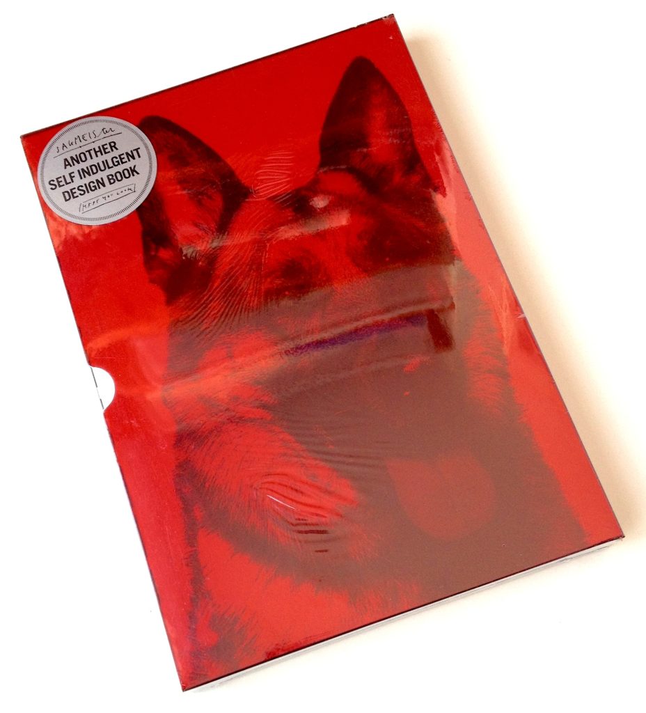
On the occasion of an earlier blog post about The Happy Film, which began as one of Stefan Sagmeister’s sabbatical projects, here’s an article I wrote when his first book, Sagmeister made you look was about to be published by Booth-Clibborn Editions, as that too was the product of a ‘year without clients’, his first in fact.
I also worked with Edward Booth-Clibborn but wasn’t involved in the editorial or production process of Sagmeister’s book, so felt that it was OK to write about it. This article appeared in the esteemed German magazine, Form, subtitled ‘The European Design Magazine’, and is presented in German and English. Scans of the article are available through the magazine’s online archive, here (access requires registration).
Reading this article reveals that even then Sagmeister would seek collaborators with complementary skills, in this case, design writer Peter Hall (for The Happy Film, he worked with co-directors Hillman Curtis and Ben Nabors). But he was wrong about one thing; that once design work is published, it’s off the agenda. A star turn like Sagmeister is always going to be known for that poster (info for AIGA Miami scratched into his skin) and that CD cover (Lou Reed’s face overwritten with lyrics). If he doesn’t show then at a lecture or talk about them in an article it’s like your favourite band refusing to play their signature tune on stage; Sagmeister’s greatest hits keep his fans happy! This article also points to the performative aspect of graphic design; not only the lure of being ‘guest speaker’ at an international conference doing your best ‘show and tell’, but also with regard to selling ideas in client presentations…a very useful skill.
Continue reading
The Happy Film; graphic design on screen
The Happy Film
Duke of York’s Picturehouse
Preston Road, Brighton, East Sussex
14 June 2017 at 6pm
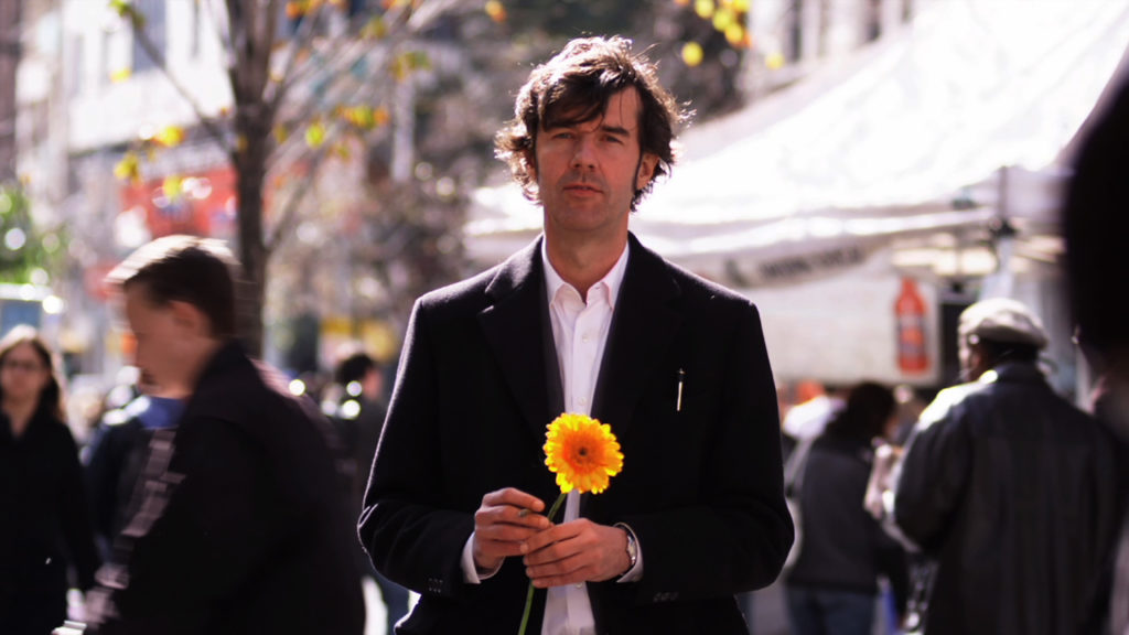
I’m not a fan of solo cinema visits but even with my partner-in-crime currently ‘away’, I had to see this just released, much discussed film at this special screening. Right on the money, the power-couple hosts of Glug Brighton, Carl Rush of creative agency Crush, and Helen, the renowned Illustration agent and founder of Agency Rush, invited graphic-design hero (and I don’t use the term lightly) Stefan Sagmeister to show his seven-years in the making documentary, The Happy Film. Despite the lure of a glorious summer evening, Brighton’s historic Duke of York’s cinema was packed with the city’s creative community including a good number of Graphic Design and Illustration students from University of Brighton, come to see the legend in action, for after a film of thrills and spills Sagmeister stepped up for the Q&A.
Continue reading
From the Archive; listening to Kalle Lasn
The outpourings of unease, dread and fear that recent political events have caused reminds me of an earlier era, 1999 (although back then we were asked to party too). The run up to the Millennium witnessed the kind of end-of-days headbanging practiced by religious zealots since the Middle Ages, spiced with a dose of fin de siècle decadence and topped with the techno-paranoia of the Y2K Bug and the predicted meltdown of communications, power and defence systems worldwide. With the Internet still in its infancy and social media merely a glint in its circuitry, hysteria was polarised. Mainstream media presented experts and button-holed politicians while conspiratorial survivalists used grass-roots networks to challenge official messages meant to placate the public.
One media practitioner commanding attention was Kalle Lasn not because he peddled doom-laden prophecies, although he was angry, but because the magazine he had launched a decade before seemed to (now) perfectly fit the zeitgeist. Adbusters gave a message of resistance and not from a place of despair. It advocated for urgent action using the incendiary power of the image, documentary and manipulated, while retaining a stance of positivity, and the look and feel of the magazine – colourful, glossy, eye-catching – helped promoted that can-do, future-focused message.
Continue reading