From the Archive; Peter Saville interview

Screen Shot 2017-09-26 at 16.37.26

The London Design Festival is the capital’s most prestigious design event, taking over the city for much of September each year. Back in 2013, Peter Saville won the London Design Festival Medal; I interviewed him for Blueprint and the article is available online via DesignCurial. At the time I asked a number of creatives about their favourite Saville works, and one guest blogger, Paul West of Form, mentioned True Faith by New Order, with photography by Trevor Key. Now, a display of work by that legendary photographer, a regular collaborator with Saville, is on show as part of Hull 2017, UK City of Culture. Trevor Key’s Top 40, features his iconic photographic images for some of the twentieth century’s most famous record sleeves. I’m using this opportunity to post another unpublished interview with a contributor to Sound Design, this time Peter Saville, as a number of their joint efforts featured in this exhibition, which the British Council toured across Asia and Australia in the early years of the new Millennium. These edited interviews come from long phone conversations or studio visits. I tried to keep the interviewees focused on the topic of designing for the music industry, and rather than bombard them with penetrating questions, I preferred to let the designers do the talking and reminisce anecdotal stories about the finer details of working with musicians and labels. You can find the Aubrey Powell interview, here, and there will be more in this series. As I’ve said before, I’m reluctant to post copyrighted images to illustration the interviews, but this Japanese website offering a complete discography of Peter Saville’s record sleeve designs is all you’ll need.

Peter Saville, interviewed by Liz Farrelly on 1/8/2000.

Liz Farrelly: Tell me about your involvement with Factory Records.

Peter Saville: Going right back to the beginning, I was at school with Malcolm Garrett, and at that point our horizons stretched no further than a Hawkwind, Velvet Underground or Roxy Music cover. Then Malcolm went to Reading University, and courtesy of the library there, the history of twentieth-century design became known to us, via his reading list, which included design theory that we at Manchester Art College didn’t get. I started college in 1974 and graduated in 1978. Malcolm did a year at Reading University while I did a Foundation Course and I encouraged Malcolm to do his next three years at Manchester.
Continue reading

signature

Seminar Paper; Mediating Design, a case study in diversity

Modes of Mediating Applied Art and Design
7th Tallinn Applied Art Triennial
Soprus Cinema
Vanna-Posti 8, Tallinn, Estonia
21 April 2017

This is an edited version of a paper I presented amidst Art Deco splendor in Tallinn. While the city was still waiting for spring the reception was warm, and the audience and fellow speakers contributed to a lively discussion around the role of media in the mediating art and design. I’d like to thank Triin Jerlie and Keiu Krikmann for inviting me to speak, and the organising committee of the Tallinn Applied Art Triennial and the British Embassy Tallinn for funding my trip. Look for another post about Tallinn, the city-wide Triennial and the Estonian Museum of Applied Art and Design.

This paper is still in the form of a ‘talk’, but also constitutes work-in-progress that will inform the last chapter of my doctoral thesis on the future of design museums. In May, I presented a longer version to University of Brighton MA Art and Design History students as part of the module, Critical Reflection, at the invitation of my colleague, Megha Rajguru, and that version of the talk provided an opportunity to explore changing definitions of ‘interpretation’. The images are from my PowerPoint presentation, and either taken from the Internet or using my Apple iPhone 4S.
Continue reading

signature

Voting for Design; Designs of the Year

For its annual Designs of the Year award, London’s Design Museum employs social media, an email campaign and a micro-site to engage with its audience and entice it to judge the exhibits. It also suggests that talent-spotting curation offers a glimpse into the future.

For its annual Designs of the Year award, London’s Design Museum employs social media, an email campaign and a micro-site to engage with its audience and entice it to judge the exhibits. It also suggests that talent-spotting curation offers a glimpse into the future.

Designs of the Year 2014
Design Museum
Shad Thames, London SE1
26 March to 25 August 2014
Nominees’ Party
25 March 2014

An exercise in engagement, a sure-fire media event, and a comprehensive round-up of the best design launched in a year, the Design Museum’s Designs of the Year award and exhibition is now in its seventh year, showcasing design across a range of categories; Architecture, Digital, Fashion, Furniture, Graphic, Product and Transport. Designs of the Year was instigated by the current Director, Deyan Sudjic, to replace the “Designer of the Year” award, when a winner was picked from just four nominated individuals whose careers and recent achievements were being judged rather than any particular outcomes. Increasingly, that competition attracted criticism for pitting star-designers against rank outsiders, and for some controversial decisions. Opening up the nomination and judging process to a wider panel, Designs of the Year provides the public with an annual, international round-up of headline-grabbing ideas, solutions and products.

The selection process for this new format has also generated a worldwide network of judges and nominatee from across the design industry — the museum’s extended “family” — who are now known to curators, with both parties mutually benefitting from the association. For the past three years, I’ve been asked to nominate, and each year had a couple of my choices make it through to the “exhibition” round. Proof of how much designers and their clients appreciate this opportunity to exhibit at the Design Museum may be judged by the massive amount of social media and personal thanks generated on the “shortlist” day, when the selection is announced; and by the packed, riotous party on the eve of opening. I’m writing this after attending the nominees party, so excuse the lack of focus on particular exhibits; this show demands repeat viewing as there’s so much to see.
Continue reading

signature

Guest blogger; assessing Peter Saville, legend

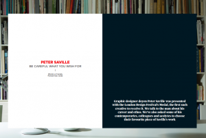
Peter Saville Blueprint spread

Interview, 13 September 2013
Published, Blueprint, issue 331, 10 December 2013
Interview: graphic design legend Peter Saville talks to Liz Farrelly
Further contribution by Paul West, Form

For as long as this interview is available on the Design/Curial website, I’ll redirect you there; after that, I’ll repost it. It was a pleasure to be commissioned by Blueprint again after a few year’s hiatus. I worked in house from 1990 to 1994 beginning as Editorial Assistant, and writing from day one; I reached the heady heights of Deputy Editor, then freelanced under every editor until about 2006. Being asked to interview Peter Saville was the bonus; this is the third time I’ve had the opportunity to conduct a long interview with Peter, as well as having a few good chats along the way. He’s a great talker and it shows in the two and half hour transcript! Peter was to be honoured with the London Design Festival’s major award, which prompted the coverage. The award spiel mentions the winner’s contribution to design in London, and I realised that Peter’s amazing affect was as an inspirtion to and an incurbator of a considerable amount of graphic design talent that has gone on to make London the most important city in the world for graphic design. So, I asked around, and got a bunch of people to talk about their favourite work by Peter. Paul West had worked for Peter, and so I’m posting his contribution here as I couldn’t get it to the magazine by the deadline. Thank you Paul for adding such a great further contribution to the story.

Paul West: Where to start with Peter’s output. Who can’t love FAC1; the “Unknown Pleasures” pulsar; the “Closer” tomb, photographed by Bernard Pierre Wolff with the beautiful Lapidary typography; the “Blue Monday” floppy disc, his Section 25 work — the list is endless. To even go on more is redundant, so well catalogued is his work (alongside designers including Martyn Atkins, Brett Wickens, Richard Smith to name but three) that it’s entrenched in our popular counter-culture, in turn influencing culture.

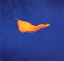
True Faith

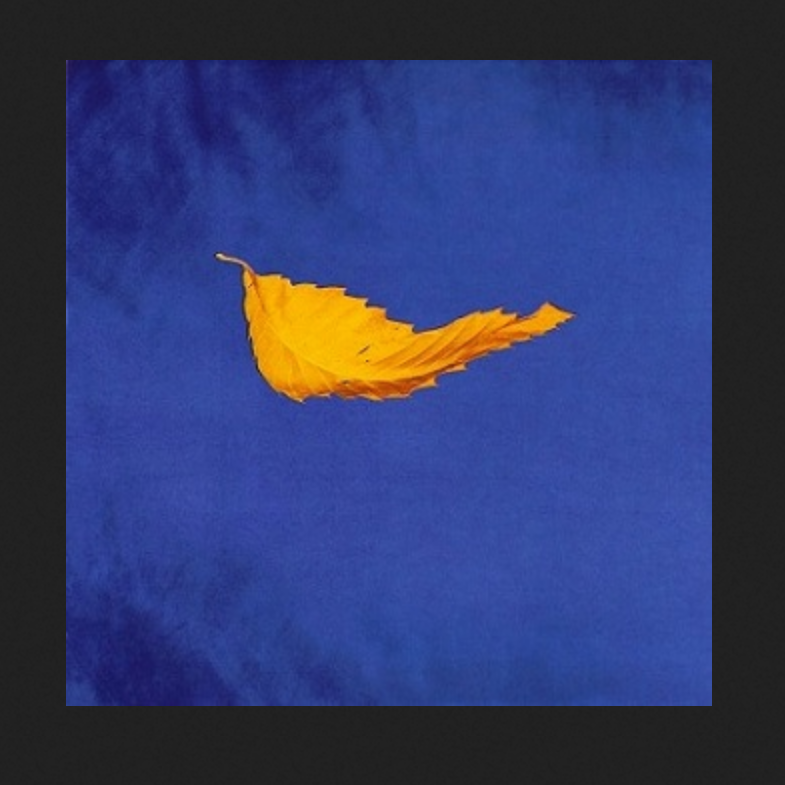
If I could name ONE piece of work I have loved above all other it is the fabulous “True Faith” 12″. This beautiful gold leaf suspended or floating on Yves Klein’s “International Klein Blue” backdrop, with the absolute minimum of information on the back cover (Name — Title / bside — Copyright — the all important Fac183 catalogue number — pre barcode!) and the way it fused art, hi-tech, independent couture, anti-couture; it feels as new now as it did then.

In 1987 I wrote my college thesis on Peter Saville Associates and Vaughan Oliver (V-23) and as a result I got through the doors and worked at PSA ’88 to ’89. I remember asking Peter about this cover and I him saying that the expanse of white on the back sleeve made the front sleeve look like an art piece, with the back cover serving as the catalogue descriptor. I loved that. It was so Warhol.

Of course so much of Peter’s great “visual” work is thanks to the genius of Trevor Key who had a studio space next door. I remember watching the exploratory work Peter and Trevor were doing for “Fine Time” and “Technique” and thinking how great it was, to be so progressive with such a spirit of discovery and invention, it was incredibly inspirational for a 20-something graduate. One day I was in Trevor’s studio talking to him about his work and looking through a massive pile of old test polaroids (including, X-Ray Spex “Germ Free Adolescents”) and I saw THE polaroid of “True Faith”. l had to ask. “Can I have it?”. “Piss off” came the reply. #legend.

From guest blogger, Paul West, Form

signature

From the Archive; advice from Howard Tangye

Thinking about fashion exhibitions, and the way that fashion designers and students use museums and galleries for inspiration, reminded me to re-post this account of a round-table discussion at London’s Design Museum about Fashion Illustration, as a discipline, practice and commodity. This event was very well attended and super informative, and part of the programme around the Drawing Fashion exhibition, which I reviewed on Eye Blog, here, and reposted on this blog too, here.

Drawing Fashion
Design Museum
Shad Thames, London SE1
3 November 2010 to 6 March 2011
Drawing Fashion debate
5 November 2010

Another reason for reposting this now, is because Howard Tangye had an exhibition this month at the Hus Gallery, “Casting the Line”; the catalogue may be downloaded, here. I became an instant fan of Howard’s work on hearing him talk at this debate, and when Stina Gromark and Louise Naunton Morgan of STSQ launched a Kickstarter campaign to fund the design and publication of a monograph of Howard’s work, I was happy to contribute. The resulting book, Within — Howard Tangye is proof that Kickstarter is a very good thing!

Eye Blog Fashion Illustration Debate

Thursday 4:58pm, 18 November 2010
Design Debate”
by Liz Farrelly
Originally published on Eye Blog

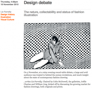
The nature, collectability and status of fashion illustration

On a rainy evening, a large and avid audience was treated to behind the scenes revelations, and much insight about the state of contemporary fashion drawing. Chaired by Colin McDowell, the panel included gallerists Joëlle Chariau of Galerie Bartsch and Charian, and William Ling of Fashion Illustration Gallery, who kicked off by discussing the growing market for fashion drawings, both originals and prints.

Chariau declared that finding an audience isn’t the issue, but that finding the drawings is, as so much was originally made to commission. She recounted how, when she first opened her gallery, she prompted René Gruau to search his house and cupboards for “packages” of artwork, which he had never considered saleable.

Ling admitted that the collecting market is still nascent, much like the graffiti scene was a decade ago. But, he added, “the art market is starved of beautiful, hand-drawn work…when I show a new client the work, and explain it, it’s extremely powerful.” Both revealed that they sell to a number of fashion photographers, musing that they are attracted by what drawing can achieve, that photography cannot.
Continue reading

signature

From the Archive; Drawing Fashion at the Design Museum

Drawing Fashion
Design Museum
Shad Thames, London SE1
Visited 5 November 2010

Drawing Fashion Eye Blog

Monday 4:47pm, 15 November 2010
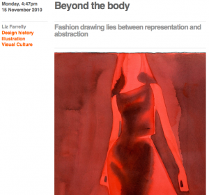
“Beyond the body”
by Liz Farrelly
Originally published on Eye Blog

Fashion drawing lies between representation and abstraction

Fashion illustration may have been marginalised in the past (and it’s not just me saying so), but right now London is being treated to a series of exhibitions and events showcasing this very rarefied genre of commercial image-making. At the Design Museum, Drawing Fashion is an historical and scholarly exhibition featuring work from the extensive collection of gallerist, Joëlle Chariau, curated by fashion critic, Colin McDowell, and Nina Due of the Design Museum.

On show is an illuminating edit of original drawings, commissioned for editorial and advertising use, building into a concise history of the genre. From early Art Nouveau and Art Deco examples by Erté and André Édouard Marty, to George Lepape’s illustrated covers for Vogue (one features the “model” drawing the masthead onto the picture plane, behind her). René Gruau (famously of Dior), Eric and Christian Bérard represent the middle decades, when drawing was used by luxury brands in full-page print adverts, as well as to report seasonal trends right off the catwalk. The chronology reveals the glory years of “drawing fashion”, mirroring the most glamorous moments of twentieth century design.
Continue reading

signature

Club to Catwalk, legacy or nostalgia?

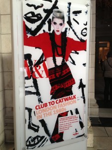
Club to Catwalk poster

Club to Catwalk: London Fashion in the 1980s
Victoria and Albert Museum, London
10 July 2013 to 16 February 2014
Visited 18 August and 20 September 2013

This long running exhibition was hotly anticipated, but it was not without its flaws, which became more obvious, as I made two extended visits to the show, and thanks to my V&A Membership Card, countless quick pop-ins. Each visit brought more to my attention, and also made me wish for more…like a kid in a candy shop. I lived through this time and as a young Londoner was a regular at a wide range of night clubs from the rockabilly Gaz’s Rocking Blues to the proto-rave of Delirium (I even worked at The Wag). I also shopped like it was going out of style (of course, it wasn’t) and owned garments by many of the featured designers, picked up in their tiny Covent Garden shops, at Kensington Market on a Saturday and Camden on a Sunday, at Jones and Browns, and up and down the Kings Road. Most of those treasures are long gone as I gave piles of clothes away before going on a long trip in the late 1990s, and sold some of the choicer pieces. There are just a few frocks still carefully preserved… One of my students asked me what from my early 20s (her age) am I nostalgic about, and mostly it is these garments, as I try to recall particular outfits and what I might have looked like. Back then we didn’t walk around with camera phones and there are so few photos of those nights out.

About the show…
Continue reading

signature

à la mode in New York

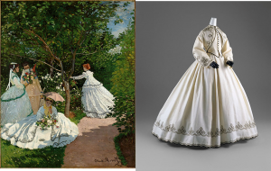
Claude Monet. Women in the Garden, 1866. Courtesy of Musée, d’Orsay, Paris. Alongside embellished white dress from the exhibition

Claude Monet. Women in the Garden, 1866. Courtesy of Musée d’Orsay, Paris. Alongside embellished white dress from the exhibition

Impressionism, Fashion, and Modernity
The Metropolitan Museum of Art, New York City
26 February to 27 May 2013
Visited 12 May 2013

From PUNK to the sublime; the next-door exhibition, on that Sunday morning, was one I’d just missed at the Musée d’Orsay in Paris back in January, where tantalizingly the entrance banner was still up but the show had closed. So I was excited to see this joint venture (between museums in Paris, New York and Chicago) in its second incarnation, enjoying spacious galleries and perfect lighting that happily accommodated both paintings and textiles.

Even though my main professional interest is contemporary design in the context of design museums, as an avid gallery-goer I’m drawn to an exhibition such as this, which presents a sure-fire art-historical hit (there’s no better crowd pleaser than Impressionism) in a new light. And, from the point of view of Museum Studies this is an interesting show; mixing over 80 major figure paintings by Impressionists and their fashionable contemporaries, with historical artefacts and garments – the clothes and accessories depicted in paint on canvas – demonstrates a newly collaborative approach to exhibition curation.
Continue reading

signature

PUNK, but not as I knew it

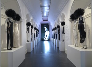
The DIY Gallery at PUNK: Chaos to Couture at the Metropolitan Museum of Art, featuring its “designationed punk”, Sid Vicious

The DIY Gallery at PUNK: Chaos to Couture at the Metropolitan Museum of Art, featuring its “designationed punk hero”, Sid Vicious

PUNK: Chaos to Couture
The Costume Institute of The Metropolitan Museum of Art, New York City.
9 May to 14 August 2013
Visited 12 May 2013

What’s to be said about a “blockbuster exhibition”? Having reached saturation point due to blanket press coverage, you’ll dutifully add it to your list of “things to do this summer”, remembering to avoid weekends, bank holidays and school half-term…

If it’s the Metropolitan Museum’s annual summer exhibition, you’ve probably also ogled the fabulous frocks and wardrobe malfunctions that clad celebrities (from Aye to Zee) at the Met Ball (proper title, the Costume Institute Gala). We have Diana Vreeland as “special consultant” to thank for kicking off the exhibit-themed frivolities back in 1971 (the film, Diana Vreeland: The Eye Has to Travel investigates Vreeland’s role at the museum). Now the Met Ball is run by Vogue and raises millions of dollars annually for the museum.
Continue reading

signature