Modes of Mediating Applied Art and Design
7th Tallinn Applied Art Triennial
Soprus Cinema
Vanna-Posti 8, Tallinn, Estonia
21 April 2017
This is an edited version of a paper I presented amidst Art Deco splendor in Tallinn. While the city was still waiting for spring the reception was warm, and the audience and fellow speakers contributed to a lively discussion around the role of media in the mediating art and design. I’d like to thank Triin Jerlie and Keiu Krikmann for inviting me to speak, and the organising committee of the Tallinn Applied Art Triennial and the British Embassy Tallinn for funding my trip. Look for another post about Tallinn, the city-wide Triennial and the Estonian Museum of Applied Art and Design.
This paper is still in the form of a ‘talk’, but also constitutes work-in-progress that will inform the last chapter of my doctoral thesis on the future of design museums. In May, I presented a longer version to University of Brighton MA Art and Design History students as part of the module, Critical Reflection, at the invitation of my colleague, Megha Rajguru, and that version of the talk provided an opportunity to explore changing definitions of ‘interpretation’. The images are from my PowerPoint presentation, and either taken from the Internet or using my Apple iPhone 4S.
The brief for today’s talk was to consider the mediation of design in relation to museums, but, disclaimer up front, I am not a ‘Museum Person’, meaning I don’t work in museums, despite having studied in one, the Victoria and Albert Museum, AKA, the world’s first museum of design and applied arts.
I write about museums because I’m interested in how contemporary design is collected and displayed in permanent and temporary exhibitions, and how the museum as an institution creates meaning. The aim of my research is to provide material for discussion, and is not an attempt to impose particular ideas or methods on museum personnel. My research is grounded in historical and empirical research and I have been looking at specific moments when change occurs within my case study institution, London’s Design Museum. My intention isn’t to back one or other participant’s version of events but, using a mix and match methodology incorporating Discourse Analysis, Qualitative Research and Actor Network Theory, I aim to triangulate a range of historical and contemporary material: comparing the institution’s cultural production, its programming, exhibitions, displays, publishing, marketing and environments; with observations of the institution’s working methods and special access to policy documents; and interviews with key personnel, past and present.
For this paper, as well as visiting the Museum and its exhibitions to observe the institution’s cultural production in action, I interviewed the Curators of the two opening exhibitions via email, reviewed the Museum’s Press Releases and the media coverage generated by the exhibitions. This analysis is a work in progress and will be included in a final section of my doctoral thesis, tracing the Museum’s redevelopment project from first announcement in 2006 to the opening of the new Museum in 2016.
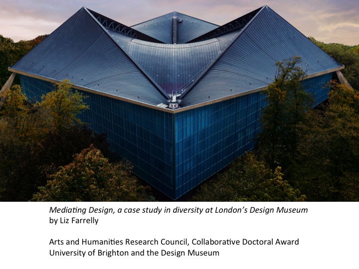
But first, a potted history and partial timeline of the Design Museum in its three incarnations, as the Boilerhouse Gallery at the Victoria and Albert Museum, as the Design Museum in Shad Thames, overlooking the river in Southwark, and as a completely reinvented institution, with the addition of an emphatic ‘the’ in the name and logo, the Design Museum, now housed in the former Commonwealth Institute on Kensington High Street in west London.
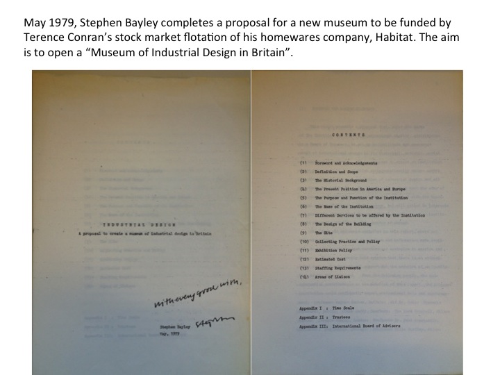
In May 1979, having been commissioned by Terence Conran, Stephen Bayley presented him with a proposal for a new museum to be funded by the stock market flotation of Conran’s homewares company, Habitat. They aimed to open a ‘Museum of Industrial Design in Britain’ under the umbrella of an educational charity, the Conran Foundation.
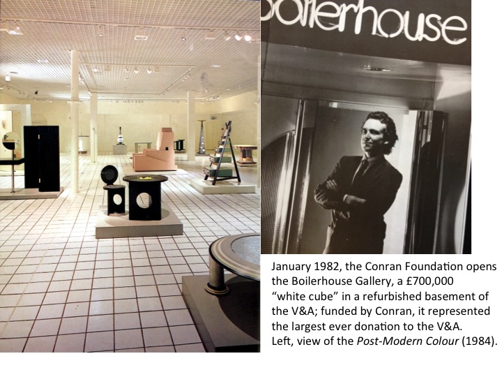
Invited into the V&A by its Director, Roy Strong, in January 1982 the Conran Foundation opened the Boilerhouse Gallery, after a £700,000 refurbishment turned a disused basement into a gridded ‘white cube’, with tiled floor, slim ‘piloti’ columns, and recessed lighting in a dropped ceiling. Financed by Conran, the ‘design and build’ constitutes the largest-ever donation to the V&A, with the Boilerhouse as the only ‘independent’ organisation to ever to housed within the Museum.
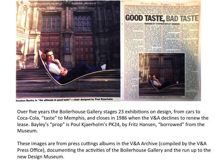
Having authored the initial proposal, Bayley was named as founding director of the Boilerhouse Project, and later the Design Museum. Both in print and when interviewed he admits to deliberately provoking the V&A’s ‘old guard’ of curators (known as Keepers) and administrators by flouting institutional procedures and dressing ‘like a banker’ (his words). Such a sartorial statement could be perceived as an acknowledgment of the rising commercial status of the design profession encouraged by Prime Minister Margaret Thatcher’s de-regulated financial markets. Whether Bayley’s intention is to align the Boilerhouse Project with the design industry rather than the museum world, by suggesting that the design curator shares tastes and attitudes with the designer, it has the affect of further demarcating the Boilerhouse’s liminal status within the Museum. In effect, Bayley highlighted the cultural divide between the Boilerhouse and the V&A, the proposed museum of design and the treasure house of decorative art.
Over five years the Boilerhouse Gallery staged 23 exhibitions about design, featuring an array of objects and images never before seen in the V&A, including cars and Coca-Cola bottles, dealing with issues such as taste and subculture, and presenting the headline-grabbing design group, Memphis, in its first London show. Each exhibition generated substantial press coverage, which was collated into several volumes of cuttings, now in the V&A Archive. This constitutes a time capsule of the 1980s ‘designer decade’ — demonstrating how design discourse was kick-started in the mainstream media by the activities of the Boilerhouse Gallery — and has been an invaluable resource for my research. It remains a mystery as to who took the initiative to collect this material; no archival data is attached to the press cuttings albums and Bayley affirms that Boilerhouse staff were not responsible.
During this phase of the institution, Bayley describes his curatorial approach as ‘Three-Dimensional Journalism’, in that it offered ‘something new to think about every few months’, with the aim of attracting repeat visitors and building an audience for design exhibitions. Measuring success by visitor numbers, the Boilerhouse Gallery boasted that it was more popular than the whole of the rest of the Museum. In 1986 the V&A’s Director refused to renew the lease and the Boilerhouse Gallery closed.
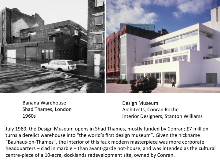
While housed in offices at Butler’s Wharf near Tower Bridge, on the 10-acre redevelopment site owned by Conran, over the next three years Conran funds the £7 million refurbishment of a derelict warehouse in Shad Thames, intended as the site’s cultural hub. When opened in 1989, it is promoted as “the world’s first design museum”. Clad in white stucco and nicknamed ‘Bauhaus-on-Thames’, the interior of this faux Modernist icon is resplendent in white marble and includes a foyer more like a corporate headquarters building than an avant-garde hot-house.
Before turning to the current incarnation of the Design Museum, the result of an £83 million renovation project, I want to introduce some ideas about museum buildings and interpretation, as discussed within the discipline of Museum Studies, which has grown in tandem with the museum sector since the 1980s, producing a substantial academic literature around museum practice and expanding the discourse of museology.
In Reshaping Museum Space: Architecture, Design, Exhibitions (2005), edited by Suzanne MacLeod (Head of University of Leicester’s department of Museum Studies), the creation of iconic museum buildings is addressed. Issues begin during the commissioning process where the needs of museum professionals are often misunderstood by a project’s lead architects. MacLeod suggests that beyond their physical presence, buildings are social and cultural entities, and calls for an ‘expanded’ definition of museum architecture, ‘to include the physical structure, the layout of functions in space, the layout of collections in space, the management, the programming’; such a definition would recognise a wider range of museum users, including staff and visitors, and acknowledge that the museum is ‘in a constant state of (re) production through use’. For MacLeod, museum space should be ‘contradictory’ and ‘oppositional’. In his essay, David Fleming, suggests that iconic buildings undermine a museum’s actual content. And Beth Lord, in her chapter, contributes a definition of curatorial interpretation that fits this dynamic, suggesting it ‘posit[s] and question[s] the relationships between things and systems’ so that ‘the museum does not simply present objects, it presents and questions the space between objects and conceptual systems’. I would add that, therefore, museum space is also ‘the space between’, and in that way becomes part of the process of interpretation.
Let’s keep in mind this idea of interpretation as communicating and questioning when looking at the two opening exhibitions of the re-launched Design Museum, as, having visited both shows, I was aware of the building itself as central to my experience of these two exhibitions.
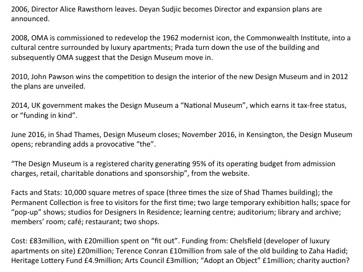
On the screen are some Facts and Figures, bringing the story of the Museum’s redevelopment up to date and demonstrating how the scale and ambition of the institution has increased substantially.
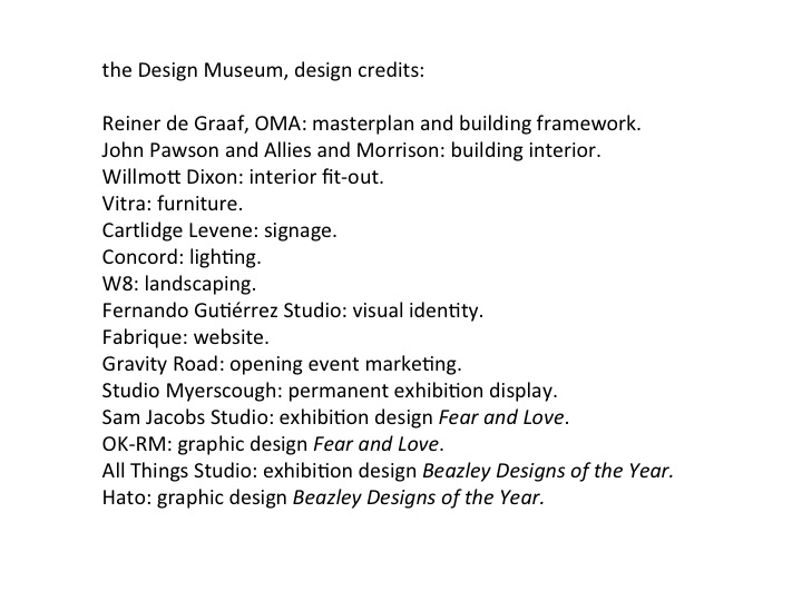
And this slide shows a list of credits, of designers from across a range of disciplines who created the new Design Museum and its two opening shows, so as to highlight the extent and skills of the teams involved, beyond the high profile starchitect who mostly enjoys the name check.
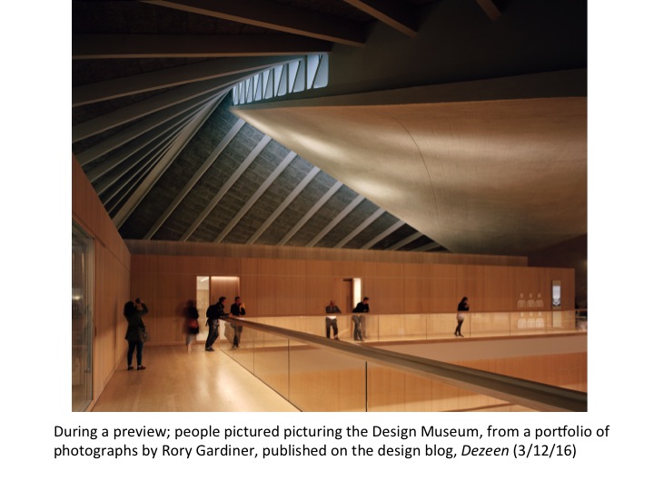
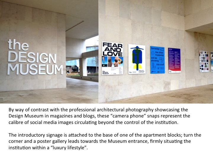
With the opening of the new Museum came a flurry of media coverage, generating masses of images in and around the institution, from the glossiest architectural photography to impromptu social media, which could be interpreted as a more nuanced vision of the Museum, beyond the control of the design press and the Museum’s marketing team.
Museum personnel also feature in this media coverage, so it is possible to identify expanded aims, beyond the Museum’s official Mission Statement, which is enshrined in press releases, the Museum’s website and the exhibition interpretation. Published interviews by Museum personnel can also be used to ‘triangulate’ statements recorded in personal interviews. Design Museum Director, Deyan Sudjic, interviewed in the January 2017 issue of Blueprint (of which he was founding editor) states, ‘We’re focused on forward future looking’, in effect, creating a museum of the future. Earlier in the process of promoting the new Museum prior to opening, in an interview with Design Week (18/3/16) Sudjic describes the Design Museum as a ‘bridge between the V&A and the Science Museum’, the aim being to encourage greater public engagement with design and technology. But Sudjic’s most telling ambition is revealed in a comparison made with Tate (in Blueprint January 2017). He acknowledges that the art museum’s Director, Nick Serota, has re-positioned contemporary art from the periphery to become ‘a central part of the wider conversation’, meaning increasing the importance of art within the British cultural sphere that traditionally has been weighted towards literature, theatre and the performing arts. So, Sudjic aspires to increase the recognition for design and architecture within the hierarchy of the arts and culture. Interestingly, unlike most other design museums, architecture is firmly on the agenda, perhaps because Sudjic trained as an architect before turning critic. Ironically, the inclusion of architecture may hamper Sudjic’s aim, as the pecking order between design and architecture puts architecture ahead of the less professionalised design industry.
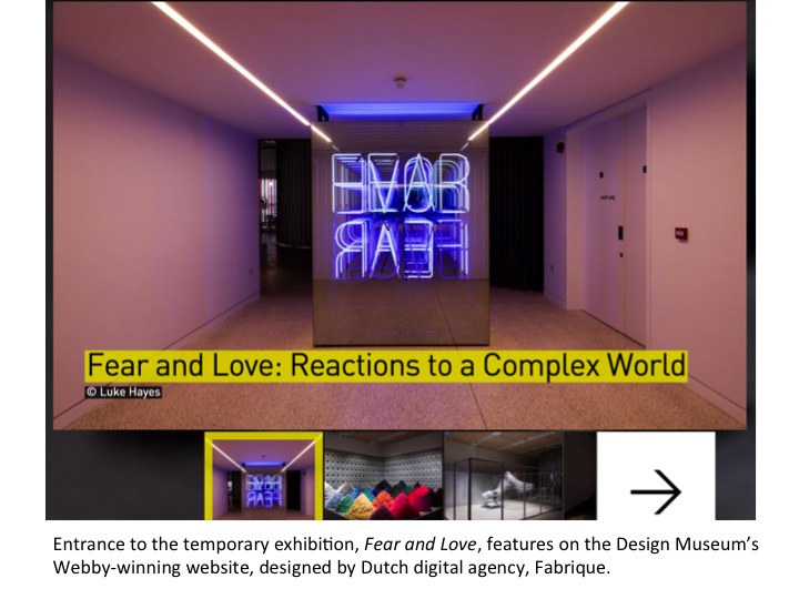
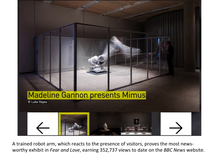
Keeping the ambitions of the Director in mind, let’s consider the opening ‘blockbuster’ exhibition, Fear and Love: Reactions to a Complex World; its stated aim being to ‘provoke the viewer to think’. The exhibition constituted an immersive environment featuring 11 installations created by designers working across a range of disciplines, from architecture and fashion, to graphics, product, robotics and urbanism. Chief Curator, Justin McGuirk suggests that as design is ‘bound up with the many pressing issues of our day’ it is as much a ‘cause of fear’ as love. When interviewed, McGuirk describes the exhibition as accessible and meaningful, as communication, while playing with ambiguity. Subjects covered include, sex, death, migration, waste, artificial intelligence, globalization…the big stuff!
Within the Museum, the exhibition was discretely signaled with an entrance off the main foyer that channeled visitors past the neon title signage and through a small opening. As a temporary exhibition it required a ticket purchase, so in effect was behind a ‘pay wall’. By contrast, the huge open atrium of the newly renovated building encourages spontaneous wandering and leads the visitor to the top-most floor where a permanent exhibition, Designer, Maker, User presents a series of thoughtful narratives to explore ‘the development of modern design through three interconnected roles’ using objects from the Museum’s collection and interactive devices. The Museum hopes to attract 300,000 paying visitors a year, to view its temporary exhibitions, alongside 350,000 free visits; which is more than double its previous attendance.
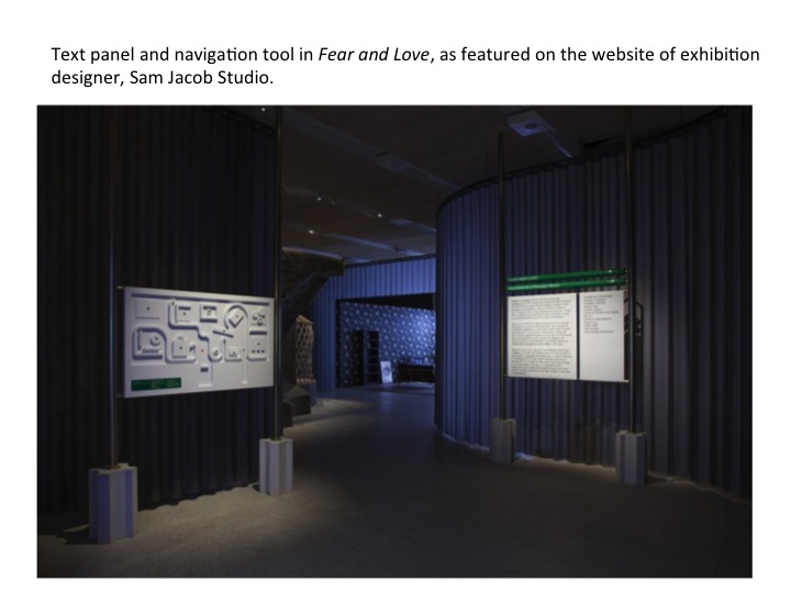
Exhibition Designer, Sam Jacob of Sam Jacob Studio, tells us on his company’s website that he took ‘mystery’ as his jumping off point to produce an installation the describes as ‘soft baroque’ that could be interpreted as both luxurious and foreboding. The enveloping fabric, a meticulously draped, dark grey wool supplied by the contract textiles company, Kvadrat, leads the visitor through an undulating route. Although the exhibition inhabits a visually subdued space, it extends beyond the physical into digital and print media where graphic elements provide another layer of information; the Museum’s website features each of the installations with links to the featured designers’ websites, and collates media coverage, including a segment from BBC News alongside sound-bite endorsements.
When asked how he selected the designers to be featured in the exhibition McGuirk explains: ‘the defining factor was wanting designers who produce critical work and were up to the task [of making a] practical, financial and time commitment’ over the course of a year. Presented with an open brief and asked to tie up substantial personal resources in the project, some early negotiations failed, and so a degree of self-selection is evident in the fact all of the contributors have attained a degree of professional success that enables them to make such a commitment.
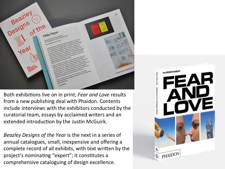
For me, the effectiveness of this exhibition must be questioned due to one particular indicator; the lack of visitors in the gallery especially in comparison to the rest of the Museum, which, in the first weeks after the reopening was very busy. It raised the question, what was putting people off? The ticket price perhaps; why buy a ticket to see a temporary exhibition when the rest of a brand new Museum is available to see for free? Perhaps it was the difficulty of the subject matter, or the level of abstraction; we might question, did visitors recognise this as design? Within the exhibition, the message, the communication, the interpretation (as MacLeod defines it) seemed lost in two ways. Firstly, the darkness of the space created an atmosphere that was less conducive to curiosity, to reading the interpretation, than to simply experiencing he immersive environment, which hovered between mysterious and oppressive. Secondly, the materiality of the installations worked against the interpretation. The installations attempted to replicate or simulate real world scenarios that I would argue were too complex to re-stage; the simplified facsimiles were unable to represent the complexity of meaning inherent in these projects. Also, both the installation and the low light levels effectively isolated the exhibits; if interpretation is as much about the interplay of juxtaposed objects, the display, the gallery, and the building, as it is about labels and wall text, then these islands of exhibits were denied that connectivity. And where McGuirk suggests that the catalogue is not essential to understanding the show, I would disagree; after reading the interviews and explanations in the catalogue I had a much greater understanding and appreciation of each project. So, the ‘other media’ relating to this exhibition (print and web) function as interpretation beyond the exhibition space and compensate for the difficulties of the physical space.
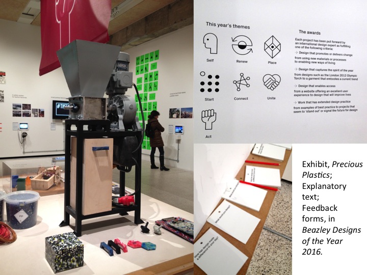
By comparison, Designs of the Year, the review show now in its ninth iteration, presents new (created in the previous year) design objects and projects across all design disciplines, amassed through an international selection process. Perhaps this is the contemporary manifestation of Stephen Bayley’s definition of design curation as ‘Three-Dimensional Journalism’; if you haven’t read a magazine or looked at a blog or all year, you can visit this show and see a comprehensive range of ‘real world’ projects nominated by an extensive network of design professionals – practitioners, academics, curators, critics and journalists – and selected by a panel of experts. The job of curating this diverse material into an exhibition is rotated between the Museum’s curatorial staff; for the last three years, Senior Curator, Gemma Curtin has been evolving the displays, installations and interpretation. In an email interview she mentioned the ‘layering’ of interpretation, which includes editorialising ‘headlines’ and catchy descriptors. The 75 projects are grouped by themes but the presentation of each is considered individually; some require multiple elements, a more elaborate ‘build’, or contextualising drawings and models to explain the design process. Curators and exhibitors communicate to produce a presentation for each project that is in effect collaborative. When asked if interpreting models and technical drawings might be beyond the expertise of the general public, Curtin suggests: ‘Even if complex plans or models can’t be fully understood, they represent process, and someone’s time, effort, care and attitude. These elements express that decisions are always being made and that there isn’t any inevitability to outcomes’.
Previously, audience surveys have revealed that unique among museums the Design Museum attracts a high percentage of design professionals who embody specialist subject knowledge, around 70% of its overall visitor numbers. That concentration of expertise and expectation of the new Museum’s exhibits will be diluted, if, as aimed for, the Museum more than doubles the size of its audience. Such a shift in the constitution of its audience is something the Museum must address, if it is to broaden its interpretive strategies without forfeiting it core constituency. To cater to diverse audiences at any one time will require that the Museum programming offers a number of approaches, across the range of experiential, educational, experimental, thematic, theoretical and historical.
In an email interview, Alex Newson, another Senior Curator who has also worked on Designs of the Year, reveals that the team has been reviewing the format, with the plan to evolve change, but with the aim of retaining the accumulated ‘brand understanding’ of this successful show. He explains: ‘Nothing should ever be considered perfect or sacrosanct and we seek to make improvements – big or small – to all our exhibitions’. Because of the move to the new building, it was decided to keep Designs of the Year as a familiar fixed point of reference for returning visitors, but now Newson acknowledges, with the Museum’s ‘enhanced aims and objectives’ the show should become bigger and better. After considering a new format that would ‘give a deeper dive into a smaller number of designs’, the team decided that the strength of the show is in the quantity and range of exhibits, and that the ‘deep dive into process’ is covered elsewhere in the Museum’s programme.
For me, the effectiveness of Designs of the Year is in its ability to reflect the true complexity of contemporary life, and within that diversity, to highlight a trend or capture the zeitgeist. While Sudjic sees the Museum as going ‘future forward’, Curtin’s work on Designs of the Year has afforded her insight into the current preoccupations of contemporary designers, which display a nuanced vision of the future. Curtin is noticing a ‘greater engagement with world problems’; designers working for ‘cleaner water, purer air, less pollution and reduced waste’; a new seriousness in response to world events; and a revival of past techniques, which she recognises as ‘less futuristic’. The notions that progress with come through technology and that growth and wealth creation is the ultimate aim of design is called into question. So, already, within the pristine newness of the Design Museum’s iconic building, the seeds of what MacLeod calls positive ‘contradiction and opposition’ have been planted, principally by an exhibition that combines a decade-old format with up-to-the-minute real-world content.
When experiencing the exhibition in the gallery, and reviewing photographs of the space, two points can be made. Within the themed areas, and across the curated themes, connections between exhibits, facilitated by long views through a succession of spaces within the gallery, create interesting juxtapositions and visual connections between exhibits. This visual echo reinforces Curtin’s perception that certain shared attitudes are present and can be identified. Also, in contrast with Fear & Love, the materiality of the Museum is present in this gallery, in a seemingly unadorned state; structural columns, ceiling, walls and floor appear to be ‘as found’, and the palette of what might be described as ‘elemental’ materials – concrete, wood, plaster, steel – creates a sense of oneness and openness simultaneously.
The fact that the Design Museum chose to stage such contrasting opening exhibitions; the old and the new; the familiar and the strange; the immersive blockbuster versus the comprehensive review; points to a diversity of approaches that can engage different audiences using meaningful and challenging content, whether you like your design ‘critical’ or ‘off the shelf’.
Finally, the role of published content within this mix of approaches, also in a range of formats and at various price-points, extends the means by which curators add interpretation to exhibits, and provide a thread back to the exhibition long after the display has been demounted. The Museum signed a deal with the visual publisher, Phaidon, six months prior to opening, with the aim of inhabiting a space within the Museum that can be used for promotional activities, and while the bi-annual ‘blockbuster’ exhibitions are guaranteed to be accompanied by a published catalogue. The longevity of online pages relating to exhibitions is more precarious and the shortcomings of archiving websites and retaining micro-sites will be explored in my thesis.

