Vitra Schaudepot
Vitra Design Museum
Charles-Eames-Str. 2, Weil am Rhein, Germany
Visited, 31 May 2016
I used to go on press trips so regularly that I thought I didn’t need holidays. Travelling on planes and trains across Europe, America and further afield I visited designers, studios, factories and museums. Having swopped my peripatetic lifestyle for a more sedentary teaching gig, this press trip came out of the blue. I previously visited Vitra for a MUSCON conference (read about it, here) and marvelled at the Vitra Haus (read, here), so was aware of the upcoming addition to the extraordinary campus and keen to see the Schaudepot (Open Storage), a relatively new development in museum practice. A return visit wasn’t on my agenda though, so when this invitation popped into my inbox along with a commission to review the Vitra Collection’s new home, I was up for it! My article appeared in Blueprint magazine (no.347, p.36) and is available online at Design/Curial, here. This post adds details from the press conference and a conversation with Curator Janna Lipsky.
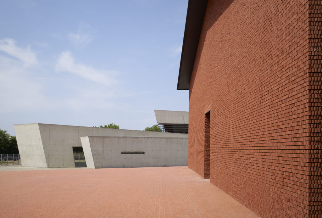
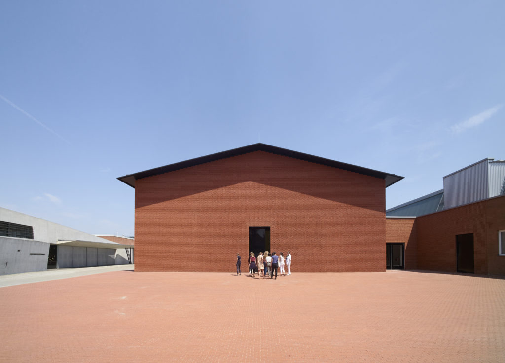
On the Vitra Campus, the Schaudepot next to Zaha Hadid’s Fire Station. Photo © Vitra Design Museum, Julien Lanoo
The press conference, held in Zaha Hadid’s Fire Station (now an events space), was packed with European journalists, eager to hear Mateo Kries, Co-Director of Vitra Design Museum, chair the panel of client and architect. Rolf Fehlbaum, Chairman Emeritus of Vitra, and Jacques Herzog of Herzog & de Meuron (H&dM) discussed the process of bringing the Schaudepot into existence. At such events the role of museum personnel may be glossed over, reinforcing the orthodoxy of starchitect as museum maker, but it was interesting to hear how, in this case, the architect’s outside the box thinking, endorsed by a client who values such expert opinion, transformed the ambition of the project and resulted in a building able to fulfil multiple functions, which is both pragmatic and graceful.
Mateo explained how, since it opened 1989, the Vitra Design Museum building by Frank Gehry has been used for temporary exhibitions, establishing the Museum’s international reputation for design research. But there was no space to display the collection. Initially, the Vitra Collection numbered 100 pieces, by the mid-1990s it held 1,800 pieces and now stands at 20,000 objects and 100,000 archival items. With serious concerns about the special challenges of conservation and the lack of climate control, in 2011 when Mateo and Co-Director, Marc Zehntner took over, accessibility was made a priority so that the public could see the collection. Rolf had the idea of creating a space for simultaneous storage and display. With the addition of a conservation lab, research workstations, educational spaces, a second shop and cafe, the Schaudepot doubles the size of the Museum, creates a new focus at the opposite end of the campus and connects to transport routes into Weil and Basel.
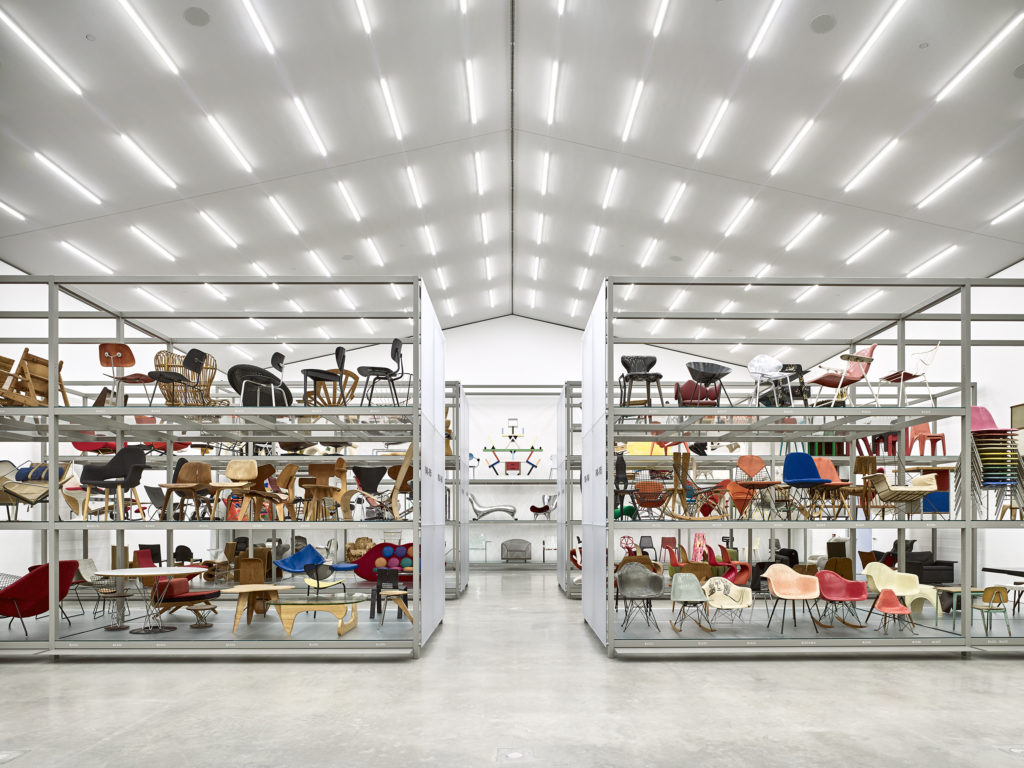
Interior, with permanent display of over 400 exhibits from the Vitra Collections. Photo © Vitra Design Museum, Mark Niedermann
Rolf offered insights into how the collection was built, with the disclaimer that ‘I never thought there would be a collection’. Back in the early 1980s, he admitted to feeling ‘a bit bored’ and wanted ‘to learn more about our activity, which is furniture design’. He begun buying pieces ‘that I loved’, mainly by Charles and Ray Eames, Alvar Aalto and Jean Prouvé and put the objects around his office, so that ‘everyday I was delighted to see them’. But his colleagues were confused about what was vintage and what was a prototype, and at one point an Aalto chair was destroyed by an ungainly sitter, so the need for ‘a space’ was addressed. Rolf asked Frank Gehry, ‘would you do a little shed for this collection?’ The Museum was sited in front of the new factory and working with the founding Director, Alexander von Vegesack, the collection grew to encompass the ‘whole spectrum of design from around 1800 until today’. Although the collection wasn’t on public display it functioned as a study collection, providing inspiration for Vitra’s designers, especially when re-editioning vintage designs by Prouvé. In 2011, a storage shed for steel, the ‘stahllage’, was moth-balled and the plan to convert it into a Schaudepot, with the addition of a basement, was hatched.
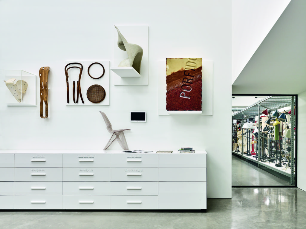
In the basement, with views into the climate-controlled store rooms. Photo © Vitra Design Museum, Mark Niedermann
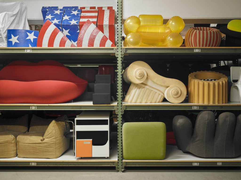
Objects will rotate from the extensive collections, stored in the basement, into the permanent exhibition. Photo © Vitra Design Museum, Florian Boehm
Jacques recalled that the industrial building was to be used because of its previous function as a store. The architects picked up on Rolf’s mood; he was “tired of these iconic architectures’, so they shied away from a signature building; ‘being a depot, an archive…the object should be in the foreground’ and the building look ‘authorless, timeless…a normal building without being boring’. Another organising factor was the need for a simple interior to accommodate transformation, ‘because in five or ten years…the curators want to use it for different purposes’.
Rolf recalled how Jacques embraced the idea of simplicity but then suggested ‘couldn’t we do half of the building on one floor, then open the floor and look down and see the whole collection. That was not the most practical idea, but it opened our eyes to something very important, that what you see there is a small selection of a much wider collection’. That spatial arrangement became a metaphor for the vastness of the collection and the mostly-hidden nature of archives. The theme of transparency was taken over into the café, with views into offices and labs, revealing the activities of a design museum.
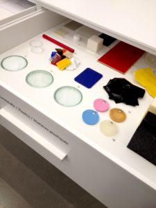
Mateo explained how his curatorial team will use the building. Having sight lines from the ground floor into the object store provides context for the displayed selection of 430 objects and ‘helps us to explain that this is a deliberate choice…a combination of known icons and hidden treasures, some unseen things, between the experimental pieces and the popular pieces…because we did not want to present a simplistic version of design history, pretending that those 400 modern pieces are the icons and the rest is less relevant’. As the campus buildings are not isolated icons neither are objects in the collection. The aim is to question definitions of design, highlight artistic dialogues between designers and artists, tell stories with objects and show process through the materials library. The 430 objects in the main hall co-exist with a compact temporary exhibition space, where curators present a different take on the collection, while the permanent exhibition changes at a slower pace. Combined with the main building the Museum can now stage nine exhibitions annually, supplemented by a programme of talks and debates. When questioned, Jacques stressed the importance of the raised piazza in front of Schaudepot; with a view of Zaha’s Fire Station it becomes an outdoor events space, echoing forthcoming museum redevelopments including MoMA’s open foyer and the V&A’s porcelain-clad ‘hub’. These liminal spaces extend the threshold of the museum, meshing the institution with the urban environment to provide an open place for exposition and entertainment.
Mateo ended with ‘a last very essential thing’, mentioning the Museum’s new digital catalogue, a supplement to the short labels in situ. ‘We did not want to disturb the character of a storage display, which usually doesn’t have much text, so we put a lot of background information, designers’ biographies and images, into a database’, accessible within the space via smartphones and the ‘Vitra Hotspot’, and at a distance through the Museum’s website. Essentially an online catalogue for the collection, it’s an important teaching and research tool and links to an ambitious publishing project, an Atlas of Furniture Design, to be launched in the autumn.
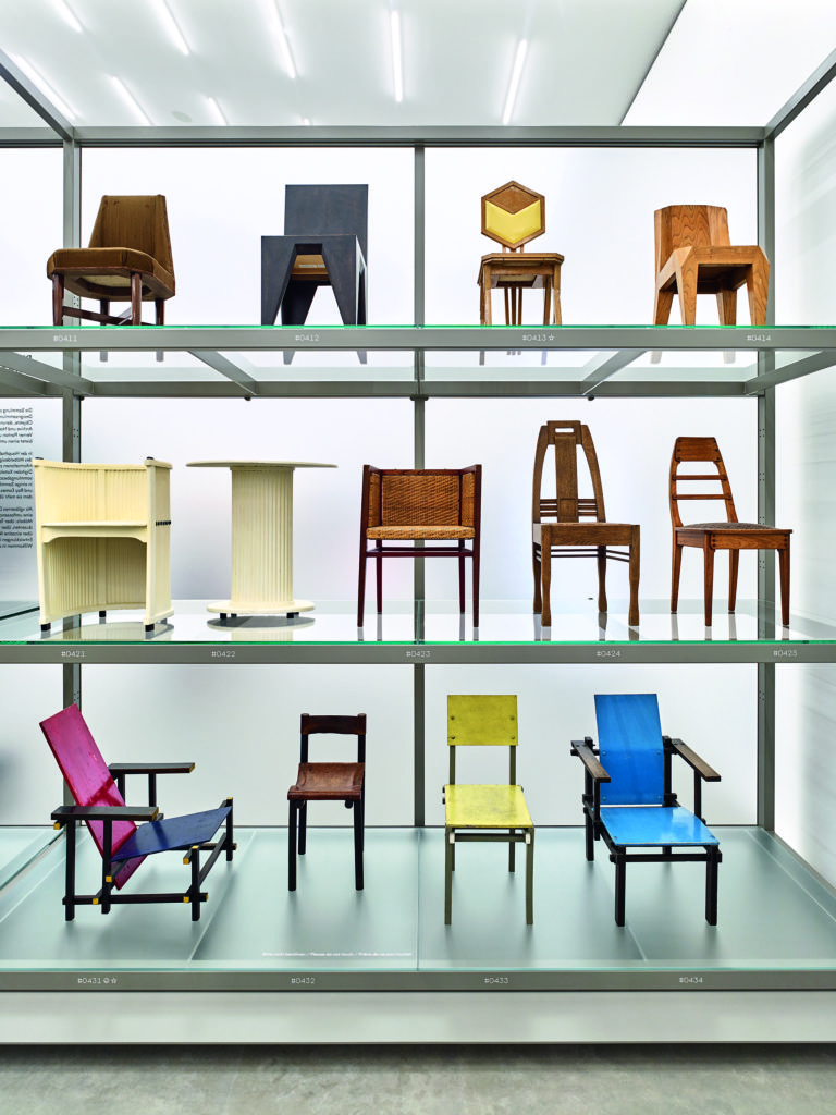
Neutral interior and minimal interpretation allow for multiple views of exhibits and unexpected alignments. Photo © Vitra Design Museum, Mark Niedermann
Curator Janna Lipsky revealed more details about the upcoming book. Documenting more than 2,000 objects from the collection, the Museum’s curators worked with a dream team of experts on what will undoubtedly be an invaluable resource for the history of modern and contemporary furniture design. The book’s lengthier chapters have been extracted for the online texts, while original photography reveals the individual character of every object. Janna explained the process of constructing a ‘family tree starting from 1800 to today’ by putting objects from the collection ‘on a big map’. ‘In the racks a kind of narrative develops and…each shelf is a history in itself’. For example, from bentwood furniture by Thonet, and Adolf Loos’ collaboration, ‘the first kind of architecture chair’ emerges. Beyond the iconic objects often seen in design publications this selection will include the roots of ideas, in the form of chairs that sparked the later developments we’re more familiar with. This ‘design archaeology’ highlights innovations in materials and techniques, and a handling collection within the Schaudepot offers visitors a way to understand more. Janna is confident that the display will never be static, as the space creates new narratives through juxtaposition, and the curatorial team continues to collect. As if to prove her point, we wandered around the display, finding unfamiliar treasures and old favourites, revealing connections and prompting comments on scale, construction, colour, texture, patina and wear.

Drawers hold teaching and handling objects, including samples and components. Photo © Vitra Design Museum, Mark Niedermann
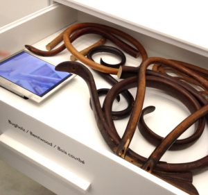
Myriad materials; furniture design has always been at the cutting edge of new technology, from steam-bent wood…
Initially, Frank Gehry’s Museum building was intended to house a private collection of chairs. Back in 1989 that first display was opened to the public on a temporary basis, but the appreciative audience wanted more and the iconic building became a public museum staging changing exhibitions. Since then the success of the Vitra Design Museum has transformed the Vitra Campus into a cultural destination, and now that the Vitra Collection is back on show it also offers a unique source of inspiration and innovation in an unrivalled collection of designed objects. Once again the Vitra Design Museum’s rationale has realigned, with an additional focus on its roots and the space to grow.
Thank you to Vitra and Caro Communications for inviting me to the press conference.

