IKEA Museum
IKEAgatan, 5, 343.36 Älmhult, Sweden
ikeamuseum.com
Visited, 9 June 2016
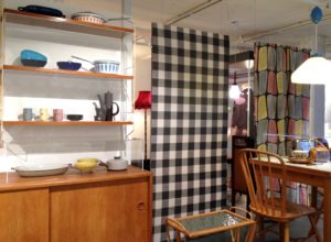
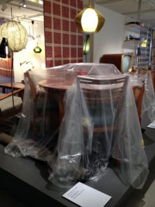
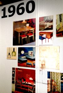
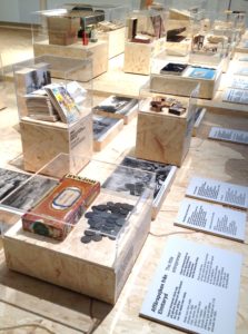
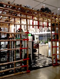
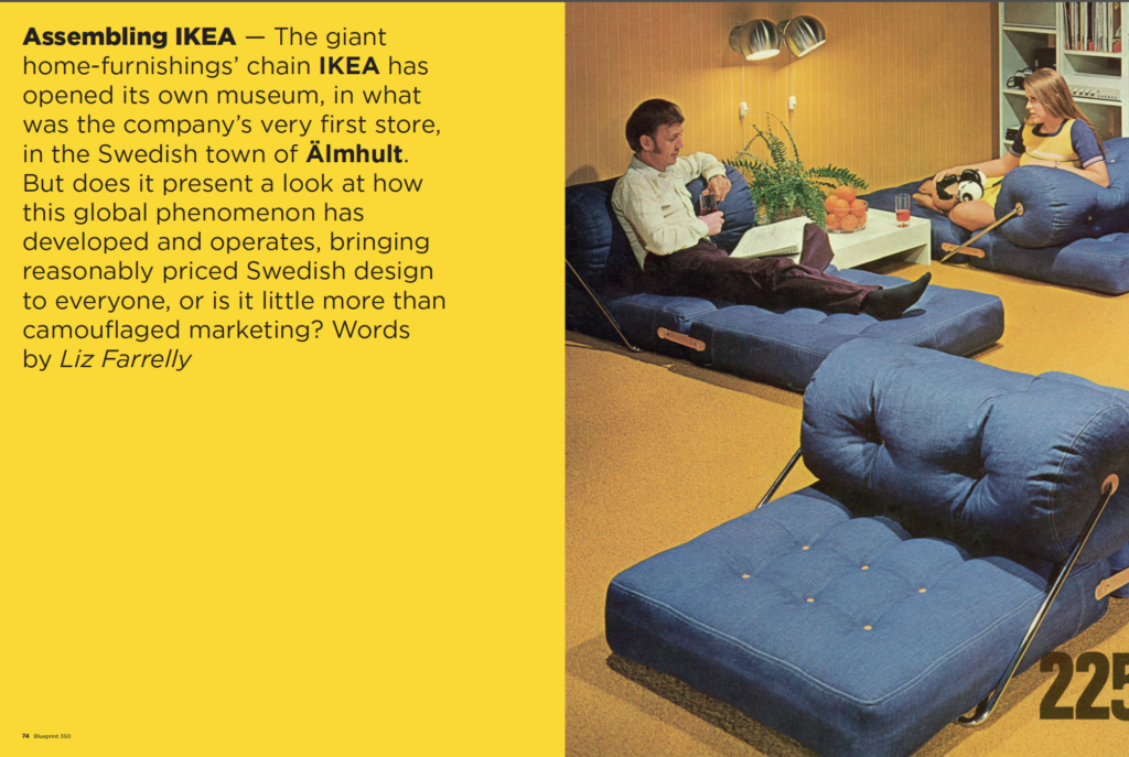
Invited to the Press Preview of the new IKEA Museum, I travelled to the company town of Älmhult in southern Sweden. Later I wrote an article about the Museum for Blueprint magazine, issue 350, also available on the DesignCurial website, here, illustrated with official photography supplied by IKEA. In contrast, this “show and tell” gallery consists of photos I took during my visit.
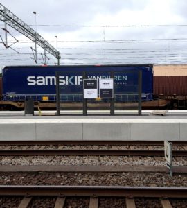
Travelling from Copenhagen Airport to IKEA’s Swedish headquarters is hassle-free as the rail network flows seamlessly from Denmark to Sweden, crossing the bridge immortalised in so many tales of Swedish Noir. Arriving at Älmhult station there was no wayfinding for the Museum, just a poster, so I walked around the still sleepy town looking for signposts, literally…you know it’s a company town when every exit off a roundabout leads to IKEA…
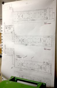
Finally on campus, I found the Museum building restored to pristine white render. Originally the first retail store, a new flagship has opened across town freeing up this building for re-use. In contrast to the architecture, the landscaping and interior were still “in progress”. With the press view a week prior to the official launch it was difficult to judge the niceties of the visitor experience as the entrance, shop, cafe, parking and pedestrian route to the campus still required final finessing.
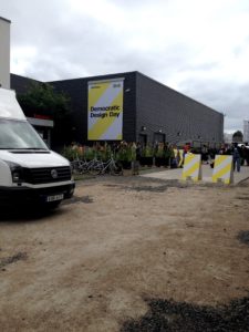
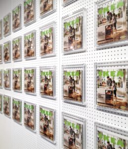
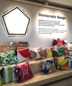
Interestingly, journalists invited to the Museum, which aims to tell the “brand story”, were separated from another press event on the same day, presenting seasonal trends in the form of IKEA’s “Democratic Design Day”. That segregation may be due to organisational divisions within the management of IKEA but it showed up a significant gap in the Museum’s offer. Apart from a few wall graphics, mainly in the form of inspirational quotes from the company’s founder, information and stories about IKEA’s vast and impressive infrastructure, which operates on a unique scale, spreading IKEA’s brand experience around the world, is conspicuous by its absence. Instead, the IKEA story pushes a Swedish version of local, small-town values, i.e. hard work and learning from your mistakes will bring success. The logistical miracle, which so many fans are in awe of, is hinted at through displays showing IKEA’s global reach, for example, the diverse language versions of the catalogue. Displays of multiples hint at the scale of IKEA but stop short of presenting facts beyond the soundbite.
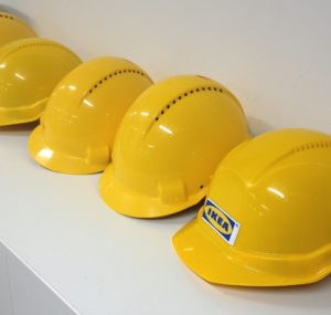
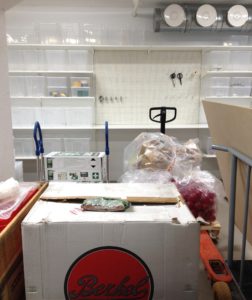
The journalists’ tour began at the service entrance and revealed that behind the scenes of any museum IKEA products could come in very handy! We entered at the end of the narrative “route” and were walked through the three sections – Our roots, Our story, Your stories – dealing with the company’s origin story (informed by the thrifty habits of southern Sweden and seeped in the cult of personality), IKEA’s worldwide growth, and (a little bit of) how IKEA now features in contemporary culture. It’s not clear, however, if all the objects included were originally sold by IKEA or are simply “merchandising” the set pieces. Contextual images are not captioned; were these images from early advertising or shots of products in stores, and is that depth of information deemed unnecessary for the Museum’s audience?
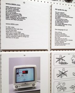
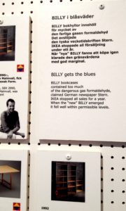
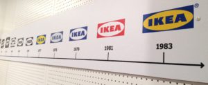
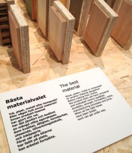
The exhibition design and displays suggest that the Museum intends to be a more dynamic environment than could be demonstrated on a one-off tour. Particle board and peg board are used throughout, suggesting that displays may be reconfigured, although an over-arching time line proceeds through most of the Museum presenting a progressive history by foregrounding change, of the logo, catalogue, products and stores.
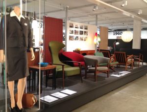
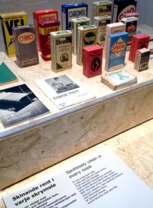
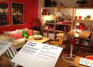
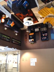
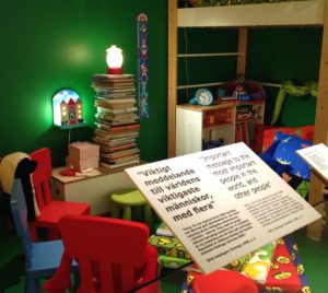
Various styles of installation and interpretation modulate the pace of the displays, though, and alter the visitor’s mode of engagement. Vitrines of historical material including ephemera, mementos and vintage objects demand close attention. Room sets recreated from catalogue pages conjure up nostalgic voyeurism, as if we’re looking at our past selves. A room of the 1970s is suspended from the ceiling, perhaps for the “wow” factor? Label texts reprint copywriting from the appropriate catalogue, but the tone of voice jars as it is more prescriptive than is usual in curatorial interpretation.
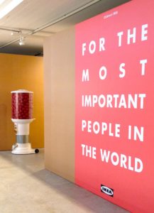
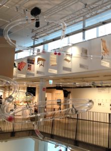
The Museum is peppered with slogans writ large, presenting key messages. Interactive games and stage sets prompt active participation, while an overhead track spirits posters of iconic objects through the space, reminiscent of a factory production line. Areas used for demonstrations, play and events evoke some of the energy of the design and production process and a fascination with materials, but again, the more complex stories are left out.
During the visit I thought the Museum looked empty and wondered if fans would be disappointed by the paucity of objects on show. But fill the galleries with visitors and the generous spaces will be welcome. Looking at these photographs now, there is a richness and playfulness to the displays that is informed by retail merchandising. The question is whether visitors will feel as “at home” and free to interact with the exhibits as they might in an IKEA store. Ultimately, though, the interpretation of the exhibits is confusing as it does not speak with the impartial authority or informed and informing remit of curation. Instead, the cult of personality and the propaganda of sales speak louder. Nowhere was this more clearly demonstrated than at the end of the Press tour, in the entrance to the Museum. After sitting through an excruciatingly moralising mood movie (I don’t know what else to call it) we encountered a message from IKEA’s founder; looking like the opening page of an annual report it speaks too clearly of crass commercialism. This is what visitors will see first, even before the shop.
On closer inspection, the octogenarian entrepreneur dissolves into a sea of faces, presumably of IKEA staff, a visual device used in an earlier advertising campaign. IKEA’s global workforce is an important audience for the Museum, which will be used for staff training, to impart the brand story and Swedish values to lucky individuals who earn themselves a trip to HQ.
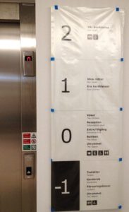
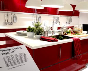
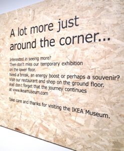
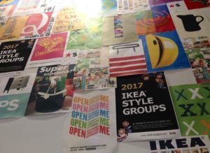
A final message reminds visitors that, beyond the curated spaces, the Museum has much to offer in the way of eating and shopping. Sadly the Press weren’t able to sample these experiences as both areas were building sites. The cafe boasts an impressive poster wall of IKEA communications, again hinting at but not exploring the marketing and advertising expertise that so successfully sells the brand worldwide. Downstairs, in the temporary exhibition space, spontaneity was evident in the display of the opening show about future kitchens. An example of canny reuse, the exhibition originally represented IKEA at the 2015 Milan Furniture Fair, featuring concept kitchens commissioned from leading designers. That it may now be enjoyed by customers and staff who could never visit the furniture industry’s high-profile trade fair is a plus; it also hints that temporary programming might rely on the largess of IKEA’s well-funded marketing department. The exhibition includes a new product too, IKEA Hacka, a flexible kitchen system that “makes it easy for [people] to ‘hack’ it to their unique needs and style”. Such an initiative both acknowledges and encourages the customisation of IKEA objects. However, there is no mention of the protracted legal battle with hacking practitioners and websites, or the eventual realisation that hacking may be a boon to IKEA, proof of the extraordinary engagement of a customer base that tips over into fandom, and a way of crowdsourcing product improvements.
My final take away is that more complex stories need to be told about the world’s biggest manufacturing and retailing brand. Much of that information can be found on the company’s website, but it has yet to cross over into the real world of the Museum. That would require a mix of objects, graphics and audio-visuals combining material evidence with conceptual ideas without condescending or over-selling. However, presenting such complexity on the public stage of the Museum, rather than consigning it to realm of digital ephemera, might be too much for a company that prefers to downplay its power. Meanwhile, read Sara Kristoffersson’s Design by IKEA: A Cultural History (Bloomsbury Academic, 2014) for a critique of IKEA’s marketing strategies.
Read “Assembling IKEA” by Liz Farrelly in Blueprint, no.350, 2017, pp.74-86; the opening spread shows the cover of the 1973 IKEA Catalogue.
All other photos taken by me, using my Apple iPhone 4S.

