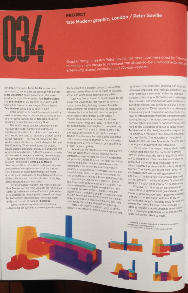
From digital to analogue, consider this a signpost to a printed, published article in Blueprint, issue 345. After interviewing Peter Saville, reading Tate Modern press releases, navigating official webpages and searching the media coverage, I wrote a review of an image created by Saville and team that was commissioned to accompany communications about the extension and renovation of Tate Modern, aka “New Tate Modern”. Eventually the image will be incorporated into a revamped identity for the entire Tate empire.
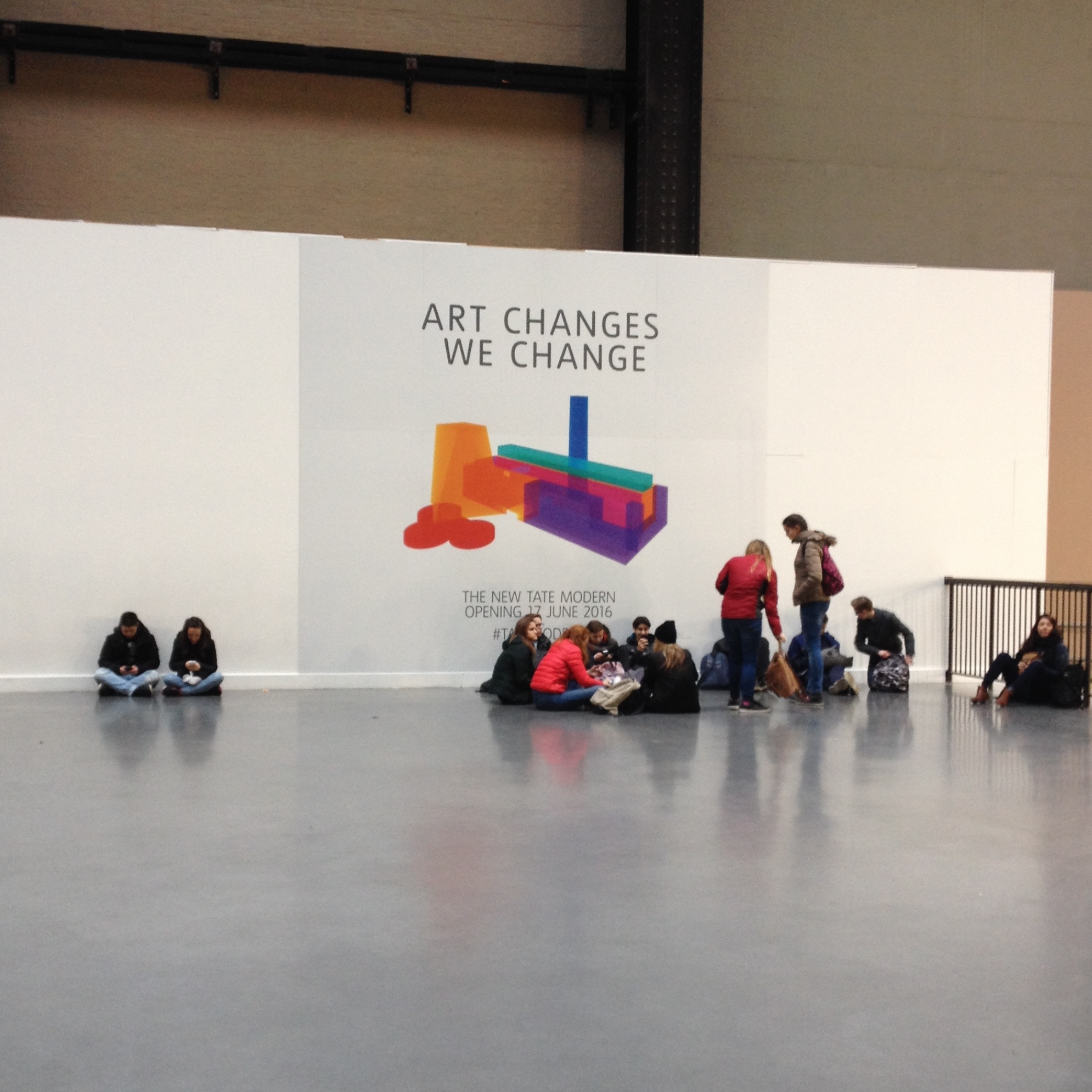
The next time I was in London, I popped into Tate Modern to find a museum open for business but not quite business as usual. A vague air of neglect invades an institution that is busy reinventing itself; so much energy is being expended behind the scenes that the public face temporarily atrophies under the unbearable “wait” of anticipation. On site, as the external building works loom large and punch into the museum’s public spaces, witness closed off areas and signs of activity disguised by placeholder billboards, Saville’s image, “Multicolour TM” (according to the accompanying credit), is present and correct, reproduced big and static.
Look to the article in Blueprint for Saville’s eloquent explanations and my descriptive additions. My final thoughts on the New Tate Modern image focused on its potential mobility. Created using 3D software, the translucent, colour-block model can be viewed any which way; animation is inherent in its code and it just needs a push start. An interactive version on a giant touch screen, or a gem-sized rendition in a mobile app, would give visitors something to play with and exploit the informational potential of an image that doubles as a simplified though accurate way-finding tool. When New Tate Modern opens in June, fans of the world’s most popular art museum will encounter a vastly extended and re-purposed venue and may feel a little lost. But rather than let Saville’s image play its part to the max, even now on Tate’s website, a saccharine “ad” takes pride of place, promising Tate-flavoured entertainment.
I wholeheartedly agree that museums are about more than objects and cabinets and collections and archives, and people use cultural institutions for a wide range of activities, and acknowledging this means museums better serve their communities. But there is a fine line between facilitating audience participation and failing to understand that museums must continually demonstrate their uniqueness beyond being a nice day out or an “ace café” with something a little different on the wall. That Saville’s image exists shows the museum to be capable of creative commissioning, testing the boundary between design and art, but the image is yet be used to its full potential, in public and by the public, and so Tate is missing a trick. The point is to surprise, challenge and wow, and Saville’s image, on the move, will do that.
 Blueprint, no.345, p.34.” width=”584″ height=”909″ class=”size-large wp-image-1390″ /> Article from Blueprint, no.345, p.34.

