Design Since 1945
Permanent Display, Room 76, Level 3
Victoria and Albert Museum
Cromwell Road, London SW7
www.vam.ac.uk
Visited, 27 August 2015
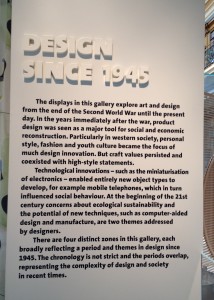
The other day I popped into the V&A for a quick refresher. It was a busy weekday near the end of the school holidays, and while there were queues outside the Natural History Museum and the V&A’s ground floor galleries were full of bodies, the upper floors were relatively quiet. I took the opportunity to see how the permanent display of contemporary design might have evolved since I last too a look (not sure when that was). On the V&A’s website the Design Since 1945 gallery in Room 76 (one of three rooms labelled “Modern” on the Museum Map) is described as showing art and design from the end of the Second World War to the present day; it also aims to present contemporary developments.
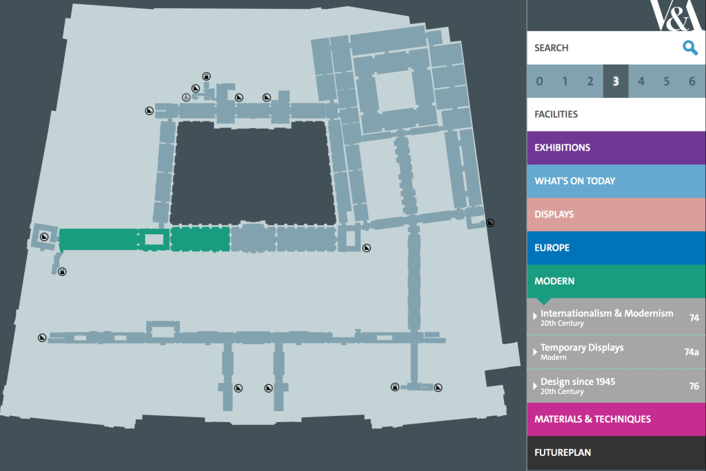
Screen Shot from the V&A website of the online, digital map, showing the Modern galleries on Level 3
Text on the webpage foregrounds the evolution of design describing it as multifaceted, a tool for economic and social reconstruction, encompassing fashion, style and youth culture, incorporating craft values, and linking design to “innovation”. Two themes are mentioned – technological innovation and environmental sustainability. These have “influenced behaviour” and are “addressed by designers”, the implication being that designers have the power to influence. Finally a chronology is layered over the top, with the gallery split into four overlapping periods. And while only two themes are mentioned in the online article (which is unsigned) the selection of objects in the gallery presents a more nuanced and complex narrative. From tableware redolent of nostalgic domesticity, to iconic pop accessories and sinister “black box” electronics, the gallery bristles with ideas, prompting multiple trains of thought. And, because the space is quite serene (off the beaten track, a cul-de-sac in fact), this is a room where a visitor can think.
I remember my first visit to this gallery when I enjoyed seeing some familiar objects relocated from a previous 20th-Century space, the long, narrow gallery perpendicular to Room 74a (more of a corridor really, now closed off). Room 76 is grander, with a high ceiling and windows overlooking the V&A’s courtyard. Originally part of the National Art Library, its panelled walls and book-lined mezzanine echo the public areas of the Reading Room, which are just the other side of locked double-doors. I was shown around the gallery by Gareth Williams when I interviewed him for a “Profile” I was writing for Design Week. I didn’t tape the interview (transcribing eats up short journalistic deadlines), so we walked and talked as I scribbling quotes. Here’s a [slightly reconfigured] extract…
Design Week, 16 April 2009
‘Profile: Gareth Williams’
“After an academic education that mixed English, Drama and Russian Studies, the latter inspired by a love of Constructivist architecture, Williams joined the Victoria and Albert Museum 18 years ago as a curatorial assistant. ‘I was interested in the design of everyday life’, he explains, ‘not the art world’s gallery system’. Moving to [what was then] the Furniture Department, he worked alongside Christopher Wilk [Keeper of the renamed Furniture, Textiles and Fashion Department] who he describes as ‘a supreme teacher’. Williams carved out ‘a nice corner of my own making’; his role being ‘to interpret the collections in our care’. That entailed staging exhibitions, writing catalogues, contributing research to books and journals, acquiring new objects for the collection, and keeping ahead of the game in contemporary furniture and product design.
[Is it by default that product design comes under the remit of the same department as furniture; perhaps because certain practitioners design both?]
Williams’ highlights at the museum included the exhibition Milan in a Van (22/4-9/6/02), which entailed a team of curators raiding the Milan furniture fair, sticking the best bits in a truck and unpacking their finds back at the ranch. Even if you’d been in Milan, this insider’s view was a rare treat. More recently, he was involved in the year-long refit of the West Room [aka Room 76], a spectacular space previously housing dusty National Art Library offices. The new installation features post-war design, arranged thematically, exploring craft, technology, consumerism, media and more, with rediscovered highlights and newly acquired pieces, from Fornasetti, Memphis and Droog.”
Excuse me for jumping from past to present and from gallery to website, but my aim is to explore the Museum in three ways: on site, using media reviews and via the institution’s online presence.
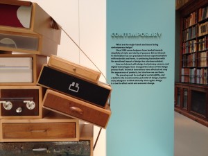
Back in Room 76, those named pieces (Fornasetti, Memphis and Droog) are still on display and although the gallery crosses the “materials” division, featuring ceramics, glass, textiles, products and graphics, it’s the furniture that stuck in my mind. Looking for more examples of contemporary furniture, the Furniture, Textiles and Fashion webpage on the V&A website, tells me there are 14,000 pieces of furniture in the V&A collections. Aside from Room 76, more furniture, including contemporary, can be found in the Dr. Susan Weber Gallery (29/11/12), where “200 outstanding pieces” tell a 600-year history of furniture, alongside digital interactives that cross-reference materials and techniques. Putting aside the fact that this new gallery is known by an individual’s name (in the style of US sponsorship) and doesn’t mention the word “furniture” in its title, it can be an issue. Search for it on the V&A’s website and four articles pop up, but none include the room number, i.e. the gallery’s location within the Museum. Increasingly, museum visitors are encouraged to use smartphones to access additional information while in the galleries, and the V&A offers free Wi-Fi, but using your gadget to navigate “real space”, to find the Dr. Susan Weber Gallery for example, requires cross referring to a map. More furniture pieces (presumably some contemporary) are kept in storage at Blythe Road (also home to the V&A Archive), but to see those requires an appointment.
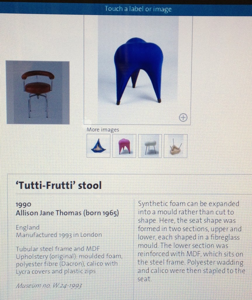
The interactive, on-screen labelling system in the Dr Susan Weber Gallery, showing examples of 20th-Century furniture, during a visit on 10/12/12
Scroll down the FTF webpage and the furniture collection shrinks to 13,000 objects (discrepancies!) while the weakness of the modern/contemporary collecting is admitted. “Our international 20th-century holdings are uneven but are rivalled by perhaps only one other institution (the Vitra Design Museum). They are extensively used by students and scholars”. Such a claim ignores other substantial furniture design collections in institutions across Europe – Paris, Ghent, Trapholt, Zurich, Munich, Berlin and Vienna. For a detailed list of design collections held in art/design/decorative arts museums see Design Museums of the World; invited by Die Neue Sammlung Munich (2003).
That single mention of “contemporary” on the FTF webpage doesn’t extend into the 21st-century, but the same webpage mentions the “online museum”. Using “Search the collections” opens a portal to the Museum’s digital records, both information and images. Here you’ll find the Fornasetti cabinet by Gio Ponti (1951), Ettore Sottsass’s Casablanca sideboard for Memphis (1981), and Tejo Remy’s You Can’t Lay Down Your Memories chest of drawers (designed in 1991, manufactured by Droog in 1993), which, by consulting the acquisition dates looks to be the only piece of the three acquired specifically for Room 76 in 2008.
Back on “The Collections” page, navigating through “articles” a sidebar index includes a link to The Design Fund. Try to rediscover where that page “sits” within the online museum, by searching “Contemporary Design” and “Modern Furniture”, and it fails to reappear, which is unsettling as The Design Fund was a crucial prompt to collecting contemporary design at the V&A. It operated from 2011 to 2015 with new acquisitions exhibited during the annual London Design Festival; I remember seeing one particular acquisition, Gareth Neal’s George chest of drawers (designed in 2009, made in 2013) on show in Room 76. The webpage acknowledges that the fund has “significantly enhanced the V&A’s holdings of contemporary design [and] reflects what is new, influential, innovative or experimental, and…representative of contemporary trends in design and society”. The acquisitions are across media and 12 pieces are listed alongside thumbnails. And while the name-checked designers “Joris Laarman, Fredrikson Stallard, Hella Jongerius and nendo” call to mind the last temporary exhibition that Williams curated before leaving the V&A, Telling Tales: Fantasy and Fear in Contemporary Design (14/8-18/10/09), which effectively put “design-art” on the Museum’s agenda, The Design Fund collection has segued into a new direction – design process, activism and critique.
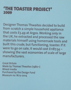
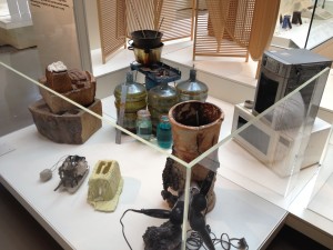
One of its acquisitions, Thomas Thwaites’ The Toaster Project (2009) is now installed in Room 76, right up front, at the beginning/end of the circulation route, and including it radically changes the mood of the room. This random-looking assortment of grungy, mysterious, “alchemical” jars and low-tech gadgetry – the actual artifacts used by Thwaites – appear in sharp contrast to any and all of the slick/sophisticated/luxurious/colourful and “complete” designed objects in the rest of the room. Thwaites created this ad-hoc chemistry set in an attempt to replicate a cheap, mass-produced mechanical/electronic product, which wouldn’t usually get a second look. He chose to make a functioning toaster using raw materials from the UK and low-tech manufacturing, recording the process first in his MA thesis and later as a book. The whole escapade reveals the global implications of mass-manufacturing and is literally an eye-opener, and Thwaites’ end-product evocatively demonstrates the improbability of the task. The presence of this project in the Museum validates the V&A’s commitment to engaging with contemporary, global design issues. However, the object label merely hints at the full story. During the 2013 London Design Festival The Toaster Project was included in a New Acquisitions Gallery (now closed due to the Exhibition Road Building Project) represented by copies of the book and a video; why isn’t that video included in Room 76 or on the V&A’s website? The current label misquotes the price of the Asda toaster, which is significant as its impossible cheapness actually prompted this project. The V&A should not be making mistakes on labels, putting misinformation into the public domain, especially as the correct information is recorded on the object’s collections record (£3.94, weird, I know). Buy the book for the whole story; it’s a fascinating read and a unique approach to writing about objects.
Screen Shot from video in V&A gallery of the toaster being assembled. Shot on mobile phone, during visit on 30/9/13
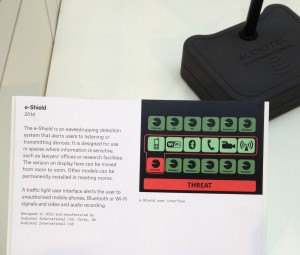
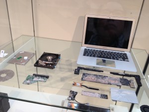
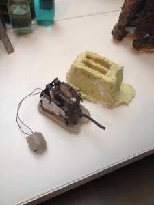
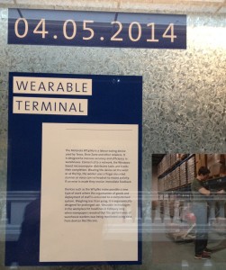
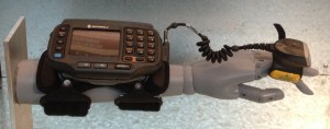
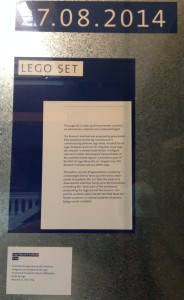
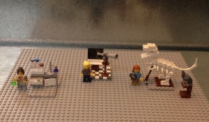
The web-article on The Design Fund (mentioned above) goes on to name the “recently established Design, Architecture and Digital department” as responsible for “continuing to broaden our contemporary design collection”. The most high-profile of the new department’s initiatives has been Rapid Response Collecting, which now has a dedicated gallery, Room 74a, in the middle of the “Modern” suite. On this visit I focused on three objects (see below) because: I’d just sat opposite a child on the train assembling a similar Lego toy, or rather, her father did, and the prescriptive nature of the packaged set contrasted sharply with my memory of Lego’s free-form building blocks; I hadn’t heard the story about the IKEA toy, and it’s good to be surprised in a museum; and, I’d heard about the plight of Amazon “pickers” but never seen the actual “prosthetic” they use, and there’s a really informative article by Corinna Gardner about the Wearable Terminal on the V&A Blog, here.
Much media coverage has been generated by RRC and by the Contemporary Architecture, Design and Digital team (CADD) (to give it its proper name); with a Senior Curator who was previously a journalist, Kieran Long, maximising publicity shouldn’t be a problem. Acquisition of a 3D-printed gun (using The Design Fund) – or rather two versions of the Liberator, one assembled and another disassembled (2013) – has been the biggest story to date, covered by the BBC and an in-depth interview in Wired, where Louise Shannon, Curator of Digital, explained the complications of collecting a fire arm that is also a digital file. Look to the V&A’s website for explanation of these curatorial developments and the story is lost, because of a lack of clear signposts. Unlike other departments, Contemporary Architecture, Design and Digital does not have a dedicated spot on the Museum’s website. My point being, if you can find it in the building, you should be able to find it on the website.
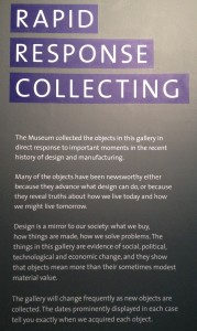
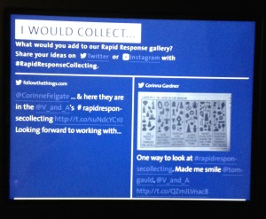
So I searched Contemporary Design and 361 results came up; of the 45 on the first page the only one that came close was the webpage about The Design Fund; it shows a thumbnail of the Liberator and mentions “the recently established Design, Architecture and Digital department”. Search RRC and three relevant links pop up, one telling me that Room 74a isn’t a permanent gallery but a temporary display (4/8/14-15/12/16), which means that you can find it via “What’s On” on the homepage, as it’s a “Display”. On another page, this web-article adds: “Regularly updated with new objects, Room 74a is the first gallery in the Museum that can be responsive to global events, technological advances, political changes or pop cultural phenomena that have an impact on art, design and architecture”. What’s missing, though, is any indication of the impact of this initiative in terms of: a round-up of the extensive media coverage, in comparison to other museum activities; social media interactivity, despite there being a “portal” inviting suggestions for new acquisitions via Twitter (see my dodgy photo above), and the Museum having a Social Media button on its homepage. It would be interesting to know if any of the suggestions were being acted upon. Further down that webpage is a link to “more about” on the V&A Blog, which links to three articles and an explanation of Tag: Rapid Response Collecting.
Using the “back button” I find my way to the front page of the V&A Blog and discover that its search box shows up the same results as the V&A homepage (by searching Contemporary Design again, still 361 results). This time, though, I search Contemporary Architecture, Design and Digital, and get 16 results, with the first article explaining the Memory Bank initiative. It looks to be the most relevant and opens with this: “The V&A has embarked on a major new approach to collecting contemporary architecture, product and digital design. We have a new digital design collecting policy and we are inviting you to participate in shaping and nominating objects for the permanent collection”. An admirable initiative to widen debate about contemporary collecting, but again, where’s the evidence on the V&A’s website of further follow up and of sharing the results? (And where is this in the gallery?) The fact that none of these webpages are dated (no “time code”) might work for the Museum (nothing looks “out of date”), but if you’re researching the work of the Museum it presents a problem. Unlike the scrupulous procedures followed by staff at the Blythe Road archives, these “n.d.” webpages are hardly good archival practice. Luckily, in this case, the event is dated in the copy: “we launched ‘Memory Bank’ at Hackney House Austin, United States, part of the fringe SXSW events, on Saturday 8 March 2014”. There’s also a Twitter #hashtag (#VAMemoryBank) and a selection of Tweets included on the page (nice touch).
Meanwhile, when checking out one of the “blog” articles from the RRC search, I find a News and Updates button in the sidebar, with this caption: “Take a look at what goes on behind-the-scenes in the world’s greatest museum of art and design. From bestselling exhibitions to hidden gems in the collections, learn about our latest projects, ideas and discoveries”. As research into Visitor Studies reveals, we’re all dying to get “behind the scenes”, so I click through to find a cache of articles. Using the back button I discover that this is accessible via a tag in a sidebar of the V&A Blog frontpage, and boasts 192 stories. There could be another link here, to “Contemporary Design”, but there isn’t. So, I’ve discovered a number of separate “flows” of articles, only one of which, the Blog, has a direct “way in” from the homepage – a linked button. Also, even though a search shows up a Galleries hub, there is no direct button for it on the website. Scroll down and, bingo, there’s a link to 20th-Century Galleries, which does include Room 76, so why not add 21st-Century to the tag?
Taking another route through the website, if you want to discover the objects that have been collected via RRC, go to the Collections page, put “Rapid Response” into the “Search the Collection” field, and discover this, 128 results. It would appear, therefore, that there are more direct routes to finding contemporary objects in the online museum – if it’s objects that you’re after. But even the first page of this search reveals that not all the objects are relevant, so it is far from being a robust research tool.
Using the website to dig deeper, looking further “behind the scenes” if you will, for information about contemporary design and CADD, I want to find mentions of these topics made within the V&A’s governing body, the Board of Trustees. The structure of the V&A has gone through many permutations; consistently, though, the best source of information is Anthony Burton’s exhaustive (and entertaining) book, Vision & Accident: The Story of the Victoria and Albert Museum (1999), (can someone tell me why it is out of print?). In its current incarnation, as a publicly-funded institution, the V&A is required to make public its Annual Reports and Minutes, and, like many other museums, chooses to do so via its website.
In the footer of the homepage, click “About” to find an article on the Trustees, which explains: “The Victoria and Albert Museum is a non-departmental public body sponsored by the Department for Culture, Media and Sport, and is a charity exempt from registration under the Charities Act of 2011. It operates at arm’s length from the Government and is governed by a board of Trustees appointed by the Prime Minister. Trustees are appointed in the first instance for a term of up to five years and may be re-appointed at the end of their term”. Scroll down to find links to Minutes of bimonthly board meetings going back to 2001 (accessing Minutes without having to schlep to an archive is a major plus). To discover which meeting might have included discussion about CADD, I (cheated) Googled “v&a board of trustees minutes contemporary architecture design and digital”, which brought up eight PDFs of minutes between 2011 and 2015 (then a gap) and another PDF of minutes from 2003. From these I learnt: on the topic of “Future Strategic Direction of the V&A” Martin Roth, the Director, stated, “Contemporary architecture and urbanism, digital design and product design were important areas going forward” (February 2012, 203rd Meeting); “CW [Christopher Wilk] outlined current thinking regarding the curation of contemporary architecture, design and digital collecting” (May 2012, 205th Meeting) but no other detail was given; and, finally, “The new Contemporary Architecture, Digital and Design Team was now in place. Action: The new team to be invited to a future Board meeting” (January 2013, 209th Meeting).
Rather than the whole team attending that meeting, Wilk was accompanied by Kieran Long and they “presented the work and plans of the CADD team which was established eleven months ago to bring a new focus to contemporary work at the V&A and to stimulate debate about contemporary design…enabling the V&A to be the foremost authority on contemporary design practice [and] how design reflects how we live together in public, and how design reflects and defines public life” (November 2013, 214th Meeting). Architecture was singled out for more discussion, with Long attending another meeting to describe ideas to extend the architecture collection (March 2014, 216th Meeting); the Exhibition Road Opening Exhibition Concept was also presented by Long (July 2014, 218th Meeting), but no other details were given; and finally, the Director made mentioned of RRC’s extensive media coverage (September 2014, 219th Meeting). From these Minutes it seems obvious that Contemporary Design is something that the Museum and its Trustees are keen to enhance and to concentrate resources on. That is will be front-and-centre for the grand opening of the new Exhibition Road building also sends a positive message regarding the place of Contemporary Design in the Museum.
Perhaps it feels overly pedantic to describe the split-second decisions that generate these “click throughs” and their insignificant digital traces (buried in “History”). With hand/eye movements that are almost imperceptible, is there any point in examining a process that is somewhere between invisible and unconscious? Much is made of the online/virtual museum, but in comparison to an actual museum visit the process of navigating, tracing and tracking the relevant information is both more complex and less conscious than interacting with a gallery display, via a well-conceived circulation route that includes reading labels, enjoying the well-designed display and installation, while consulting a free gallery guide (by the way, in Room 76 the holder for free guides was empty). By comparison, a museum’s website, however pristine it might be on first launching, can become a labyrinth of information that doesn’t necessarily reflect the most pressing concerns of the institution. By describing the process of searching for contemporary design (in the real world) and “Contemporary Design” (online), skipping from gallery to website, in the Museum (via free Wi-Fi) and at home, it becomes apparent that although the V&A has invested resources and personnel into expanding a commitment to collecting and displaying contemporary design, and gone some way to creating a cohesive physical presence for contemporary objects within the museum, it has yet to solidify (or even echo) that progress online. For despite a pledge to consider the role of design in our “public life”, and the Internet being the omnipresent conduit between public and private, there is no clear route to contemporary design on the V&A’s website, instead it requires multiple searches to find relevant content. There is plenty of content, but no “hub”: no links to the RRC Twitter suggestions; no archive of the extensive media coverage of CADD or RRC; no real-time traces of the contemporary team even though they’re all active users of social media. A homepage marker for Contemporary Architecture, Design and Digital, and for Rapid Response Collecting, would be good start; the V&A is doing the job, so why not shout about it?
References
Burton, Anthony (1999) Vision & Accident: The Story of the Victoria and Albert Museum
Cook, Beth; Reynolds, Rebecca; Speight, Catherine (eds)(2010) Museums and Design Education: Looking to Learn, Learning to See
Falk, John H. (2009) Identity and the Museum Visitor Experience
Falk, John H. and Dierking, Lynn D. (1992) The Museum Experience
Hufnagl, Forian; Hölscher, Petra; Rösner, Corinna; Gaines, Jeremy (eds) (2004) Design Museums of the World; invited by Die Neue Sammlung Munich
Thwaites, Thomas (2011) The Toaster Project: Or a heroic attempt to build a simple electric appliance from scratch
Williams, Gareth (2006) The Furniture Machine, Furniture Since 1990
Williams, Gareth (2009) Telling Tales: Fantasy and Fear in Contemporary Design: Narrative in Design Art
Williams, Gareth (2012) 21 Twenty One: 21 Designers for Twenty-First Century Britain
The articles and pdfs mentioned can be found by clicking the links.
Gallery photographs taken by Liz Farrelly, on an Apple iPhone 4S.

