VitraHaus
Vitra Campus
Ray-Eames-Str. 1, Weil Am Rhein, Germany
www.vitra.com
Visited, 16 to 18 October 2014
In relation to design objects and the museum, VitraHaus, the close neighbour of VDM, is worth pondering. Sited on the Vitra campus, it opened in 2010. As the flagship store for the Vitra Home Collection it showcases the furniture manufacturer’s domestic ranges (distinct from the contract products that are specified by architects for public and office spaces). On Vitra’s vast website, the page for VitraHaus invites us to “find inspiration for your home, explore your taste in design and try out, order and purchase furniture and design objects”.
For a concise explanation of Vitra’s role in the furniture industry look to Gareth Williams’ The Furniture Machine, Furniture since 1990. In the Introduction, Williams sets the scene for the reinvention of the definition and the industry of furniture design in the contemporary era. Recapping Vitra’s role in the process, he suggests that it “changed public taste”; the Vitra Editions, begun in 1988 by Rolf Fehlbaum, son of the founder, allowed for the manufacture of “significant designs, primarily seating, by elite designers”. The aim was to experiment beyond “the routine production of office furniture”, giving designers a free hand to not follow trends or be restricted by economics but to make “things with attitude”. Williams adds that Vitra has both contributed to and benefited from the collectors’ market that made mid-century modern trendy and the Eames into household names. Vitra owns the European rights to the Eames back catalogue, as does Herman Miller in the US; together they’ve reissued and re-imagined a wide range of classics (in new colours and with technical and material innovations). Rolf Fehlbaum himself explains the 2007 collection of Vitra Editions in the in-house magazine, online, of course. (Putting Williams’ book into a design history context, it’s reviewed in the Journal of Design History).
Coming after Vitra Editions, the rising popularity of vintage furniture, and the growth in home and mobile computing that prompted the rise of the “home office”, Vitra’s domestic ranges reacted to a growing trend – the “appropriation” of commercial design into the home. By the late 1990s, media coverage of domestic projects by designers and architects – their own homes in fact – was also crossing boundaries and widening the audience for design. Beyond the design industry’s trade press, a reinvigorated publishing sector, the shelter magazine, featured these “professional homes” and sold design to an increasingly savvy public. Launched in 2000, out of Mill Valley, CA. the tony “suburb” of the Dwell has become the media success story of this new generation of “how to achieve the look” mags. Then, during the noughties, online design blogs stepped up to pump out more images of cool homes.
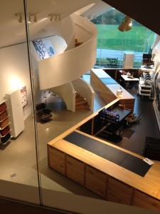
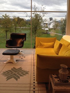
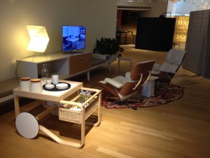
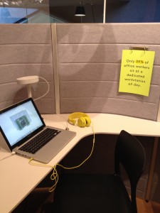
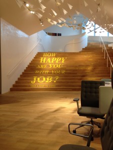
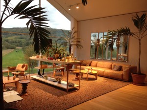
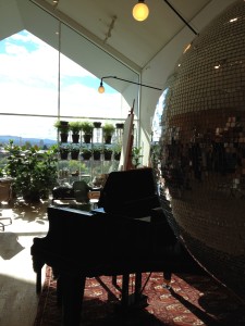
Looking beyond the products (and the media coverage), at VitraHaus it’s the staging and merchandising that tells this story, with the viewer/consumer invited to participate in imagined interiors that are “on-trend” (but not trendy). The architects, Herzog & de Meuron, mix metaphor with spectacle; “home” is quoted in the form of gabled extrusions (as if based on a child’s drawing of a “house”); and the gravity-defying stack of twelve separate but linked pavilions presents an unmissable landmark, rising out of the flat landscape to pose the question, “how did they do that?” Again, I’m reminded of child’s play, this time with building blocks. Inside, the dynamic circulation offers balconies and mezzanines for all-angle viewing, with surprises revealed around every corner. The fully-glazed “ends” frame the landscape, providing live backdrops for room-sets that manage to be both domestic and glamorous. Although this showroom is on a grand scale, and the show-stopping installations keep on coming, as you spiral up to an top-floor balcony, the seating, dining and home-office settings are on a human scale.
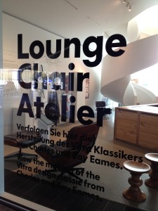
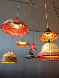
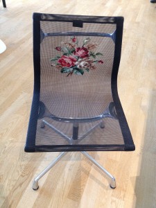
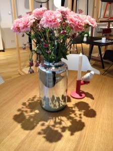
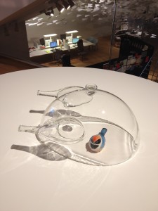
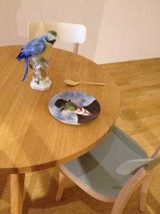
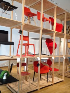
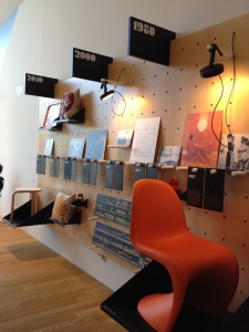
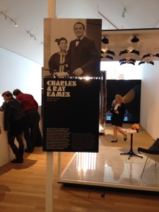
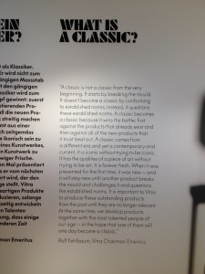
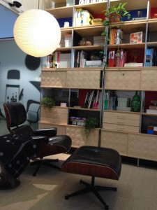
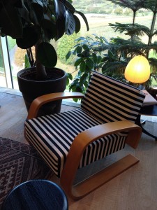
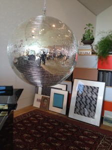
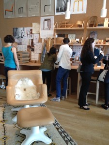
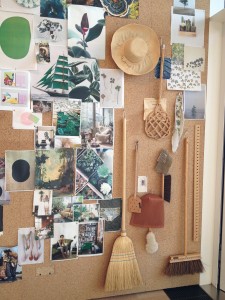
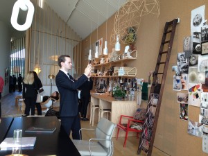
Within this alter-ego of Gehry’s spiral (the Museum is white, VitraHaus is a dusty black) is a retail solution that presents a version of “the everyday”, albeit aspirational, seductive and, so as to encourage sales, non-intimidating. The merchandising is eclectic and playful, including not only items for sale in the (gift) shop downstairs, but one-off artworks, collectables and pots of thriving flora. The arrangement looks spontaneous, but rather than conjure up any macabre feelings (that the rightful inhabitants have just left the room), instead the spaces are warm, as if the viewer has stumbled into domestic bliss, a parallel universe of “home”. Now and again, tropes borrowed from museum display are employed: wall texts inform (in English) about featured designers (Eames of course); an Eames-inpired decade by decade Timeline pin styles to the wall and include actual products; the “grid” of classic chairs, so familiar from museums and design stores, is colour coded, underlining the extensive choice on offer.
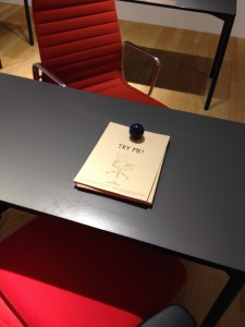
I popped into VitraHaus a couple of times during the MUSCON Conference (see my blog post about it) and enjoyed a different experience each time: walking around with colleagues, trading comments on the objects and displays; or alone, quietly enjoying the views, comfortable seating and taking the opportunity to record the experience; but also engulfed by school parties and family groups trying out the “stuff”, photographing and touching “exhibits”, be they objects on tables or items on pin-boards – nothing is roped-off. The high level of “interactivity” was a surprise, almost a shock, as the space aped a museum (but isn’t). The audience was uninhibited by museum-rules and yet exercised a higher level of decorum than is usually found in shops. Why might that be? Perhaps because these environments invoked, to a degree, the formality of the museum (using certain display methods) but were also imbued with the individuality of a home – you wouldn’t visit a friend’s house and abuse their belongings. And because the actual items on display weren’t for sale – there are no price tags – they resist being picked up and moved around. Instead, with a distant echo of IKEA’s “checklist”, products may be ordered at the sales desk on the ground floor. That degree of distance – it isn’t self-service – means that the displays remain intact. To keep the spaces pristine must require maintenance and housekeeping (cushion plumping at least), but unlike most retail spaces, where assistants are tasked with cleaning during quieter moments, I saw no “staff” on the “sales floor”, and therefore no sense that this was a sales floor; there was no figure of authority to disrupt the impression of being “at home”. And, despite the throng of visitors on a Saturday afternoon, the place was spotless, which you can’t always say of museums, where dust, grim, foot- and fingerprints often spoil the illusion.
It’s worth considering the separation between museum and retail on the Vitra Campus; the gift shop is housed on the ground floor of VitraHaus while just a few catalogues are for sale in the Museum foyer. Such a distinction flies in the face of museum-retail trends, but perhaps is necessary in this situation where a museum is sits so close to a manufacturer’s factory, all on the same “campus”. The separation distances the Museum’s scholarly activity from the commercial imperative of the company, even though they share a brand name. That the VDM collection contains “classics” that are produced by Vitra could also blur the boundary were it not for the further separation of the collection from the Museum; it is not on display in the Museum, but a new building intended to house the schaudepot (open storage facility) is already complete and in the process of being filled before opening to the public next year. For while the VDM holds the archives of the hero designers that Vitra manufactures under licence, the fact that the collection is not represented in the Museum, which instead stages temporary exhibitions, means that the Museum is unlikely to be perceived as a salesroom for the manufacturer. It wasn’t always that way, as shown by this official Museum image from 1989 (reproduced in Williams’ book), where the familiar chair grid features classics from the VDM collection.
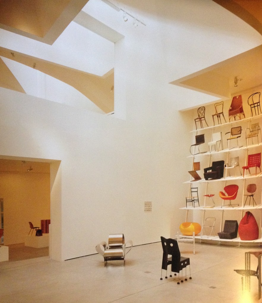
Interior of the Vitra Design Museum by Frank Gehry, 1989. Photograph by Vitra Design Museum and Peter Inselmann, reproduced in ‘The Furniture Machine, Furniture since 1990’ by Gareth Williams
The idea of a canon isn’t too far from the Museum shop, with the book 100 Masterpieces from the Vitra Design Museum Collection and “a poster with 225 objects of the collection” in the best seller selection. I found an earlier version of the poster in a Brighton charity shop; note the disclaimer – you can’t buy ALL the chairs from Vitra. Meanwhile, the chair grid has migrated across from the VDM to VitraHaus.
VitraHaus borrows display techniques from the world of museums, thus conferring a degree of “classic” status on the goods for sale, but we know they’re classics already (some of them at least). These are heirlooms in waiting, consumer goods that are afforded the same status as museum objects. The question of vested interests in the realm of spectacular retail meets private museum has been rehearsed before, when Habitat founder and all-round “retail-guru”, Terence Conran, brought the precursor of London’s Design Museum, the Boilerhouse, into the V&A (I’ll be investigating this further in my thesis). That retail and research is linked within the space of a design museum is unavoidable, when dealing with contemporary and everyday objects that are for sale. At Vitra the “line” must have been a lot less distinct before VitraHaus opened, but, with the luxury of space, and the initiative of an individual who likes to collect not only furniture but also architecture, separate buildings can help refine those distinctions. I’m looking forward to my next visit…
All photos taken on my Apple iPhone 4S

