Pick Me Up: Contemporary Graphic Arts Fair
Somerset House, London WC1
24 April to 5 May 2014
Five years in and Pick Me Up is now a headline event in London’s creative calendar; undoubtedly it’s evolved and mutated, and much discussion has been generated about how it reflects and influences the graphic arts in London, the UK and beyond. But more of that later, when I visit this year’s PMU. Also, watch this space for an archival re-post of a PMU debate that I chaired in 2012, here.
Meanwhile, here’s guest blogger John O’Reilly, editor of Varoom, the magazine of the Association of Illustrators, with a long-form review of the very first Pick Me Up, back in 2010. I commissioned this for étapes magazine; it was published in “issue zero”, an experimental, white-cover experiment intended to rehearse the redesign/relaunch in the form of a quarterly “bookazine”. John explored the widest implications of PMU, as an expression of zeitgeist and as a reinvention of the exhibition/artfair.
Photography: © Sylvain Deleu
Courtesy: Somerset House
Review of Pick Me Up 2010 by John O’Reilly
23 April to 3 May 2010
Two exhibitions bookend transition moments in recent British visual culture. Back in the late 1980s a young art student took over an empty building in London’s docklands and put on an exhibition that would shape the Art World over the next two decades. Born in a recession, Damien Hirst’s show, “Freeze”, introduced the general public to a type of brash, spectacular art, and over time these Young British Artists (YBAs) combined the two-fingered, anti-establishment sensibility of their roots with a growing awareness of big-budget, Art World thrills. It evolved into brash, boom-time art, and whereas artist Robert Patterson described the YBA tag as “a kind of licence to show tits and arse more than anything”, with this second exhibition, the invitation implied in the informality of “Pick Me Up”, of a cultural cheap date, is ideologically, temperamentally and aesthetically very different.
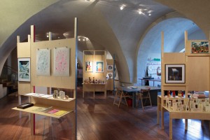
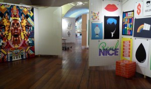
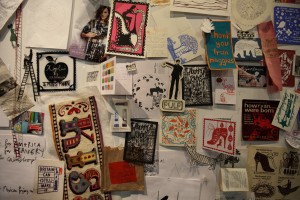
The “Pick Me Up” graphic arts fair at London’s Somerset House does capture a zeitgeist moment, showcasing over 25 upcoming illustrators (“upcoming” is relative when introducing illustration to the British public) alongside a bunch of illustration and graphic collectives, printmakers and small publishers. From the baroque liquidity of Alex Trochut, to the flat graphic pop of James Joyce, and Claire Scully’s post-urban sci-fi collage, the visual narrative of “Pick Me Up” highlights diversity, colour and expression. The informality is underlined by the displays of prints attached by “bulldog” clips to large functional, white-washed pegboards. It also captures something of the aesthetic debate around “where does graphic design end and illustration begin?” At the moment, illustration looks very relaxed, whereas graphic design is a little bit buttoned-up, more self-conscious and cool, aware of its relationship to commerce, even (or especially) in graphic designers’ own personal projects.
Contemporary illustration doesn’t have such hang-ups. Even when the work on display is highly commercial, such as HelloVon’s magisterial images of Federer and Nadal for Nike, the images are iconic (in the true religious sense) because this is an artistic expression of love and devotion. What makes illustration unique as a commercial art form is its paradoxical, easy blend of self-expression and aesthetic distance, wrapped in an emotion. In HelloVon’s work the camouflage shading of the faces captures the animal intensity of sport at the highest level, and for all the commercial and brand requirements HelloVon’s illustrations get under the skin of the top-level competitor, standing astride the brand while fulfilling a brief; the brand also benefits from the much sought after attribute of “passion”.
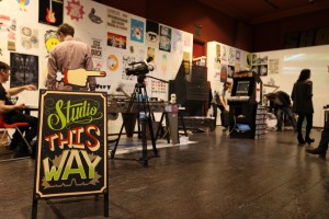
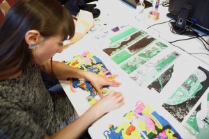
So, contemporary illustration has a very different relationship to commerce, and a different public image than either the YBAs or contemporary graphic design, and this comes into focus in the small “salons” housed in nooks off the main gallery at Somerset House. That’s where groups such as the Peepshow Collective operate, enabling visitors to print off unique woodcut images. Rob Ryan has taken over a large room and made it his studio for the 10 days of the show; the art on display is as much about Ryan and his team meticulously cutting paper amid the clutter of his relocated studio, as it is the finished work. This kind of activity is at the core of the show. For a general public who are a bit fuzzy about what illustration actually is (children’s books, Ronald Searle, Christmas cards perhaps), this show connects the idea of illustration as craft with funky creatives improvising in funky aprons. Print Club London have facilitated a different collaborator each day to create fresh work (James Jarvis and Jonathan Barnbrook included), selling in limited editions of 50, amid the smelly chaos of a well-equipped screen-print studio. All these activities manage to demystify illustration for the viewer while presenting the process as performance art.
The back-story for all of this started with certain illustrators taking control of technology. Whereas the livelihoods of commercial photographers have been hit by new technology — cheap high quality cameras, easy entry for the pro-sumer into the marketplace via sites such as Flickr — illustrators have benefitted from the distribution possibilities offered by the Internet, and by a growing desire among people for tangible “things” in a digital culture. Illustrators working as small publishers and printmakers have, as the Marxists used to say, taken control of the means of production, along with something which Marx never imagined, the means of distribution, online. This is illustration as a cottage industry, and these illustrators are supplementing their commercial work by selling their personal work directly to the public. Anyone visiting can buy the work, not just in the sense that it is available to purchase, but because the price of the work means it is affordable. This is a different relationship than a buyer has to conventional Art (I like the Capital A -Ed), and engenders a less precious sense of ownership, more rooted in pleasure rather than investment. Over the ten days many visitors bought a lot!
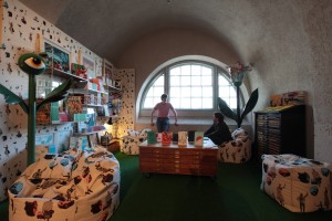
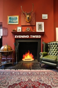
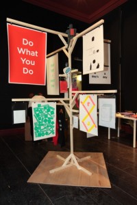
At “Pick Me Up”, it wasn’t just the printmaking that expressed this transition, but also the mini-salons where collectives, such as Evening Tweed, lounged in leather chairs presenting their work in the context of a slightly louche, aristocratic drawing room. Or the bearded boys of Nous Vous, laid back, heads buried in books, their work displayed on large cardboard boxes and a charming wooden stand that couldn’t decide whether it was giving directions or drying clothes.
As much as the improvised warehouse space of the “Freeze” exhibition lent Young British Art the glamorous idea of “life-on-the-edge”, Somerset House lends illustration a slightly faded nostalgia, giving the illustrations an almost nineteenth-century sense of being a “curiosity”; for a keen example, see Mathias Rekowski’s mix of physical and digital collage; the illustrations themselves, with their handmade, bespoke quality, exude an air of eccentricity. And not to labour a point, as much as the YBAs revelled in the fact that they did not actually create the work (often their concept was executed by others), “Pick Me Up” is all about the ethos and chaos of making stuff yourself. Whether the public, or art critics, or the media, actually register this, “Pick Me Up” is a zeitgeist show that pictures where illustration and our wider culture is at; in 2010 there’s nothing as romantic, or creatively honest as the improvisation of a cheap date.
Siggi Eggertsson
Landfill Editions
Manymono
Nobrow

