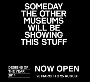
For its annual Designs of the Year award, London’s Design Museum employs social media, an email campaign and a micro-site to engage with its audience and entice it to judge the exhibits. It also suggests that talent-spotting curation offers a glimpse into the future.
Designs of the Year 2014
Design Museum
Shad Thames, London SE1
26 March to 25 August 2014
Nominees’ Party
25 March 2014
An exercise in engagement, a sure-fire media event, and a comprehensive round-up of the best design launched in a year, the Design Museum’s Designs of the Year award and exhibition is now in its seventh year, showcasing design across a range of categories; Architecture, Digital, Fashion, Furniture, Graphic, Product and Transport. Designs of the Year was instigated by the current Director, Deyan Sudjic, to replace the “Designer of the Year” award, when a winner was picked from just four nominated individuals whose careers and recent achievements were being judged rather than any particular outcomes. Increasingly, that competition attracted criticism for pitting star-designers against rank outsiders, and for some controversial decisions. Opening up the nomination and judging process to a wider panel, Designs of the Year provides the public with an annual, international round-up of headline-grabbing ideas, solutions and products.
The selection process for this new format has also generated a worldwide network of judges and nominatee from across the design industry — the museum’s extended “family” — who are now known to curators, with both parties mutually benefitting from the association. For the past three years, I’ve been asked to nominate, and each year had a couple of my choices make it through to the “exhibition” round. Proof of how much designers and their clients appreciate this opportunity to exhibit at the Design Museum may be judged by the massive amount of social media and personal thanks generated on the “shortlist” day, when the selection is announced; and by the packed, riotous party on the eve of opening. I’m writing this after attending the nominees party, so excuse the lack of focus on particular exhibits; this show demands repeat viewing as there’s so much to see.

London’s Design Museum amasses a pool of experts, from industry and academia, to scout for nominations, which are judged by a panel and then exhibited. A further round of judging decides on “best in category” and the over-all winner. Each year, the exhibitors meet the judges at the “first round” nominees party.
Extending over the spring-summer season, the exhibition keeps up momentum with a number of key events, when nominees get to see the show, and of course the awards ceremony itself. And if you miss it (where were you?!), a handy, pocket-sized catalogue of the entire shortlist is published each year. If you don’t read any design magazines, nor look at a single blog from one year to the next, you can still get a good sense of designs’ headline grabbers from this one little book. The exhibition also lives on via the museum’s website, where Previous Exhibitions are archived online. This year, for the first time, there’s also the Designs of the Year micro-site, encouraging a daily public vote, a choice between paired-off projects, utilising the snappy “headlines” that also announce each exhibit in the installation. A bold, black and white, san-serif, all-caps layouts and the “VS” device promote a healthy sense of competition (albeit verging on hucksterism), and an opportunity for social media engagement, by the museum, the designers and their clients. In the past, the exhibition installation has appeared a tad chaotic, with some exhibits literally “over-shadowed” by others, due to a mix of scale. Separating the exhibits into categories meant allowed for visitors to “by-pass” entire disciplines. This year, the selection is mixed, but each exhibit gets a headline and most are afforded a “demarcated space”, a long-ish caption and credits. The overall feel is of a more curated, contextualised display.
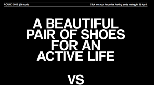
Two diverse nominations/exhibits are paired in each vote, demonstrating the diversity of design. Voters must log-in to social media sites to actually vote. The daily pairings are archived on this micro-site alongside the voting results as percentages. Some are very close, 51% to 49%; others are landslides, 96% to 4%. Pithy headlines describe each project, and a further link brings you direct to the designer or manufactuer’s website.

Alert to all newsletter members by one of the nominees, canvassing for the “social” vote, to produce the people’s choice winner. A link brings you to the voting page on the exhibition’s micro-site.
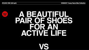
And the winner is…Earning 74% of the vote, Tracey Neuls’ Bike Collection goes on to the next round in the “social” vote.
Establishing Designs of the Year as an annual event has facilitated connections between the museum and various audiences. For professional designers and their clients, nominees can bask in the limelight while the rest check out the competition. For the UK’s substantial student population, it provides an opportunity for student designers to acquaint themselves with the contemporary canon, their peers, future employers, and examine an array of successful projects. Meanwhile, the public are invited to inspect an annual round-up of new stuff, conveniently amasssed under one roof. Keeping-on-keeping-on is crucial to this process of building an audience, which learns to trust the museum too, because while the concept repeats, the content and installation is annually refreshed. The task of curating the show rotates between the museum’s curatorial teams, so each year benefits from a fresh approach to what is a mammoth task, of compiling, judging, commissioning and displaying the world’s best new design.
Panning out from the exhibition itself, to consider how Designs of the Year might impact the design industry, the niggly issue of just how useful it may be to judge diverse projects against each other has not been addressed. The “face off”, the shortlist, the judging panel and the awards ceremony are “media-friendly devices” adopted by all creative industries. Why? The hook; the media require “something” to report, and an awards competition is a perfect way of flagging-up an industry; it’s literally declaring, “here we are, we’re really good at this!” So, as a public relations exercise and a means of professionalising the design industry, Designs of the Year puts design on the media map. But it also generates a number of more substantial “take aways” for the museum’s various audiences. For example, for the public, the realisation that “it’s all design” is a primary lesson. For industry professionals, the demonstration that “this museum is as competent displaying graphic design as it is exhibiting architecture”, is reassuring, especially if they might suspect that design museums are only interested in iconic chairs and star-designers, and that their discipline is ignored by curators lacking the specialist knowledge to do it justice.
What Designs of the Year proves, again and again, is that the Design Museum and its curators are knowledgable about design in all its incarnations. It is crucial, therefore, that the museum archives these annual exhibitions in a way that makes them accessible to the public, via the museum’s website, micro-sites (which don’t disappear into the ether) and published catalogues (which remain in print). That temporary exhibitions “live on” in other media can provide proof of curatorial expertise and build a database of contemporary design, which might therefore negate the neeed to actually acquire the “object” for the museum’s collection (i.e. so that it may reside in a storeroom beyond public access). Ultimately, temporary exhibitions must do more than simply entertain (for a finite time) and create revenue (however high on the list of priorities this may be). If archived and accessible, these “traces” of temporary exhibitions can build into a unique collection, albeit a digital one, which in turn provides a new oportunity for outreach, and for extending the museum’s audience, worldwide.
