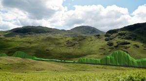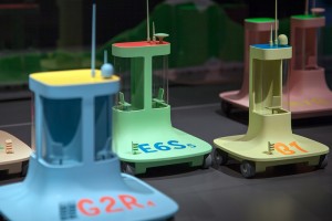
Communo-Nuclearists let the train take the strain.
Image by Tommaso Landa
©All rights reserved by d_&_r
United Micro Kingdoms (UmK): a design fiction
Design Museum, Shad Thames, London
1 May to 26 August 2013
Visited 30 April and 15 August 2013
I was lucky enough to be in the right place at the right time, attending a Designer Breakfast (8am start!) at the Design Museum, and was invited into the Press View for United Micro Kingdoms. There I bumped into Fiona Raby and Anthony Dunne, the instigators of this groundbreaking exhibition, which is billed as “a design fiction”. True to my journalistic roots, I fired a few questions and scribble some answers, before PRs whisked them away.
Tony and Fiona use design to provoke debate; they call it “critical design”. With “UmK” they’ve created a near-future scenario for our little island, populated by four tribes defined by differing attitudes to technology and ecology. These in turn are manifested as imagined transportation and energy choices, which mirror each tribe’s ethical and ideological beliefs.
The aim of the exhibition is to invite the audience to use their imaginations. Read the tribal “biogs”, examine the vehicle models, contemplate the staged photos and computer renderings and you might find yourself sympathising with certain attitudes or drawn to particular design solutions, because you like their aesthetics or the descriptions of how they work.
Take the game a stage further; perhaps you identify with one or other tribe, agree with their choices and solutions? More likely, you find some options acceptable, others not. Either way, these situations ring true, due to the fact that much of the detail is extrapolated from current science.
So why play this game? Tony and Fiona stress that their aim is not to define and classify us, the audience, instead, they say; “We want viewers to imagine stories. It’s a mix of fiction, sci-fi and future gazing. Dystopian or utopian; that’s too black and white, there are good things and drawbacks with each tribe”.
I ask how they go about creating an imaginary world. “We start by writing a synopsis, then put together a team of experts – scientists, technologists – with us, the designers, as part of the team. We recognise the problems and put them to the experts. And, we use the tools of our trade – models, photo shoots, statistics, computer renderings – to rehearse and develop the ideas.”
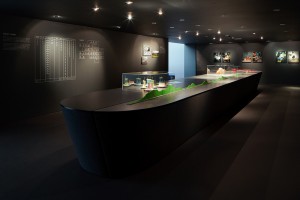
Interestingly, those “tools of the trade” also add a heighten sense of verisimilitude. Fly-on-the-wall photography, the perfect finish on detailed models, convincing graphs and graphics, and a coolly immersive display (dark walls, the luxury of space), present an “it’s possible” world. Everyday, as consumers, we see people and products (in ads, in stores) looking just like these images and objects. The scriptwriting mantra of “show don’t tell” is also crucial to the design process, to imagining something that is yet to exist. And, such tools are so much more effective at demonstrating a thesis than screeds of academic articles.
Fiona and Tony mention that they kept the styling of these images… “deliberately vague, it could be now, it could be the future”. The landscapes are green, not post-apocalyptic; the kids aren’t wearing spacesuits. It’s a tested trope of contemporary sci-fi, making the future recognisable by including stuff from “now”, rather then going totally “off planet”.
As an exhibition, United Micro Kingdoms ticks boxes. It’s definitely entertaining, and not just for geeks. It’s educational too, with a small “e”, effectively introducing “design thinking” to the museum’s audience, without resorting to a lecture. Because not only does it demonstrate dialogue between designers and other professionals, but the interaction continues as the audience engages with these ideas. There’s a well-stocked reading nook, and beyond the “here and now” of the show, a microsite (natch) encourages discussion and links to masses more media.
For me, as a viewer, the strongest message is that for every lifestyle choice we make as consumers and communities, there are consequences. And before we even get to choose, design is playing a major role in creating our futures. Fiona and Tony mention how project after project by their Design Interactions students (at the RCA) prompt serious debate about possible positive and negative repercussions, and by implication, the ethical and moral judgements that designers have to make.
It’s a brave show to stage at the Design Museum, for although Dunne & Raby are regulars on the international design museum/conference circuit, their brand of “critical design” in no way endorses the familiar role of design as the stylish handmaiden of progress and facilitator of a rose-tinted, technocratic future (one it’s played for so long). For the design professionals who make up a significant proportion of the Design Museum’s audience, was Dunne & Raby’s game of Consequences too bitter a pill?
In a very different context, I witnessed Dunne & Raby’s “Foragers” (their jaw dropping contribution to http://www.moma.org/explore/inside_out/2012/04/02/born-out-of-necessity-contemporary-design-and-the-myth-of-problem-solving/“Born Out Of Necessity” at MoMA, visited 30 August 2012) prompting much discussion among the contemporary art museum’s more mixed audience of tourists and locals. A group of blue-rinse matrons (from Long Island or New Jersey?) were contemplating the shiny, Kelly green, prostheses, intended to aid our digestion of all sorts of plant matter. Quizzical, they wondered if they were real, but they thought not. That said, they all agreed that it was a very good idea….
[Last point; a practical one. As this blog is about the actual experience of visiting exhibitions, I was pretty disappointed on my second visit to UmK to see that much of the information, in the form of exhibition graphics, was so badly damaged – lettering peeled off – that it was impossible to read! In a show that aims to communicate ideas, such an “installation malfunction” seriously limits its effectiveness. As the show was conceived to run over a number of months, surely maintenance of the display should be budget for?]


